Placeholder button text never gets rewritten and visitors stop trusting the form
Why placeholder button text like Submit survives redesigns, and what that small unedited label does to visitor trust in your forms
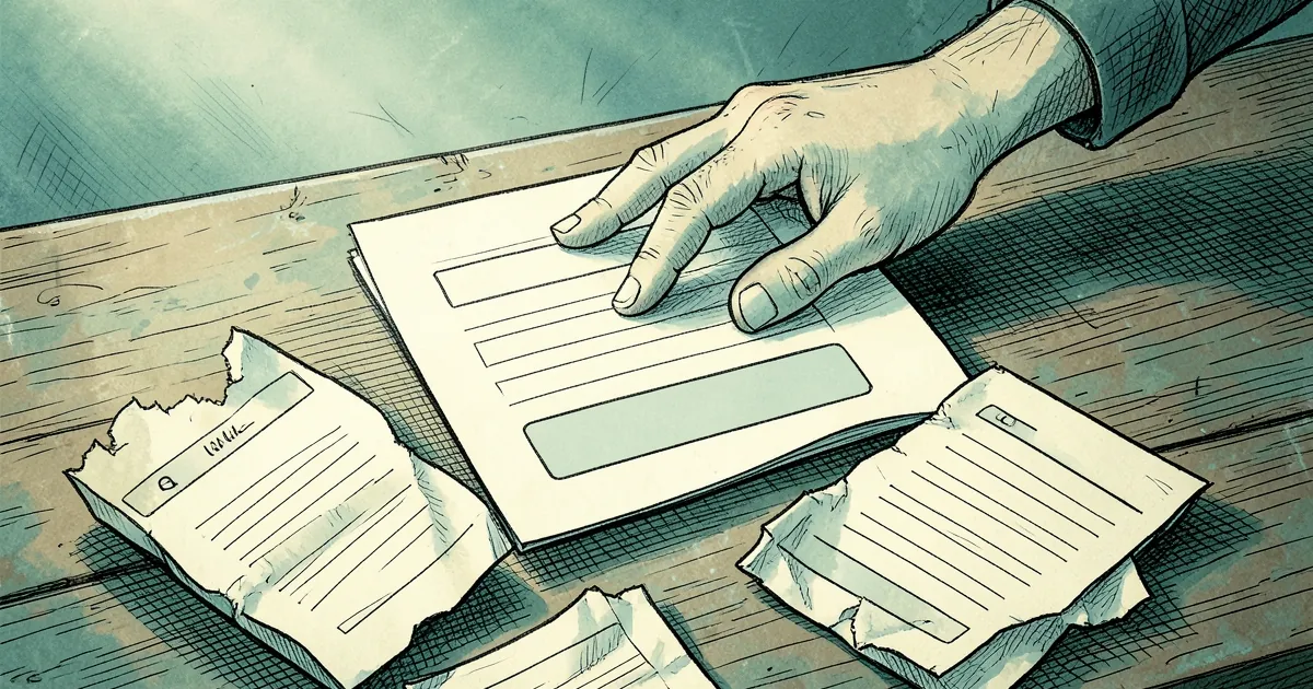
A form's submit button is often the last thing anyone writes and the first thing anyone reads. It says "Submit" on a Tuesday, ships on a Wednesday, and then survives three redesigns, two copywriters, and a product pivot without a single person reopening the label. The question worth asking isn't whether placeholder text is lazy. It's why nobody ever gets around to fixing it, and what that small unedited word does to the person staring at it.
The label is a promise, and "Submit" promises nothing
A button label is a micro-contract. "Get my quote" tells you what happens next. "Submit" tells you that something will be submitted, to someone, for some purpose — which is to say, it tells you nothing. Visitors read that gap as uncertainty, and uncertainty in a form is expensive. They've already invested effort; now they have to guess whether the click commits them to a sales call, a newsletter, or nothing at all.
This is the same failure mode as a final-step button that feels heavier than the task it completes. If you've read why a form's submit button feels like a final boss, the mechanism is familiar: the cost of clicking is legible, the reward isn't.
Nobody rewrites it because nobody owns it
Placeholder copy sits in a dead zone between design and engineering. The designer assumed content would replace it. The content person was briefed on headlines and hero sections. The developer copied the component from the last project. So the string persists — not through anyone's decision, but through the absence of one.
There's a behavioral name for what happens next. Variable-ratio reinforcement, the schedule that makes intermittent rewards so sticky, also describes how teams treat placeholder audits: someone fixes a button, gets a small win, and then nobody checks again for months. The reward is unpredictable, so the habit never forms.
The trust cost compounds quietly
Loss aversion does the rest. A visitor who clicks a vague button and lands somewhere unexpected doesn't just bounce — they update their model of your site. Research on decision-making under uncertainty (Kahneman and Tversky's work is the standard reference) shows people weight a bad outcome more heavily than an equivalent good one. One confusing confirmation screen outweighs five smooth ones.
You can see the same asymmetry in interface timing. Undo toasts that fade before users trust them create a small betrayal that users remember longer than the feature's convenience. A stale button label works the same way: it's not that "Submit" is hostile, it's that it's evidence nobody checked.
Concrete example: the A/B test that fixed the wrong thing
A common pattern in agency work: a team runs a button-color test, finds a 4% lift, ships it, and declares the form optimized. The label stays "Submit." What the test actually measured was salience — a brighter button gets noticed. It didn't measure comprehension. When a later team swaps the label to something specific ("Send my project brief") and keeps the original color, the lift often exceeds the color test, because the change addressed the question the visitor was already asking.
The lesson isn't "labels beat colors." It's that teams test what's easy to change and leave what's hard to own.
What to do before the next redesign
Go find every button whose label could have been written by someone who never met your user. Then ask a blunter question: what does the visitor believe will happen in the three seconds after they click? If the label doesn't answer that, it's a placeholder regardless of how long it's been live.
Worth pairing with a scroll audit — if most visitors never get past the third result, the button they finally reach had better be self-explanatory. And when you do rewrite it, keep the undo path honest: an undo that saves one keystroke but forces a rebuild is the same broken promise in a different costume.
— creative mess