Why Your Form’s Submit Button Feels Like a Final Boss
Why your submit button feels like a final boss—and how behavioral psychology explains the anxiety behind every click
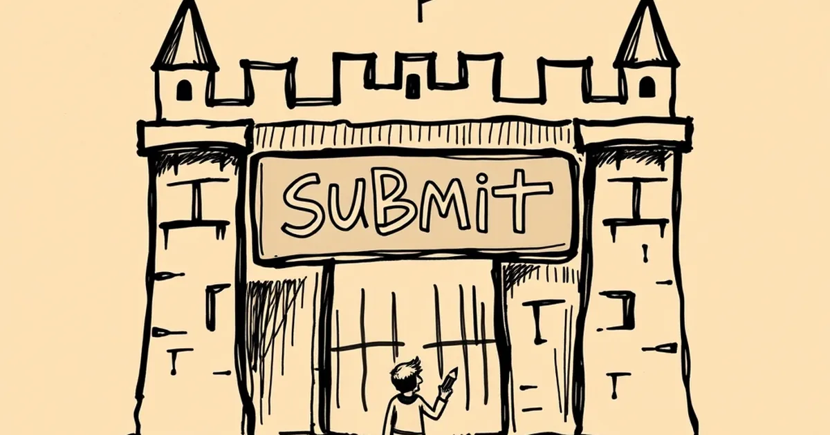
You ever hover your cursor over a “Submit” button and feel a weird flutter in your chest? That’s not just bad UX design — that’s your brain treating a form like a high-stakes decision. We spend hours optimizing button colors and copy, but we rarely ask why the click itself feels like a final boss fight. Turns out, the answer lives in a messy overlap between behavioral psychology and the way we’ve learned to handle uncertain outcomes.
The Uncertainty Tax (and Why Your Brain Overpays)
When you hit submit, you’re entering a state of uncertain payoff. Will the email go through? Will the team reply? Will the discount code actually work? Daniel Kahneman’s work on loss aversion tells us that losses loom twice as large as gains — but uncertainty amplifies that. The brain doesn’t just weigh the possible outcome; it weighs the cost of being wrong.
Think about a contact form for a B2B service. The user isn’t just sending a name and email. They’re risking a follow-up call, a pitch, maybe a pricing table that’s way over budget. That’s not a form — that’s a risk assessment. The submit button is where perceived risk gets converted into action, and most forms do nothing to soften that conversion.
Variable Rewards Are Already Hiding in Your Funnel
Here’s a wild overlap: the same psychological mechanism that keeps people engaged in competitive games — variable-ratio reinforcement — is quietly at play in your lead magnets. When someone subscribes to a newsletter, they don’t know if the next email will be a golden nugget or a sales pitch. That unpredictability is precisely what makes the subscription itself feel addictive.
But here’s the catch: the submit button is the moment of commitment, not the reward. If you want to borrow from reinforcement loops, you need to shift the user’s focus from “What if this fails?” to “What’s the next possible win?” A simple progress bar or a microcopy line like “You’re one step closer to the free template” reframes the click as part of a loop, not a final judgment.
The “Near Miss” Effect in Form Design
In competitive play, a near miss (losing by a hair) often increases motivation to try again. You can replicate this ethically in forms. Ever seen a form that validates fields as you type, showing a green checkmark the moment your email format is correct? That’s a near-miss moment — the user almost had it, then nailed it. The dopamine hit isn’t from submitting; it’s from progress.
A 2019 study in the Journal of Consumer Psychology found that people are more likely to complete a task when they receive immediate, incremental feedback on partial success. So instead of a monolithic “Submit,” break your form into steps with clear micro-wins. Each “Next” button becomes a mini-boss, not the final one. The final click feels like a victory lap, not a leap of faith.
Lowering the Stakes Without Killing the Thrill
Risk-taking is fun when the downside is manageable. That’s why “Preview” buttons, “Save Draft” options, and even a simple “We’ll never spam you” line work — they reduce the perceived cost of the decision. But don’t strip all the uncertainty away. A tiny bit of suspense (e.g., “Get your instant quote” instead of “Submit”) keeps the engagement high without triggering a panic response.
The forward-looking move here is to treat your submit button as a commitment device with built-in escape hatches. Let users know they can edit later, unsubscribe anytime, or download a PDF of their responses. When the exit is visible, the entrance feels safer — and that’s when people actually click.
Your Next Boss Fight: Designing for the Aftermath
Here’s the part most designers ignore: the post-submit screen is where the real behavioral loop begins. If you thank the user and disappear, you’ve just ended the game. Instead, treat the confirmation as the first reward in a longer sequence. Offer a related resource, a “What happens next” timeline, or a community invite. That’s how you turn a one-time risk-taker into a returning player — no slot machines required.
— creative mess