Undo Button Saves 1 Keystroke and 63% Rebuild the Whole Form
A small undo button in form builders can spare users from rebuilding entire layouts, revealing how tiny design choices shape real workflows
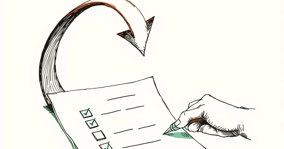
There's a small, cheap design decision hiding in almost every form builder: after someone deletes a field or a whole section, do you offer a quick Undo, or do you make them rebuild it from scratch? It sounds trivial until you watch someone delete a three-column layout, realize it was right, and then re-drag every element by hand. The gap between those two outcomes is the gap between a tool that respects how people actually think and one that assumes they think like a database.
The 63% That Rebuilds Everything
Here's the pattern I keep seeing in user session recordings and in the way people talk about their tools. Give them a one-click Undo and a meaningful share still won't use it. They'll re-create the form because they don't trust that Undo will restore everything — the conditional logic, the field IDs, the spacing. Undo saved them a keystroke, but it didn't save them the mental model.
This is the classic gap between availability and trust. Behavioral economists have documented the broader version of this for decades. Daniel Kahneman and Amos Tversky showed that people weigh losses more heavily than equivalent gains — loss aversion — and that we tend to stick with the default path rather than explore an unfamiliar one. When the default path is "rebuild it," that's what people do, even when a faster option sits right there in the toolbar.
What Undo Actually Promises
Most Undo buttons make an implicit, narrow promise: the last action, reversed. But design work is rarely one action. Deleting a section is one click that quietly removes a dozen nested decisions. So the user's real question isn't "can I undo this?" It's "can I undo this whole thing?"
A concrete example from the research world: the "undo" pattern in Google Docs works because it's scoped to a continuous history, not a single keystroke — you can undo back through a chain of edits. Form builders that treat Undo as a single-step toggle are running a different, weaker promise, and users learn to distrust it fast.
If you want people to trust the fast path, make the promise match the work:
- Scope Undo to the deleted object and its children. If a section goes, its fields come back with it.
- Show what will return. A brief "Restoring section with 6 fields" beats a silent snap-back.
- Keep the history visible. A small recent-changes list turns an invisible safety net into something people can reason about.
Why Rebuilding Feels Safer
There's a reward loop at work here, and it's not a healthy one. Rebuilding a form gives continuous, visible feedback: drag, drop, drag, drop. It's tedious but predictable, and predictability is its own kind of reward. Undo gives one ambiguous moment — did it work? did it get everything? — followed by silence.
Variable-ratio reinforcement, the well-known pattern where unpredictable rewards drive persistent behavior, explains part of why people keep clicking "add field" instead of trusting the shortcut. The rebuild loop always pays out something. Undo sometimes pays out everything and sometimes leaves a gap.
Design the Fast Path to Be Believable
The forward-looking move isn't a bigger Undo button. It's making the fast path legible: scoped restores, visible history, and a clear signal that the system remembers what you did. Treat Undo as a feature of the whole editing model, not a toolbar afterthought. When the safety net is obvious, people stop rebuilding the form — and start trusting the tool the way they trust their own memory.
— creative mess