Why Your Form’s Error Message Feels Like a Personal Attack
Discover why form validation errors trigger such a visceral reaction—and how to fix them for better user experience
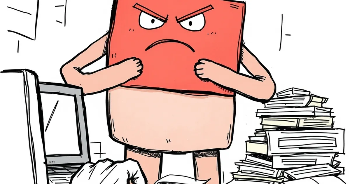
You know that flash of hot annoyance when you hit “Submit” on a form, and a red border screams “Password must contain an uppercase letter, a number, and the blood of a virgin”? It’s not just you. That tiny interaction feels like a snarky comment from a passive-aggressive friend. And if you build websites for a living, you’ve probably wondered: why does a simple validation error trigger such a visceral, personal reaction?
The answer isn’t in your CSS. It’s in how our brains process loss, status, and reward — the same circuitry that makes slot machine levers tempting and competitive leaderboards impossible to ignore.
The Loss Aversion Trap: Your Error is a Punishment
Daniel Kahneman and Amos Tversky’s prospect theory famously showed that losses hurt roughly twice as much as equivalent gains feel good. When a user fills out a form, they have already made a mental investment. They’ve typed, thought, and committed. An error message isn’t neutral feedback — it’s a loss of progress. Worse, it’s a loss of face.
Study this: in a 2017 Nielsen Norman Group usability test, users described inline validation errors as “judgmental” and “condescending” — not because the words were mean, but because the timing was. The error appeared after they’d already moved on. That delay turns a simple correction into a public reprimand.
The fix isn’t softer language. It’s reducing the perceived loss. Show errors before the user submits (real-time validation), and pair them with a clear path forward. Never say “Error” — say “Almost there.”
Variable-Ratio Reinforcement: Why Intermittent Success is Addictive
Here’s where it gets weird. Behavioral psychology tells us that unpredictable rewards create the strongest habit loops. B.F. Skinner’s famous pigeons pecked levers obsessively when rewarded on a variable-ratio schedule — sometimes every 3 pecks, sometimes every 20.
Your form does the same thing, unintentionally. Sometimes the user nails it on the first try. Sometimes they get stuck on a weird phone number format. That random mix of success and failure actually increases engagement — but it also increases anxiety. Users start to “play” the form, bracing for the next surprise.
The practical takeaway: Make the reward schedule predictable. If a field is optional, say so clearly. If a password rule is unusual, show the rule before they type, not after. Remove the slot-machine suspense from data entry.
The Competitive Edge: Your User is Already in a Game
Think about the last time you filled out a multi-step checkout. Your brain was tracking: “How many steps left? Am I faster than last time? Did I beat the estimated time?” That’s not just impatience — it’s a form of competitive play against an invisible opponent: the system itself.
When your error message says “Invalid email address” without explaining what’s wrong, it’s like a referee blowing the whistle without showing the replay. The user feels cheated, not informed.
A better model: Treat your form like a level in a well-designed game. Show progress bars. Celebrate small wins (e.g., a green checkmark on a valid field). And when the user fails, give them a hint that feels like a power-up, not a penalty.
Risk-Taking and the Friction Paradox
Here’s the forward-looking part. We know that too much friction kills conversion, but too little friction breeds distrust. Users actually appreciate some risk — it makes the eventual success feel earned. That’s why “Are you sure you want to delete?” dialogs work, and why a simple “Confirm your email” step boosts trust.
The design opportunity is to embrace this paradox. Instead of hiding errors, design for them. Use microcopy that acknowledges the user’s effort: “That email looks off — double-check the domain.” Add a subtle progress animation that makes waiting feel like part of the challenge. Let the user feel like they won the form, not just survived it.
The Next Step: Design for the “Second Chance”
Stop thinking of error messages as obstacles. Think of them as second-chance mechanics — the same reason players love a “continue?” screen after a near-miss in a racing game. The next iteration of your form should:
- Reward persistence: After two failed attempts, show a reassuring tip (not a warning).
- Reduce ambiguity: Use inline icons that change color based on input as they type, not after.
- Humanize the system: Write error copy that sounds like a helpful colleague, not a bouncer.
The goal isn’t to remove errors — that’s impossible. It’s to make the error itself a moment of engagement. When you understand that your user’s brain is wired for loss, reward, and competition, you’ll stop treating validation as a technical necessity and start treating it as a game mechanic. And that’s a game everyone can win.
— creative mess