Form Validation Fires 200ms Before the Field Turns Red
That 200ms gap between leaving a field and seeing red is where trust in your form is quietly built or broken
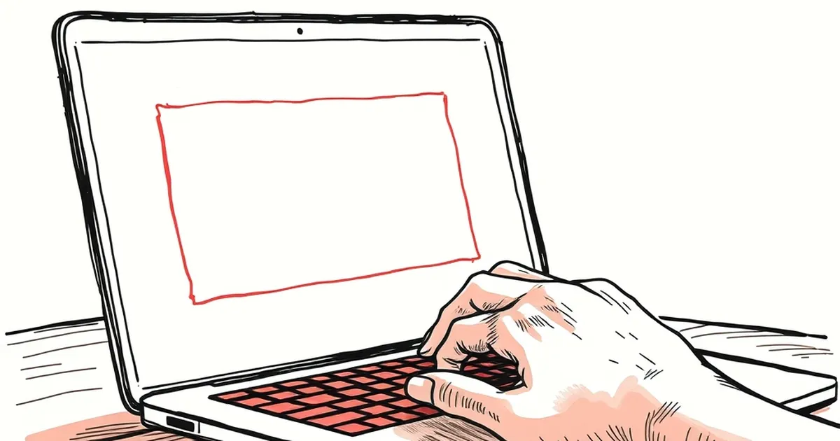
You've probably felt it: you tab away from an email field, and for a fraction of a second, nothing happens. Then the border turns red and the message appears. That 200-millisecond gap is doing more work than most designers realize — it's the difference between a form that feels like a conversation and one that feels like a trap. So what's actually happening in that gap, and why does timing it well change how people behave?
The gap is where trust gets built or broken
Most validation logic is instantaneous. The browser knows the input is invalid the moment you blur the field. What we're really designing is the delay — and that delay is a behavioral signal, not a technical one.
Show the error too fast and the user reads it as an accusation. They typed something, they moved on, and the interface slapped them before they'd even finished thinking. Show it too slow and they've already started typing the next field, and now the correction arrives after they've mentally moved on — which means they have to backtrack, re-read, and re-orient. Both feel bad, for opposite reasons.
The 200ms sweet spot isn't arbitrary. It's roughly the threshold where a response still feels causally linked to your action. Beyond that, the brain starts attributing the feedback to something else.
Variable-ratio reinforcement, but for form fields
Here's where it gets interesting. B.F. Skinner's work on variable-ratio reinforcement showed that unpredictable rewards produce the most persistent behavior — the pigeon pecking for a pellet that arrives on an irregular schedule. Most people cite this in the context of games and habit loops, but it applies just as cleanly to form feedback.
If a field turns red every single time you make an error, the feedback becomes noise. Predictable, ignorable. But if the interface sometimes confirms correct input with a subtle green check, sometimes stays silent, and sometimes flags an error — the user pays closer attention to every field. Not because they're being manipulated, but because the feedback carries information again.
The design lesson isn't "be random." It's that uniform feedback trains people to stop reading it.
Kahneman's System 1 doesn't wait for your debounce
Daniel Kahneman's distinction between fast, intuitive System 1 thinking and slow, deliberate System 2 thinking matters here. When a user fills out a form, they're mostly operating in System 1 — pattern-matching, autofilling, moving quickly. System 2 kicks in only when something forces it.
A red border alone doesn't force System 2. It's too easy to dismiss. But a red border that arrives 200ms late, paired with a specific message about what is wrong and why, does. The delay creates a micro-pause. The specificity gives System 2 something to chew on.
What this looks like in practice
- Instant red, generic message: "Invalid input." User ignores it, submits, gets blocked, gets frustrated.
- Delayed red, specific message: "This email is missing the @ symbol." User reads it, fixes it, moves on.
The second one costs you 200ms. It saves the user a full round-trip.
Loss aversion is why the error state matters more than the success state
Kahneman and Tversky's loss aversion work found that losses feel roughly twice as painful as equivalent gains feel good. In form design, this means a red error state carries disproportionate weight. Users will remember the field that rejected them far longer than the field that quietly accepted them.
That asymmetry is a design constraint, not a bug. It means error states deserve more craft than success states. The delay, the wording, the color — all of it compounds. Get it right and the form feels fair. Get it wrong and the user remembers the form, not the product.
Where this goes next
The interesting frontier isn't better error messages — it's forms that learn when to stay quiet. If a user has corrected the same field type three times across a session, maybe the fourth time you validate on input rather than on blur. If they've never made an error in a field, maybe you skip validation entirely until submit.
The 200ms gap is just the beginning. The real question is whether your form is paying attention to the person filling it out, or just the data they're entering.
— creative mess