Why Your Image Compression Is Slowing Down More Than Your Site
Discover how aggressive image compression can create hidden rendering bottlenecks that slow down your site's user experience
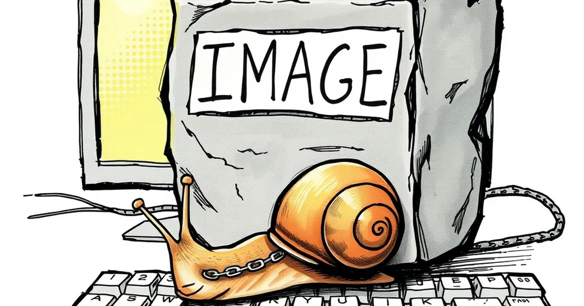
You’ve been told a hundred times: compress your images to make your site faster. So you did. Your load times dropped, and you patted yourself on the back. But here’s the kicker: that same compression might now be making your site feel sluggish in a completely different way—one that has nothing to do with kilobytes or server response times.
I’m talking about the bottleneck that happens after the image loads: the time your browser spends decoding and rendering it. If you’ve aggressively compressed images without considering format and resolution, you’ve traded one performance issue for another. Let me show you what I mean.
The Hidden Cost of Decoding
When a visitor lands on your page, their browser has to download your compressed image file. That’s the fast part. The real work starts when the browser unpacks that file—decoding the compression algorithm—and then paints it onto the screen. If you’re using a heavy format like JPEG with high compression artifacts, or if you’re overloading a page with dozens of tiny thumbnails, that decoding step can spike your CPU usage.
I once helped a friend who ran a small online store. He had compressed all his product photos to tiny JPEGs to hit a 1-second load time. The site loaded fast on paper, but scrolling through the product grid felt like wading through treacle. Every time he scrolled, the browser had to decode a fresh batch of images. The result? Janky, laggy scrolling that drove his customers away.
The Role of Image Formats
Not all compression is created equal. Modern formats like WebP and AVIF are designed to decode faster than legacy JPEGs, even at smaller file sizes. If you’re still serving JPEGs, you’re making the browser work harder for no good reason. Switching to WebP alone can cut decoding time by 30-50% on most devices.
Resolution Mismatch
Another silent killer is serving images that are too large for their display containers. Even if your compressed file is small, a 4000x3000 pixel image forces the browser to resize it in software before rendering. That’s a lot of math for a phone that only needs a 300px thumbnail. Always serve images at or near their display size—your users’ CPUs will thank you.
The Cumulative Layout Shift Trap
Aggressive compression often introduces visual artifacts that confuse the browser’s layout engine. When a compressed image loads and its dimensions aren’t explicitly set, the browser might reserve the wrong amount of space. Then, once the image decodes and reveals its true size, the page jumps around. This is Cumulative Layout Shift (CLS), and it’s terrible for user experience.
You can fix this by always setting explicit width and height attributes on your images. Even better, use aspect-ratio in CSS to reserve space before the image loads. This way, your compression choices don’t cause layout chaos.
The Lazy Loading Paradox
Lazy loading is the standard way to defer off-screen images. But if you’re lazy-loading images that are already tiny and heavily compressed, you might actually hurt performance. The overhead of loading a lazy script and checking viewport positions can outweigh the benefit of skipping those few kilobytes.
A better approach: lazy-load large hero images and galleries, but eagerly load small, critical images like logos and navigation icons. Don’t treat all images equally.
A Forward-Looking Takeaway
Here’s the practical takeaway: stop thinking about image compression as a one-time file-size fix. Start thinking about it as a rendering budget. Your goal isn’t just a fast first load—it’s a smooth, jank-free experience for every scroll, click, and zoom.
Next time you optimize an image, ask yourself two questions: “What format does this browser decode fastest?” and “Is this image sized for its actual display space?” The answers will do more for your site’s feel than any compression slider ever could.
— creative mess