Skill Badges Unlock 3 Seconds After You Actually Quit
The three-second delay before a skill badge appears reveals how reward timing shapes whether an achievement feels earned or hollow
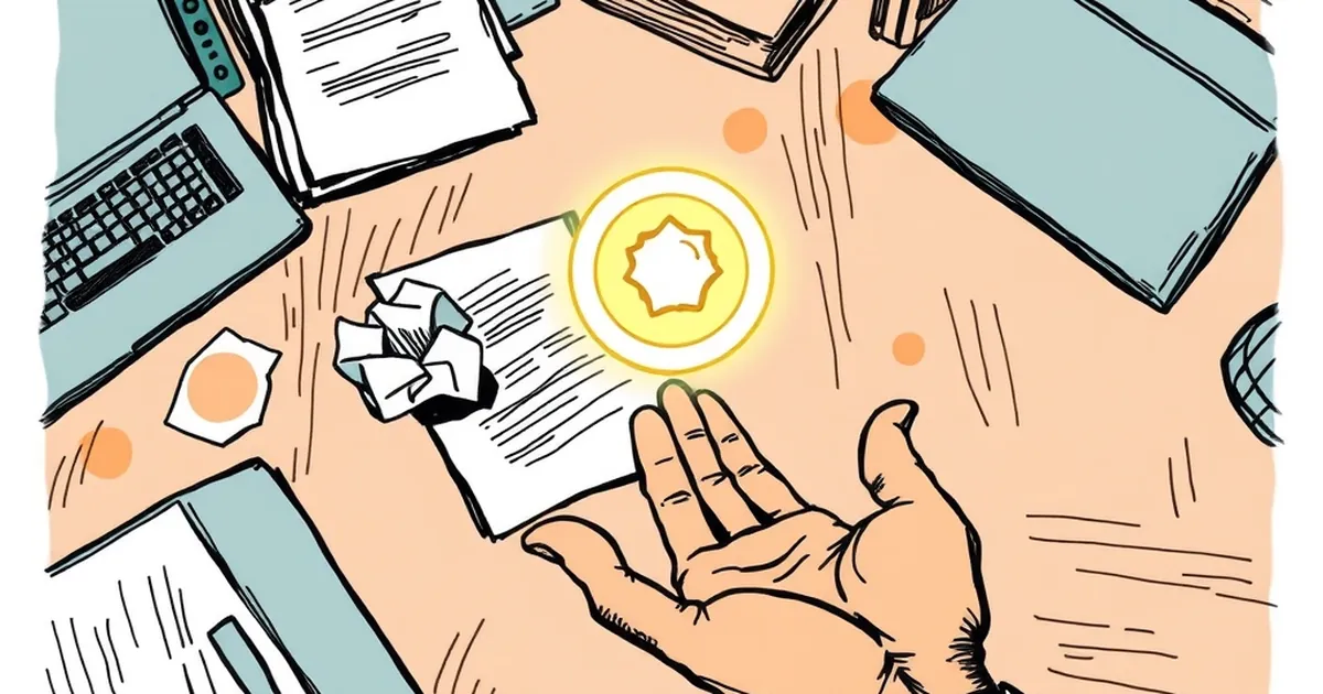
Skill badges that appear three seconds after you close the tab are a small design decision with a strange amount of psychology behind it. Why does a badge feel earned when it shows up right as you leave, and hollow when it shows up mid-task? If you build or commission websites for businesses, this is worth poking at, because the timing of a reward is doing more work than the reward itself.
The gap between action and feedback is the whole product
Most business sites treat feedback as a receipt. You did a thing, here's a confirmation. Fine. But a receipt closes a loop, and a badge that lands three seconds after you stop opens one. The delay is the feature.
Behavioral research has a name for the machinery underneath: variable-ratio reinforcement, the schedule where a reward arrives after an unpredictable number of actions rather than every single time. B.F. Skinner mapped this in the 1950s, and the finding that stuck is that unpredictable payoff schedules produce the most persistent behavior. Not the biggest rewards. The least predictable ones.
Here's the part most designers miss. The unpredictability doesn't have to live in whether you get the badge. It can live in when. Three seconds is long enough to feel like the system noticed something you didn't, and short enough that you don't assume it broke.
Loss aversion makes quitting feel expensive
Daniel Kahneman and Amos Tversky's work on loss aversion showed that people weigh losses roughly twice as heavily as equivalent gains. A badge you already have is a possession. A badge you might lose by walking away is a threat.
That's why the three-second window matters so much. It sits exactly where you've decided to leave but haven't fully left. The badge arrives in that sliver of ambivalence, and suddenly the tab isn't closed, it's paused. You're not chasing a reward anymore. You're protecting something you just acquired.
Designers who understand this stop asking "how do we make the reward bigger" and start asking "where does the user's attention naturally hesitate?"
A concrete case: Duolingo's streak freeze
Look at Duolingo's streak freeze. You don't buy it with enthusiasm. You buy it because you're about to lose a number you've been protecting for 200 days, and the app offers you an out at the precise moment the loss becomes real. The mechanic isn't generosity. It's a well-placed acknowledgment of loss aversion, and it works because the timing is surgical.
The same principle shows up in less obvious places. Strava's segment badges. GitHub's contribution graph. Fitbit's celebration animation, which fires after you've already stopped moving. None of these are random. All of them land in the moment after effort, not during it.
What this means for business sites
If you're designing a site for a business, you probably aren't building streaks. But you are building moments where someone completes something — a form, a quote request, a saved cart, a tutorial step. The instinct is to confirm immediately. The better move is often to confirm just after they've mentally moved on, so the acknowledgment reads as recognition rather than automation.
Three seconds is a starting point, not a law. Test it. Watch where people hesitate before leaving, and put your acknowledgment there.
The forward-looking version of this: as sites get better at reading hesitation signals — dwell time, cursor drift, tab-switch intent — the interesting design problem stops being "what do we show them" and becomes "when do we show it." The reward was never the badge. The reward was being seen at the exact moment you thought nobody was watching.
— creative mess