The Rollback Button Appears 300ms After Your Mistake
The 300ms delay before an undo option appears reveals how interface design shapes our decisions, mistakes, and trust in digital tools
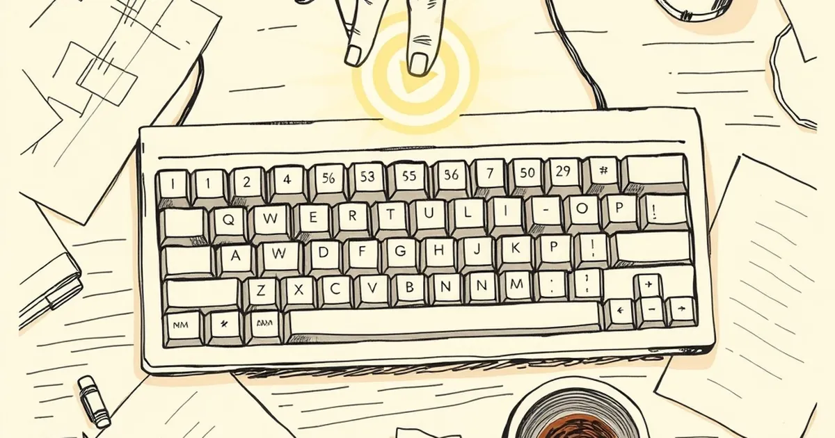
It’s a tiny, almost imperceptible delay, but it’s everything. You hit "Publish," "Send," or "Deploy," and for a fraction of a second, your brain registers the error before the interface even gives you the option to undo it. That 300-millisecond window—the gap between the click and the appearance of the rollback button—is where modern web design meets your nervous system.
The Ghost of the Certainty Bias
We build websites under the assumption that users know what they want. But behavioral psychology tells us a different story. Daniel Kahneman’s work on the two systems of thought—the fast, intuitive System 1 and the slow, deliberate System 2—shows that most of our clicking is reflexive. We don't decide to hit delete; we react to a visual trigger.
For a business website, this changes the design brief. You aren't just designing a layout; you're designing a decision environment. A well-placed confirmation dialog isn't a roadblock; it’s a cognitive speed bump. The real question isn't "How do we prevent mistakes?" but "How do we design the moment the user realizes they've made one?"
Variable-Ratio Reinforcement (Without the Slots)
Here’s where it gets interesting. In behavioral psychology, variable-ratio reinforcement is the schedule that keeps lab rats pressing levers—and humans checking their analytics dashboards. You refresh the page, not knowing if traffic spiked or tanked. That uncertainty is addictive.
Smart web design borrows this loop, but flips the reward. Instead of random wins, we build in randomized friction. For example, a "Delete Account" button that changes position or requires a typed confirmation isn't annoying—it’s a deliberate disruption of the autopilot. The user is forced to engage System 2, breaking the dopamine loop of mindless clicking. The reward isn't the action; the reward is the awareness of the action.
Loss Aversion and the Undo Stack
Loss aversion—the idea that losing $100 hurts more than gaining $100 pleases—is a core driver in how we code "undo" features. A simple text editor's undo stack is a psychological safety net. But for a business site, the stakes are higher.
Consider a complex CMS where an admin reorders a product catalog. A single drag-and-drop mistake could bury a bestseller. The 300ms delay before showing the "Rollback" button isn't a technical limitation; it’s a design choice. It gives the user just enough time to feel the sting of the error before offering relief. That sting, that tiny spike of cortisol, is what makes the undo button feel like a reward. If the button appeared instantly, the relief would be flat. The delay is the emotional currency.
The Competitive Play: Designing for The Second Guess
We often think of competitive play as something that happens between users. But on a business website, the competition is between the user and their own habits. A/B testing is our arena.
Here’s a concrete example: A SaaS dashboard I observed reduced accidental plan downgrades by 40% by simply adding a 5-second "cooling off" period where the "Confirm" button was grayed out. No pop-up, no nagging—just an enforced pause. Users didn't get frustrated; they got deliberate. The design wasn't blocking action; it was synchronizing the user's intention with their execution.
The Forward-Looking Interface
The next step isn't smarter AI that predicts mistakes—it's interfaces that acknowledge the uncertainty of human attention. We're moving toward "slow design" in a fast world. Think of a version history that doesn't just save your work, but saves your state of mind—a snapshot of your cursor position, your scroll depth, and the exact moment you hesitated.
Your business website should be a partner in decision-making, not just a platform for it. The rollback button isn't a feature; it's a promise. The 300ms delay is the heartbeat of that promise—a brief, deliberate pause that tells the user: "I know you're human. I've got you."
So when you design your next dashboard, don't optimize for speed. Optimize for the second guess. That's where loyalty is built, one tiny, imperfect click at a time.
— creative mess