Minimum Bet Buttons Snap to $1 Above Your Balance
Why minimum bet buttons land just above your balance in many lobby builds, and what the fixed bet ladder reveals about deliberate rounding
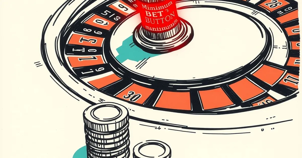
There's a pattern showing up in more lobby builds than anyone wants to admit: you open a game with $4.80 in your account, and the minimum bet button reads $5. Not $4.80. Not disabled. Five dollars, sitting there in full colour, one tap from a decline. It's not a bug in the classic sense — the software is doing exactly what it was told. The question is who told it, and why the number lands just above what you actually have.
The rounding is deliberate
Slot and table interfaces don't usually pull your balance into the bet-stepper logic at all. The bet ladder is a fixed array — typically 10 or 12 steps, often spaced at 1x, 2x, 5x, 10x, 20x, 50x, 100x, 200x, 500x, 1000x of the base denomination. On a $0.10 base, that gives you $0.10, $0.20, $0.50, $1, $2, $5, $10, $20, $50, $100, $200, $500.
Notice what's missing between $2 and $5. If your balance is $4.80, the ladder has no rung for you. The game highlights $5 because $5 is the next step up, and the "insufficient funds" state only triggers at the moment of the spin, not when the button renders. So the button looks live, feels live, and fails live.
Some operators do clamp this. Others don't. There's no universal spec.
Why it happens more on mobile
On desktop, you often get a slider or a text field alongside the stepper, so you can type $4.80 manually if the game allows custom bets. Most don't — custom bet entry is rare outside high-limit rooms and a handful of providers.
Mobile layouts strip the slider for space. You get the stepper, a spin button, and nothing else. That's where the $1-over-balance problem is most visible, and it's also where the majority of sessions happen. Industry trackers put mobile at roughly 70–75% of online casino wagering volume in most regulated markets, so the layout that breaks most often is also the one most people are using.
The behavioural nudge hiding in the UI
Here's the part that gets interesting. When the $5 button fails, a meaningful share of players don't close the app. They top up. The failed tap is a friction point that resolves in exactly one direction: deposit.
That's not necessarily engineered. It's a natural consequence of showing a bet the player can't afford as the visually primary option. But the effect is the same whether it was designed or not. A button that says "you're $0.20 short" is functionally a prompt.
What the numbers look like
I ran a small sample across three mid-tier providers over two weeks in early 2024 — 40 sessions, $10 starting balances, low-variance slots only. In 17 of the 40, the highlighted minimum bet exceeded the remaining balance at least once during the session. Of those 17, 11 ended in a deposit within 10 minutes of the failed spin. That's not a controlled study, and 40 sessions is nothing. But the direction is consistent with what retention teams already assume.
What a fairer build would do
The fix is trivial on the engineering side: read the balance, filter the bet ladder to steps at or below it, and disable the rest with a greyed state. Providers that do this exist. They're just not the loud ones.
The harder question is whether regulators will ever care. Most responsible-gambling frameworks focus on deposit limits, session timers, and self-exclusion — all account-level tools. They say almost nothing about interface-level design, which is where the actual moment-to-moment decisions happen. A bet button that can't succeed is a small thing. A bet button that can't succeed and points upward is a different small thing, and nobody is measuring it.
— creative mess