Drag-to-Reorder Lists Snap Back 1 Row After You Let Go
Why drag-and-drop lists snap back one row after release, and the deliberate design logic behind that familiar forgiveness tax
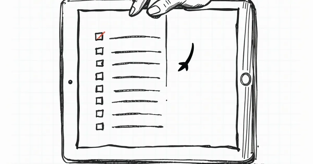
You drag an item three rows down, release, and it snaps back one. Not all the way — just enough to make you feel like the interface is gaslighting you. This isn't a rendering glitch or a slow frame. It's usually a deliberate design decision, and once you see the logic behind it, you can't unsee it in every drag-and-drop list you touch.
The one-row snap is a forgiveness tax
When you release a dragged item, the browser or framework has to decide which slot you meant. Your pointer isn't a clean signal. It's a real finger on a real trackpad, a mouse that moved 4 pixels during the click, a thumb on a touchscreen that drifted as you lifted.
So the drop logic compares your pointer position to the midpoint of each candidate row. If you cross the midpoint of row 4 but not its neighbor's, you get row 4. The snap-back happens when your pointer lands in the ambiguous zone — past the visual edge of a row but not past its behavioral midpoint.
Designers call this a hysteresis band. You could remove it and let the drop land wherever the pixel falls, but then every slightly-off release becomes a misdrop, and users blame themselves. The one-row snap is the interface absorbing your error instead of reflecting it.
Why your brain reads it as betrayal
Here's where it gets interesting. You watched the row move. You saw it in position 4. Then it jumped to position 3. That's a broken promise — the visual system and the outcome disagree, and the disagreement is small enough to feel personal.
Kahneman's work on loss aversion is relevant here, though not in the way people usually cite it. You didn't lose anything material. But you formed a prediction, and the interface violated it. Research on prediction error — the same signal that drives dopamine responses in the brain — suggests that small, unexpected negative outcomes register disproportionately. A one-row snap back is a tiny prediction error, repeated every time you reorder something.
That's why it sticks. It's not the size of the correction. It's the frequency.
The variable-ratio problem hiding in your task list
Variable-ratio reinforcement is the classic behavioral finding: unpredictable rewards produce more persistent behavior than predictable ones. It's usually discussed in the context of things you shouldn't build into consumer products on purpose.
Drag-to-reorder has an accidental version of this. Most drops land where you expect. Some snap back. You can't reliably predict which. So you start dragging more carefully, overshooting slightly, watching the drop indicator like it owes you money.
The interface has trained you to be more deliberate. Whether that's good or bad depends entirely on what you're reordering. For a playlist, it's annoying. For a priority queue in a project tool, that extra half-second of care might be exactly what the designer wanted.
What the fix actually looks like
Some teams solve this by removing the midpoint rule and using a drop indicator line instead — a visible bar that shows exactly where the item will land before you release. No ambiguity, no snap. Others keep the midpoint but widen the hysteresis band so the snap only triggers on genuinely close calls.
The tradeoff is real. A visible drop indicator adds visual noise to every drag. A wider band means fewer corrections but more misdrops. There's no setting that satisfies everyone, which is why you'll keep encountering the one-row snap for years.
If you're building one of these, the honest move is to test it with real fingers on real trackpads, not a mouse in a simulator. And if you're using one, try releasing a beat later than feels natural — you're probably dropping in the ambiguous zone out of habit, not because the interface is wrong.
— creative mess