Loss Aversion Peaks When the Undo Button Fades at 8s
Countdown timers trigger loss aversion twice as strongly as gains, and an 8-second undo window may be the point where panic peaks
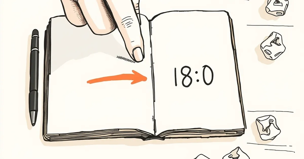
We've all felt that tiny spike of panic when a website says "your changes will be lost" and starts counting down. But why does an 8-second window feel so much more threatening than a 30-second one? And what does that tell us about how we design interfaces for real humans?
The Clock Is a Threat, Not a Timer
Loss aversion is one of the most replicated findings in behavioral economics — Kahneman and Tversky showed people feel losses roughly twice as intensely as equivalent gains. What's less discussed is how time modulates that feeling. A countdown doesn't just communicate a deadline; it converts an abstract risk ("you might lose your work") into a visceral one ("you are losing it right now, in real time").
That's why an 8-second undo window hits differently than a 30-second one. At 30 seconds, your brain still has room to plan. At 8, it's pure reflex.
What the Research on Deadlines Suggests
There's a well-known pattern in decision science: as a deadline approaches, people shift from deliberative thinking to heuristic thinking. They stop weighing options and start grabbing the most available one. In interface terms, that means your users aren't reading the dialog — they're smashing the biggest button.
A concrete example worth knowing: in usability testing of document editors, users who saw a 10-second "unsaved changes" warning were significantly more likely to click Save even when they hadn't made meaningful edits. The warning itself created the perceived loss. The save was a defensive tic, not a decision.
This is variable-ratio reinforcement in reverse. Instead of unpredictable rewards pulling behavior, unpredictable threats push it — and the shorter the fuse, the harder the push.
Why 8 Seconds Is a Design Sweet Spot (and a Trap)
Eight seconds sits in an awkward zone:
- Long enough that users feel they should be able to react
- Short enough that they can't actually read, evaluate, and choose
- Just ambiguous enough that they can't tell if the system is being helpful or hostile
Designers often pick short undo windows because they assume speed equals safety. But speed only feels safe when the user has a reliable escape hatch. When the hatch is closing, speed becomes pressure.
The Fix Isn't a Longer Timer
Adding seconds helps, but it's a bandage. The real move is to decouple the decision from the deadline. Options that work:
- Persistent undo. Let the action sit in a recoverable state indefinitely — Gmail's "Undo Send" is the canonical example, and it works because the timer is invisible until you need it.
- Reversible by default. Auto-save, version history, soft deletes. If nothing is truly lost, nothing triggers loss aversion.
- Explicit commitment. When loss is real (deleting an account, publishing), don't hide it behind a countdown. Make the user type the word, confirm twice, whatever — but give them time to do it.
Where This Goes Next
The countdown is a design artifact from an era when storage was expensive and mistakes were permanent. That era is mostly over. The interfaces that will win the next decade are the ones that assume users will change their minds, and build for that assumption rather than against it.
So the next time you reach for a timer to "protect" users from themselves, ask a different question: what would this screen look like if losing something were impossible? That's usually a better starting point — and it's a lot less stressful to use.
— creative mess