Free Plan Lock Icon Sits 2px Left of the Paywall It Guards
A 2px misalignment on free plan lock icons reveals how tiny visual errors quietly erode user trust and shape design perception
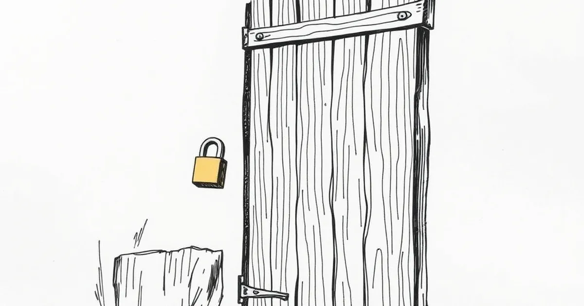
The lock icon on a free plan badge is almost never centered. It sits a pixel or two left of the text it's supposedly guarding, and once you notice it, you can't stop noticing it. That tiny misalignment raises a real design question: when a small visual cue is almost right, does it read as sloppy craft or as deliberate friction? And more interestingly — does the human brain even register the gap, or does it just feel something is off and quietly trust the page a little less?
The 2px Problem Is Really a Trust Problem
Behavioral research has a name for what happens when something is subtly wrong: we often can't articulate it, but we act on it. Kahneman's System 1 thinking is fast, associative, and pattern-hungry. A lock icon that doesn't line up with its label is a micro-violation of a pattern your eye learned before you could read. You don't think "the padding is off." You think "this feels cheap," and you move on.
That's the cruel part. Designers fix the things users complain about. Nobody files a ticket saying the lock looks 2px left. They just bounce.
Loss Aversion Is Doing the Heavy Lifting on That Lock
Here's where it gets genuinely interesting. A lock icon next to "Free Plan" isn't decoration. It's a promise of security, and promises are evaluated asymmetrically. Kahneman and Tversky's loss aversion work showed that losses loom roughly twice as large as equivalent gains. Applied to a pricing page, that means users weigh the risk of a free plan (data, lock-in, hidden limits) far more heavily than the benefit of saving money.
So the lock is a loss-aversion lever. Which makes its execution matter more than its size suggests. A perfectly aligned lock reads as confidence. A misaligned one reads as a hedge — like the company isn't sure it wants to stand behind the promise.
Variable-Ratio Rewards and the Upgrade Nudge
There's a second mechanic underneath the free plan that's worth naming: variable-ratio reinforcement. Skinner's classic work showed that unpredictable rewards produce the most persistent behavior — more persistent than predictable ones. Modern product design borrowed this wholesale. Usage meters that fill at unpredictable rates. Feature gates that open at thresholds you can't quite predict. Upgrade prompts that appear on some sessions and not others.
The lock icon is the visual anchor for all of it. It marks the boundary between what you have and what you might get. When it's 2px off, the boundary feels arbitrary — and arbitrary boundaries are exactly what trigger the "is this worth it?" calculation you were trying to avoid.
What the Fix Actually Looks Like
I've watched teams spend a week arguing about button copy and ship a misaligned icon. The practical move is boring and it works:
Set the lock and label in a single flex container with align-items: center and gap. No absolute positioning. No manual margin-left: -1px patches that someone added in 2019 and nobody remembers why.
Audit at 2x and 3x zoom. Most misalignments are invisible at 100% on a laptop and glaring on a phone. Test both.
Check optical alignment, not just mathematical. A lock has asymmetric visual weight — the shackle is thinner than the body. Centering the bounding box often leaves it looking off. Nudge by eye, then verify.
The Forward-Looking Bit
The teams that win on pricing pages over the next few years won't be the ones with the cleverest upgrade prompt. They'll be the ones who understand that trust is built in the pixels nobody mentions. A lock icon that sits exactly where it should is a small act of respect for the user's attention. Do that a hundred times across a product and you get something you can't buy with a better funnel: the sense that this thing was made by people who cared.
Go look at your free plan badge right now. Zoom in. You'll know within two seconds whether it needs fixing.
— creative mess