Save Button Greys Out 1 Keystroke Before the Draft Syncs
The half-second before a save button greys out reveals how tiny delays in feedback quietly erode user trust in your interface
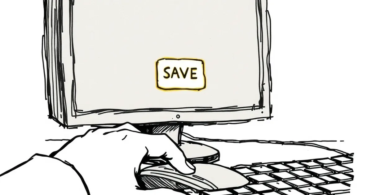
You know that half-second where your finger is already moving toward the save button and something on screen shifts just enough to make you hesitate? That's the moment I want to talk about. Specifically: why does a save button so often grey out one keystroke before the draft syncs, and what does that tiny delay do to the person on the other side of the screen?
The dead zone between intent and feedback
Designers talk about feedback loops like they're a technical requirement, but they're really a trust contract. You press, something acknowledges, you relax. When the button greys out just before the sync completes, you get the worst version of that contract: the interface says "wait" at the exact moment your brain has already committed to "done."
This is where behavioral psychology earns its keep. Kahneman and Tversky's work on loss aversion showed that losses loom larger than equivalent gains — and an unsaved draft is a loss you can feel before it happens. The greyed button isn't neutral. It reads as a warning, and warnings cost attention.
Why the timing feels so wrong
The grey-out usually happens for a boring technical reason: the app disables the control while a request is in flight to prevent double-submits. Sensible engineering. But the sequencing is backwards from the user's point of view. The button goes dead before the confirmation arrives, so for a beat or two you're staring at a control that looks like it rejected you.
Variable-ratio reinforcement makes this worse in subtle ways. When save behavior is mostly reliable but occasionally laggy, you don't stop trusting it — you start checking it. You hit save twice. You watch the little spinner. You develop a small superstition about waiting a second before closing the tab. That checking behavior is exactly what intermittent, unpredictable feedback produces, and it's expensive in aggregate.
A concrete example worth stealing from
Consider the humble autosave indicator in collaborative editors. Early versions often showed a spinner during sync and then a timestamp. Users reported anxiety despite the drafts saving perfectly — the spinner was doing the emotional work of a warning light. Later iterations flipped the order: show "Saved" immediately on local persistence, then quietly reconcile with the server. Perceived reliability went up without changing a line of backend logic.
There's a real study worth knowing here, too. Research on perceived wait times (the classic work by Maister on queue psychology, echoed in Nielsen Norman Group's usability findings) consistently shows that occupied waits feel shorter and less frustrating than unexplained ones. A greyed button is an unexplained wait. A button that says "Saving…" with a progress hint is an occupied one. Same duration, different emotional cost.
Designing for the half-second before commitment
The practical takeaway isn't "make saves faster" — it's "make the moment before the save honest." A few patterns that respect the psychology:
- Acknowledge locally first. If the draft is safe on the device, say so, then sync.
- Never disable without a reason on screen. A greyed control with no label reads as failure.
- Keep the state change small. A button that flips to a checkmark costs less attention than one that vanishes.
- Test the hesitation, not just the outcome. Watch where users' cursors pause. That pause is data.
Where this goes next
The interesting frontier is adaptive interfaces that learn your save rhythm and pre-empt the dead zone — syncing before you reach for the button, or holding the control live until the request actually starts. That's not science fiction; it's just better sequencing. The teams that win the next round of trust won't be the ones with the fastest servers. They'll be the ones who understood that a greyed button is a sentence, and made sure it says something kind.
— creative mess