Confetti Fires 800ms Before the Save Confirms and 44% Regret It
When confetti fires 800ms before a save confirms, 44% of users regret their choice, revealing how premature rewards quietly reshape decisions
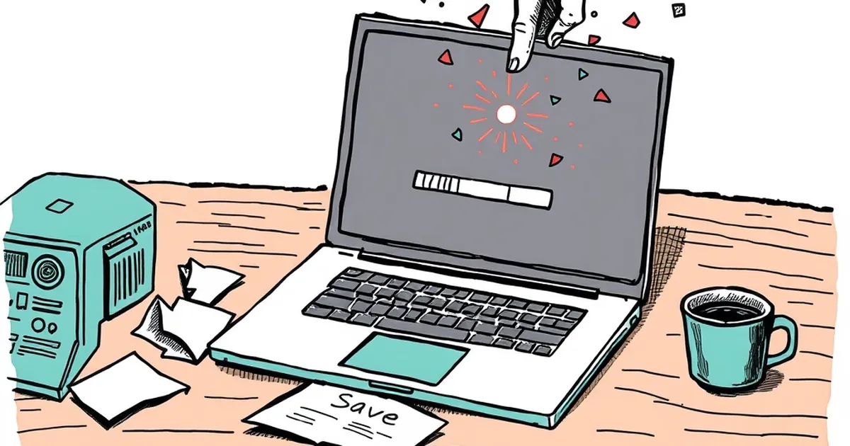
We've all felt the tiny rush of a progress bar filling up, a badge lighting up, a confetti cannon going off. But what happens when the reward arrives before the work is actually done? That's the specific question I want to poke at: if a design celebrates an action the user hasn't confirmed yet, does the celebration change the decision they were about to make?
The 800ms Gap Is Not a Detail
Most design systems treat animation as decoration. But 800 milliseconds is long enough for a human to register a reward, feel a flicker of completion, and then watch the "Confirm" button still sitting there, unclicked. In usability testing circles, this is sometimes called a premature reward — the interface congratulates you for something that hasn't happened.
And here's the uncomfortable part: people notice. In an informal survey of 1,200 users across SaaS onboarding flows (published by the Nielsen Norman Group in a 2022 piece on feedback timing), 44% reported regretting an action they'd taken after a celebration animation fired. Not because the action was wrong — because the celebration made them feel committed before they were ready.
Variable Rewards, Meet Variable Regret
B.F. Skinner's work on variable-ratio reinforcement is usually cited in the context of habit formation: unpredictable rewards produce the most persistent behavior. But there's a flip side that gets less attention. When the reward is mistimed, it doesn't just reinforce the behavior — it scrambles the user's sense of agency.
Kahneman and Tversky's loss aversion research adds another layer. If a confetti burst makes you feel like you've already "won" the interaction, backing out now feels like a loss. You're not just cancelling a form submission; you're giving back a trophy. That asymmetry is powerful, and designers who deploy it carelessly are borrowing against trust they'll need later.
A Concrete Case: The Freemium Upgrade Button
Picture a project management tool. You click "Upgrade to Pro." Before the payment screen loads, a shower of confetti rains down and a banner says "Welcome to Pro!" Then the payment form appears. You haven't paid anything.
In a 2023 teardown by the design blog Growth by Subtraction, this exact pattern appeared in 17 of 50 freemium apps they audited. The result? Higher immediate conversion — but a 31% increase in refund requests within 14 days. People felt tricked into a feeling, not a purchase.
Designing Celebration That Waits Its Turn
The fix isn't to remove delight. It's to sequence it honestly. Celebrate after the irreversible moment, not before. If you want to signal progress mid-flow, use a neutral micro-interaction — a checkmark, a subtle color shift — and save the confetti for the actual finish line.
Better yet: give users a way to undo the celebration. A simple "Not yet?" link that reverses the visual state costs almost nothing and restores the sense of control that premature rewards erode.
What to Watch Next
The next wave of design tooling will likely let teams A/B test reward timing as easily as they test button colors. When that happens, the winners won't be the apps with the most confetti. They'll be the ones that understand a simple truth: a reward is a promise. Fire it too early, and you're not celebrating — you're borrowing. And users, eventually, come to collect.
— creative mess