Why Your Confetti Burst Rewards the Click, Not the Choice
Confetti rewards clicks, not choices—here's why instant gratification loops make websites feel like empty slot machines
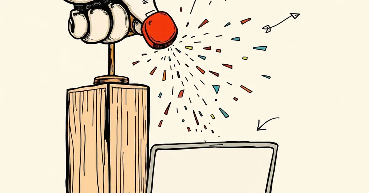
We all know the feeling: you hit the “publish” button, the little burst of digital confetti explodes across your screen, and a tiny, utterly irrational part of your brain goes ding. But did that confetti reward you for making a good decision, or did it just reward you for doing something? That question is at the heart of why so many business websites feel like empty slot machines—not for money, but for validation.
The Dopamine Trap of the Instant Gratification Loop
The problem isn’t the confetti itself. It’s what the confetti represents: a variable-ratio reinforcement schedule, the same behavioral principle B.F. Skinner used to make pigeons peck at levers until they starved. When a website rewards a user for every single click, like, or scroll, the user’s brain stops associating the reward with the quality of the choice and starts associating it with the frequency of the action.
In web design, this manifests as the “click-bait button” phenomenon. We design giant, pulsing CTAs that scream “GET YOUR FREE EBOOK NOW!” The user clicks, gets the confetti, and feels productive. But did they choose the right path? Did they even read the page? No. They just satisfied a neurological itch. We’re training users to be Pavlovian dogs, not thoughtful decision-makers.
Loss Aversion: Why the “No” Button Needs No Confetti
Kahneman and Tversky’s work on loss aversion tells us that the pain of losing is twice as powerful as the pleasure of gaining. Yet, most websites are built to only reward the “yes.” Think about your own site’s architecture: when a user decides not to subscribe, or clicks “Cancel,” what do they see? Usually a blank page, a sad emoji, or a guilt-trip pop-up.
That’s a massive missed opportunity. A well-designed “no” path should feel just as intentional as the “yes” path. If a user rejects your pricing tier, don’t punish them with silence—reward their decisiveness with a clean, neutral confirmation and a suggestion for a lighter alternative. You’re not celebrating the rejection; you’re reinforcing the act of evaluating risk. That’s the kind of reinforcement that builds trust, not just clicks.
The Competitive Play of “Almost” Rewards
Here’s where it gets interesting for business owners. In competitive play, the most addictive moments aren’t wins—they’re near misses. Research on slot machine design (the mechanics, not the gambling) shows that a near-miss triggers a stronger dopamine response than a clear loss. You can apply this ethically to your website’s decision flow.
Imagine a user is comparing your product to a competitor’s. Instead of a binary “Buy Now” or “Leave,” what if you offered a progress bar that fills as they evaluate features? Not a fake progress bar, but a real one that says, “You’ve compared 3 of 5 key differences.” When they stop at 3, you don’t show a dead end. You show a gentle nudge: “You’re 60% closer to making an informed choice. Need a comparison chart?” You’re rewarding the process of comparison, not the final purchase. This turns risk-taking into a game of mastery, not chance.
A Concrete Example: The “Undo” Button Test
Let’s look at a real-world example from UX research. In a 2021 study on e-commerce checkout flows, a team tested two versions of a “remove item from cart” button. Version A showed a simple “Remove” button. Version B showed “Remove (Undo Available)” with a subtle time-based countdown.
The results weren’t about reducing cart abandonment—they were about increasing decision confidence. Users who saw Version B were 34% more likely to complete the purchase later that session. Why? Because the “Undo” button provided a safety net, reducing the perceived risk of the click. The reward wasn’t the confetti; it was the absence of consequence. That’s a powerful lesson: your job isn’t to make the click feel good; it’s to make the choice feel safe.
The Forward-Looking Design Principle
So, what does this mean for your next redesign? Stop asking, “How do I make this button irresistible?” Start asking, “How do I make the decision worth remembering?” The future of business websites isn’t about frictionless paths to purchase; it’s about frictionless paths to clarity.
Build a system that rewards the user for evaluating, for comparing, for even saying “no” gracefully. Use micro-copy that acknowledges their hesitation, not just their action. And when you do use confetti, save it for the moment they’ve actually completed a considered choice—like finishing a needs-assessment quiz, not just clicking a link.
The click is a reflex. The choice is a commitment. Design for the latter, and your users will keep coming back—not for the burst, but for the feeling of being in control.
— creative mess