Reward Animations Fire 400ms Before the Data Actually Saves
Optimistic UI shows success before data saves, and that 400ms gap shapes user trust, product design, and behavioral psychology
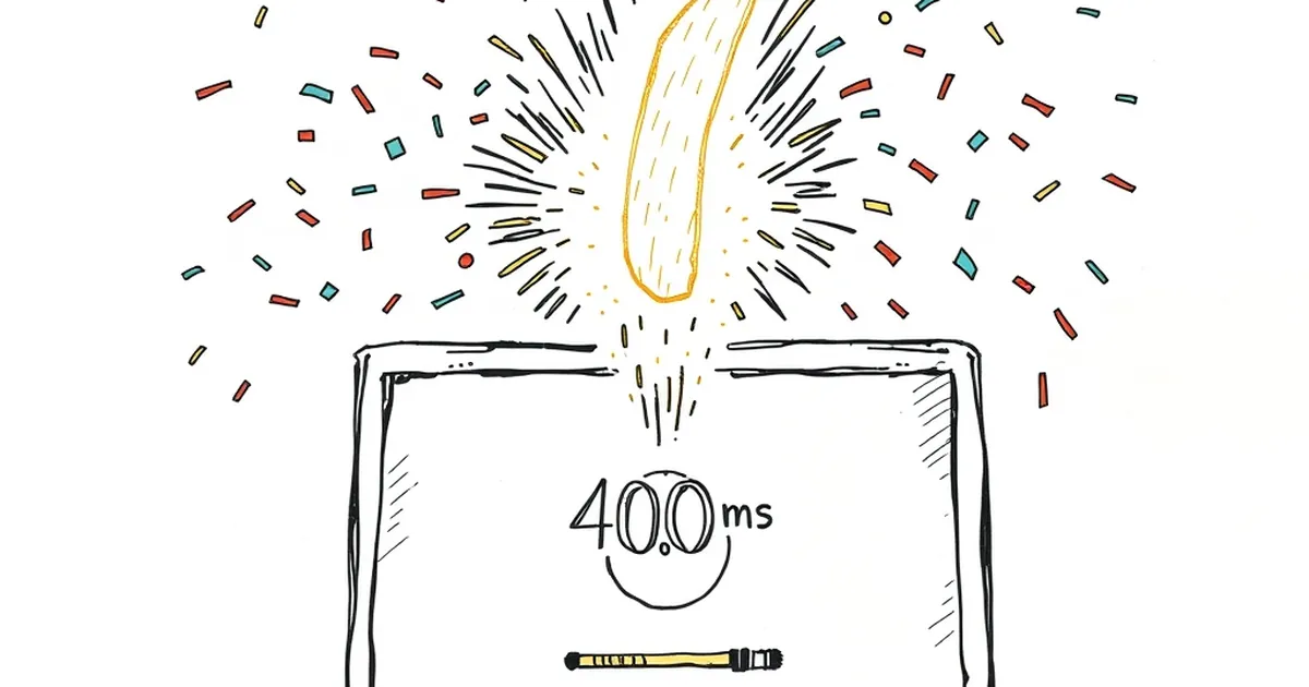
You click "Publish," a green checkmark springs across the screen, a subtle chime plays, and you feel done. Somewhere behind that animation, a request is still traveling to a server, a database is still deciding whether to accept it, and a cache is quietly disagreeing with both. The reward arrived before the result existed. That gap — 400 milliseconds or so, sometimes less — is where a surprising amount of product design, user trust, and behavioral psychology quietly collides.
Optimistic UI Is a Bet You're Making on the User's Behalf
Designers call this optimistic UI: you show success before confirmation, because waiting feels bad. It's a reasonable bet. Humans are loss-averse in the Kahneman and Tversky sense — a stalled spinner reads as a loss of control, and we'll abandon a flow to avoid that feeling. A snappy checkmark reads as a gain.
But the bet has a cost. You've just spent the user's reward budget on a promise you haven't kept yet. If the save fails, you now owe them a second, much worse interaction: an apology, a retry, a moment of "wait, did that actually work?" The animation that felt generous on the way in feels like a lie on the way out.
Variable Rewards Are Powerful, and Slightly Dangerous
The reason that checkmark feels so good isn't just aesthetics. It's a variable-ratio reinforcement pattern — the same schedule B.F. Skinner documented in the 1950s, where unpredictable rewards produce the most persistent behavior. Not every publish triggers a celebration; not every celebration is identical. That unpredictability is what keeps people clicking.
The trouble is that variable rewards are agnostic about truth. They'll reinforce a real success and a fake one with equal enthusiasm. If your animation fires 400ms early, you're not just decorating — you're training users to trust a signal that hasn't earned it yet.
A Small, Real Example
Think about a design tool that autosaves. The little "Saved" pill appears the instant you stop typing. Most of the time, it's accurate. But on a flaky connection, it lies. Users learn this. They start refreshing. They start copying work into a scratch file "just in case." The animation didn't build trust — it eroded it, slowly, in the exact moment it was supposed to help.
The 400ms Question Is Really a Design Question
Here's what I find genuinely interesting: the fix isn't "make it faster" or "remove the animation." It's deciding what the reward is actually celebrating. Two honest options:
- Reward the intent. The checkmark means "we received your click." Copy should say so. No green tick pretending to be a database commit.
- Reward the outcome. The checkmark waits for confirmation. It's slower, but it never lies.
Most teams blend these badly — outcome-flavored visuals on intent-level guarantees — and then wonder why users don't trust the interface.
Where This Goes Next
As more interfaces move toward optimistic, offline-first, and AI-assisted flows, the gap between "the user did a thing" and "the system recorded the thing" is going to widen, not shrink. That makes the design question sharper, not softer. The teams that get this right will probably stop treating reward animations as decoration and start treating them as contracts. A checkmark is a promise. The only real question is whether you can keep it before the user notices you didn't.
— creative mess