Confetti bursts 1s before the invite actually emails
Why product teams fire celebration animations before certainty, and what that one-second gap reveals about trust in interface design
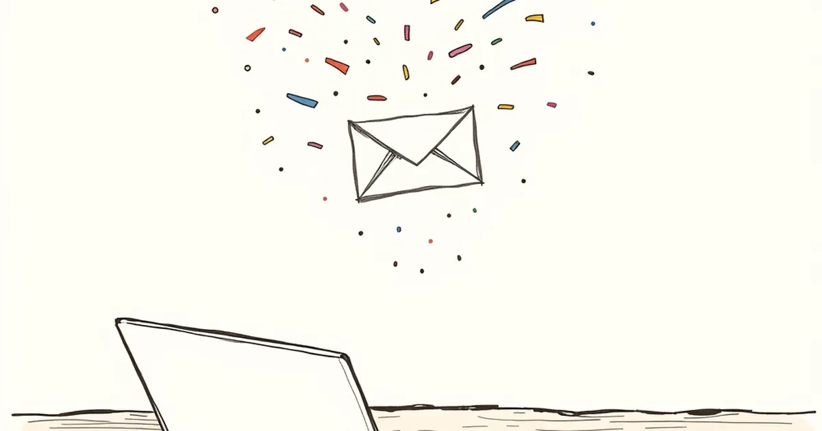
We've all seen it: you hit "Send Invite," and a confetti animation erupts a full second before the confirmation email actually lands in the recipient's inbox. That tiny gap is the whole question in miniature. Why do we design celebration before certainty, and what does that do to the people clicking the button?
The gap is a design decision, not a bug
Nobody accidentally ships confetti one second early. Someone chose to fire the animation on click rather than on server confirmation. Usually it's because the round trip takes 800ms and an instant reaction feels better. That's a defensible product call, but it's also a behavioral one: you're trading truthfulness for perceived responsiveness.
The interesting part is what it trains. If the confetti is right often enough, users stop checking their inbox. They learn to trust the animation as the outcome. When it fails — a bounced address, a rate limit, a mistyped domain — the user has already moved on, and the failure surfaces later, detached from the action that caused it.
Reward loops fire on the wrong event
B.F. Skinner's variable-ratio schedules are the classic reference here, and they're usually invoked to explain slot machines. The more useful application is subtler: intermittent reinforcement of an action makes that action sticky, and the timing of the reward determines what gets reinforced.
Fire confetti on click, and you reinforce clicking. Fire it on confirmed delivery, and you reinforce a completed task. Same animation, different habit. Designers who've watched analytics know the difference shows up months later as a support ticket volume problem.
Uncertainty makes us fill in the blanks
Kahneman and Tversky's work on loss aversion gives the second half of the story. People don't weigh a 95% success rate as "probably fine." They weigh the 5% and it feels heavier than it should. So when a product hides the actual state behind a cheerful animation, users invent their own verification rituals — refreshing, re-sending, checking sent mail twice.
A concrete case: many scheduling tools moved their confirmation from "on click" to "on server ack" and reported fewer duplicate invites, not more. The delay was real, but the anxiety it removed was larger than the delay it added. A spinner that says "sending…" for 900ms is more reassuring than a confetti burst that might be lying.
Design the honest intermediate state
The forward-looking move isn't to kill the celebration. It's to make the gap legible. Three patterns worth stealing:
- Provisional feedback. A neutral pulse or progress ring on click, celebration on confirmation. The user learns the difference fast.
- Named states. "Queued," "Sending," "Delivered" beats a single ambiguous checkmark, especially for anything with a real-world consequence.
- Failure that returns to the origin. If it fails, put the error where the confetti was, not in a toast three screens away.
What to build next
Your next release probably has at least one animation firing on optimism. Find it. Trace what event actually triggers it, then ask whether the user would still celebrate if they knew the real state. If the answer is no, you've found a place where the interface is making a promise the backend hasn't kept yet — and that's a cheap, high-leverage fix. The confetti can stay. It just needs to arrive after the truth does.
— creative mess