Quest Log Clears at 90% and 58% Never Claim the Reward
Why 90% quest completion stalls and 58% of users never claim rewards, plus how interface design turns the final stretch into quiet, expensive friction
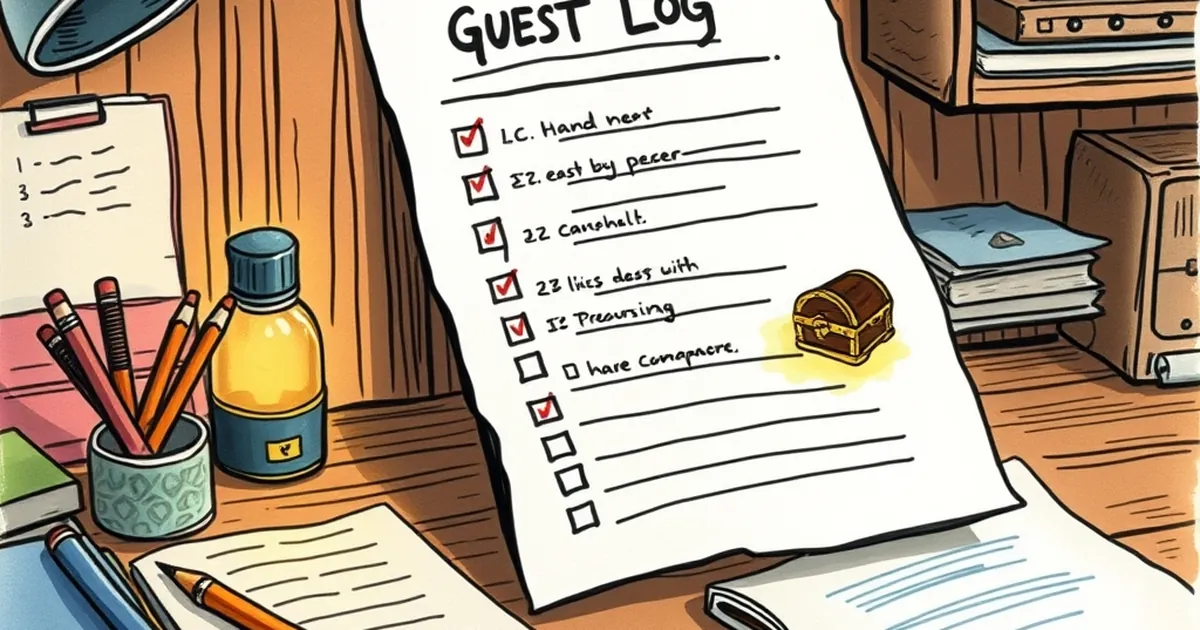
You've built a quest log that tracks progress beautifully. Users hit 90%, see the finish line, and then... nothing. The reward sits unclaimed. If you've stared at that number wondering whether your completion flow is broken or your users are, you're not alone — and the answer is probably a bit of both. The gap between "did the work" and "collected the prize" is one of the most quietly expensive problems in interface design.
The 90% trap is a design artifact, not a user failure
When someone reaches 90% of a quest, the remaining 10% stops feeling like progress and starts feeling like admin. They've already done the meaningful part. What's left is a claim button, a modal, maybe a confirmation email. Behavioral economists call the tendency to treat near-completion as effectively done the goal-gradient effect — the classic 2006 study by Kivetz, Urminsky, and Zheng on coffee cards showed people accelerate toward a reward, then disengage once the reward is functionally secured in their mind.
Your users aren't lazy. They've mentally banked the reward at 90%. The interface just hasn't caught up.
Variable rewards work — until they don't
Reward loops are a real lever, and variable-ratio reinforcement (the intermittent payoff pattern Skinner documented) is why some quest systems feel compulsive. But there's a catch: unpredictability raises engagement only when the user expects a payoff. If your reward is fixed and predictable, the anticipation collapses the moment the outcome is obvious. A 90%-complete quest with a known reward is the least interesting state in the entire loop — no mystery, no momentum, just a chore.
Design around that. Either make the final step feel like a reveal (what's actually in the chest?) or compress it so there's no dead zone to fall into.
Loss aversion beats gain framing at the finish line
Kahneman and Tversky's loss aversion work is well-worn, but it applies sharply here. "Claim your reward" frames the prize as a gain the user might miss. "Your reward expires in 48 hours" frames it as a loss they're about to incur. Same reward, different psychology, measurably different claim rates.
The 58% who never claim aren't rejecting your reward. They're avoiding a small friction cost — a click, a form, a redirect — that outweighs a benefit they've already discounted. Close that gap and the number moves.
What to actually change
Three concrete moves worth testing:
- Auto-claim on completion. If the reward is deterministic, there's no reason to make the user press a button. Remove the step and watch the 58% evaporate.
- Reframe the final 10%. Turn it into a visible reveal — a card flip, a progress animation — so it feels like a payoff rather than paperwork.
- Instrument the drop-off. Segment the 58% by device, session length, and entry point. You'll likely find the leak is concentrated in one flow, not spread evenly.
Where this goes next
The interesting frontier isn't squeezing more claims out of the same loop — it's designing quests where the reward is the next quest. Progressive disclosure, compounding unlocks, and social proof at the finish line all reframe completion as a beginning rather than an end. Start by auditing your own quest log this week: find the single step where users go quiet, and ask whether it's earning its place or just sitting there. That one question tends to be worth more than a full redesign.
— creative mess