Why Your Task Completion Bar Rewards Speed Over Quality
Your task bar rewards speed, not quality—here's why that design flaw hurts your team's deep work
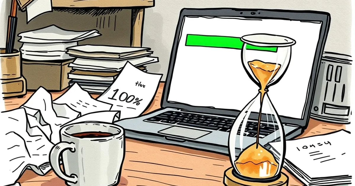
You open your project management tool, and there it is: a green progress bar creeping toward 100%. You feel a tiny hit of satisfaction. But look closer at what you actually did to fill that bar. Did you finish the deep work, or did you just check off the easy stuff first? That question sits at the heart of a design problem most business websites ignore: the task completion bar doesn't reward quality. It rewards speed.
The Dopamine Trap of the “Almost Done”
Our brains are wired to love progress. It’s called the goal-gradient effect — the closer we get to a finish line, the harder we push. Designers have known this for decades. Think of a coffee shop loyalty card that comes with two free stamps already punched. You’re more likely to return because you feel you’ve already started.
That’s fine for coffee. But for a business website’s onboarding flow or a client’s project dashboard, the same mechanic backfires. Users rush toward the green bar. They skip reading the terms. They upload the first image they find. They hit “Next” without reviewing. The system rewards the act of clicking over the act of understanding.
Variable-Ratio Reinforcement: Why You Keep Clicking
Here’s where behavioral psychology gets interesting. Variable-ratio reinforcement — the principle behind why slot machines are so addictive — works because you never know exactly when the reward will come. Some task bars mimic this by giving you a satisfying animation or a “You’re on a roll!” message at unpredictable intervals.
But for business websites, this creates a dangerous loop. Users learn that clicking fast earns praise, while pausing to think gets nothing. The result? Rushed decisions, abandoned carts from buyer’s remorse, and support tickets that could have been avoided if someone had slowed down.
Loss Aversion: The Hidden Cost of “Almost There”
Daniel Kahneman and Amos Tversky showed us that losses hurt about twice as much as equivalent gains feel good. A task bar at 80% triggers loss aversion: “I’ve already come this far, I can’t quit now.” That can be a powerful motivator to finish a boring form.
But here’s the twist: loss aversion also makes people afraid to undo. If your completion bar penalizes going backward — say, by resetting progress when a user edits a previous step — you’ve effectively punished quality control. Users will stick with a mediocre choice just to protect their bar.
A Concrete Example: The LinkedIn Profile Strength Meter
LinkedIn’s old “Profile Strength” bar is a textbook case. It encouraged users to add skills, connections, and a photo just to move the needle from “Intermediate” to “All-Star.” Research from a 2020 study in the Journal of Behavioral Decision Making found that users who were shown a progress bar completed profiles faster — but their profiles were less accurate and contained more placeholder text.
The bar rewarded speed. Quality suffered. LinkedIn eventually redesigned the experience to focus on meaningful completions, like adding a work sample or getting a recommendation.
Designing for Quality, Not Just Motion
So what do we do about it? The forward-looking fix isn’t to remove progress bars — they’re too useful for reducing anxiety. Instead, we redesign the reward structure.
- Introduce “quality gates.” Don’t just count actions. Count reviewed actions. After a user fills out a field, require a short pause or a confirmation checkbox before the bar advances.
- Make undoing painless. Let users backtrack without losing progress. If the bar stays stable when someone edits a previous section, they’ll feel safe improving their work.
- Change the visual metaphor. Instead of a linear bar, try a “growth ring” or a “skill tree” that branches. This communicates that depth matters more than speed.
The best business websites don’t just guide users to a finish line. They guide them to a good finish — one they won’t regret tomorrow. And that means designing for the brain that wants to rush, while gently insisting on the brain that wants to think.
— creative mess