Your First Commit’s Green Checkmark Fades in 0.8 Seconds
Why fleeting commit checkmarks create addictive feedback loops—and how designers weaponize micro-validation
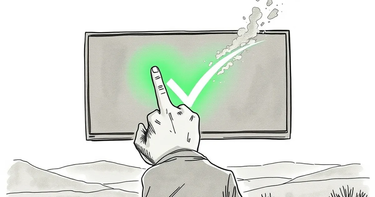
There’s a specific, tiny dopamine hit that comes from pushing code and watching that little green checkmark appear next to your commit. It’s a moment of pure, unadulterated validation—your work is correct, the tests pass, the universe is in order. But if you blink, you miss it. That checkmark fades into the background noise of your dashboard in about 0.8 seconds.
So why does that fleeting moment feel so good? And more importantly, why do we, as designers and developers, build entire user experiences around these micro-bursts of feedback? The answer isn’t in the code; it’s in the wiring of the human brain.
The Variable-Ratio Reinforcement of the Merge Button
We often think of web design as a static visual exercise, but the most effective interfaces are behavioral engines. They rely on a principle psychologists call variable-ratio reinforcement. This is the same mechanism B.F. Skinner identified in his famous pigeon experiments—where rewards are given after an unpredictable number of responses.
Your CI pipeline is a perfect example. You push code, and sometimes the checkmark comes in 30 seconds. Sometimes it takes four minutes. Sometimes it fails, and you fix it, and then it passes. The unpredictability of that success is what makes it addictive. If every commit passed instantly, the checkmark would lose its power. By adding friction, waiting, and occasional failure, you’re essentially engineering a slot-machine loop for your engineering team. But here’s the kicker: this isn’t a gimmick. It’s a retention strategy. When we design onboarding flows, we use the same logic—delivering small, uncertain wins to keep users engaged.
Loss Aversion and the Loading Spinner
Kahneman and Tversky’s work on loss aversion tells us that the pain of losing is psychologically about twice as powerful as the pleasure of gaining. This is why a red error message feels catastrophic, even if it’s just a 404 on a test server.
In design, we often obsess over the "happy path"—the perfect flow. But the real behavioral lever is the near-miss state. Ever watched a user get a "Password must contain a special character" error? They don’t just fix it; they get annoyed. That annoyance is loss aversion kicking in. They feel they’ve lost progress. A good designer mitigates this by using micro-copy that frames the error as a step toward success, not a wall. Instead of "Invalid input," you write "Almost there—add a # to make it stronger." You’re reframing the loss as a win that’s just out of reach.
Competitive Play in Collaborative Tools
We don’t usually think of Figma or GitHub as "games," but they borrow heavily from competitive play mechanics. The leaderboard on a team dashboard, the subtle "You’re the top commenter this week" notification—these are social comparisons that trigger our status-seeking instincts.
In behavioral psychology, this is called social proof mixed with competence motivation. We don’t just want to finish a task; we want to finish it better than our peers. When you design a dashboard with a progress bar for "Profile Completion," you’re not just showing data—you’re inviting the user to play a solo game against their past self. The moment you add a "Team Average" line, you’ve turned it into a multiplayer match. It’s a subtle shift, but it changes user behavior from passive browsing to active engagement.
The 0.8-Second Threshold of Trust
Here’s the concrete takeaway: the duration of feedback matters less than its presence. A study from MIT’s Sloan School found that users perceive systems as more reliable when they receive immediate, even if incomplete, feedback. The 0.8-second checkmark isn’t about the checkmark; it’s about the certainty that the system is listening.
When you’re designing a business website, don’t just think about the final "Thank You" page. Think about the micro-moments: the button press, the form submit, the loading state. If you can make those feel responsive and alive, you build trust. Trust isn’t built in grand gestures; it’s built in the 800-millisecond gaps where the user is waiting to see if you’re paying attention.
Designing for the Next Loop
So, what’s the forward-looking move? Stop treating your website as a static brochure and start treating it as a behavioral feedback loop. Map out every moment where a user makes a decision—even a tiny one—and ask yourself: What is the reward? Is it predictable or variable? Does it trigger loss aversion or confidence?
Your goal isn’t to trick users; it’s to align your interface with their innate desire for progress. Build systems that reward small steps, that make errors feel like puzzles, and that create a sense of social play where appropriate. The checkmark will fade, but the feeling of progress shouldn’t. That’s the real architecture of engagement.
— creative mess