Your Confetti Cannon Fires 400ms After the Reward Clears
The 400ms after a reward clears decides user loyalty—here’s how to optimize that critical gap
The internet is a noisy, anxious place, and we obsess over the exact moment a user clicks "buy" or "subscribe." But I keep wondering: what happens in the 400 milliseconds after the confirmation screen loads? We spend so much time optimizing the friction before the reward that we ignore the tiny, crucial gap where the brain decides whether that reward was worth the effort. If you’ve ever built a website, you know that this blink of an eye is where loyalty is born—or quietly killed.
The "Sunk Cost" of the Success Screen
We all know about loss aversion—Kahneman and Tversky taught us that losses hurt roughly twice as much as equivalent gains please us. But on the web, we rarely consider the inverse: the effort spent before a win. If a user spends 45 seconds filling out a form, their brain has already "invested" cognitive energy. The moment they hit submit, they are in a state of heightened arousal, expecting a payoff that matches their investment.
If your confirmation page is a plain white rectangle with a tiny checkmark, you’ve just told their brain, "That 45 seconds of typing was worth about 12 pixels of feedback." This is a missed opportunity for what behavioral scientists call reward prediction error—the gap between the expected reward and the actual reward. A larger error (positive) spikes dopamine; a smaller error (negative) creates a subtle feeling of deflation.
Variable-Ratio Reinforcement for Your Microcopy
Here’s where it gets tricky. The most addictive loops in digital products (think social media feeds) use variable-ratio reinforcement—rewards that come at unpredictable intervals. But you can't make your checkout process unpredictable; that would be chaos. What you can do is vary the texture of the reward.
Instead of a static "Thank you," consider a subtle, randomized micro-message. One time it says, "You’re on the list." Another time it says, "Boom. Done." A third time it says, "We saved your spot." This isn’t gamification for the sake of it—it’s a tiny injection of novelty. The user’s brain, having just completed a task, is scanning for a pattern. If the reward is always identical, the neural response habituates quickly. If it’s slightly different each time, you keep the reward loop alive just a little longer.
The 400ms Window is a "Risk" Sandbox
Think about the moment right after a successful action—say, an e-commerce order. The user is momentarily flush with relief. This is the single best moment to ask for a slightly risky action, like "Add a gift note for $2" or "Create an account to track this order." Why? Because the brain’s risk tolerance spikes after a win.
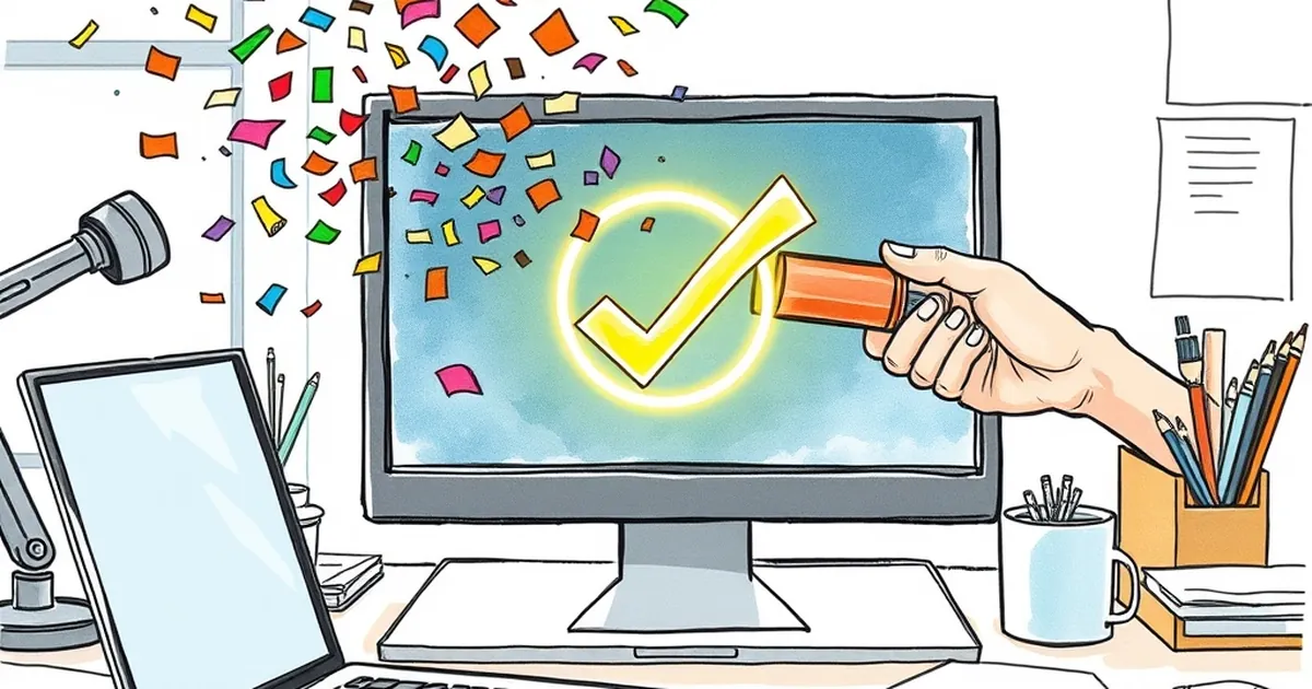
But here’s the design nuance: the visual cue for that risk must fire after the primary reward clears. If your "Add a gift note" popup appears at the same time as the "Order Confirmed" header, you’ve created cognitive interference. The user can’t process the win because you’ve already pushed the next decision. Give them 400ms of pure, unadulterated success. Let the confetti cannon fire, let the green checkmark breathe, and then slide in the secondary offer. This mimics the "post-reinforcement pause" observed in animal models—a brief calm where new information is more readily accepted.
A Concrete Example: The Duolingo Streak
Consider Duolingo’s streak maintenance. When you complete a lesson, you get a massive, animated celebration. But the real genius is the "Streak Freeze" offer that appears after the celebration, not during it. They know that if they ask you to buy a shield while you’re still watching the fireworks, you’ll feel rushed. By waiting those extra few hundred milliseconds, you’ve fully absorbed the reward (dopamine released), and now you’re in a more generous, less defensive state.
Forward-Looking: Design for the "Afterglow"
Stop treating the success screen as a dead end. Start treating it as a behavioral pivot point. In the next quarter, I challenge you to do this: record your screen during a user test and watch their face during the 400ms after they submit. Are they exhaling? Smiling? Or are they already scanning for the exit? Then, prototype a delayed secondary action. Add a subtle progress bar that fills up after the confirmation. Or a gentle "You did it" animation that takes 500ms longer than you think it should.
The web is built on instant gratification, but the memory of a good experience is built on the lingering moment after the click. Give that moment some space. Your bounce rate will thank you.
— creative mess