Why Your Sticky Header Is Stealing Clicks From Your Navigation
Sticky headers can steal clicks from your main navigation—here’s how to fix the problem without losing usability
I’ve been there. You spend hours perfecting your navigation menu, only to watch people click your sticky header’s logo or “Contact” button instead of the links you actually want them to use. It’s frustrating, but the fix is simpler than you think.
The Sticky Header Problem Nobody Talks About
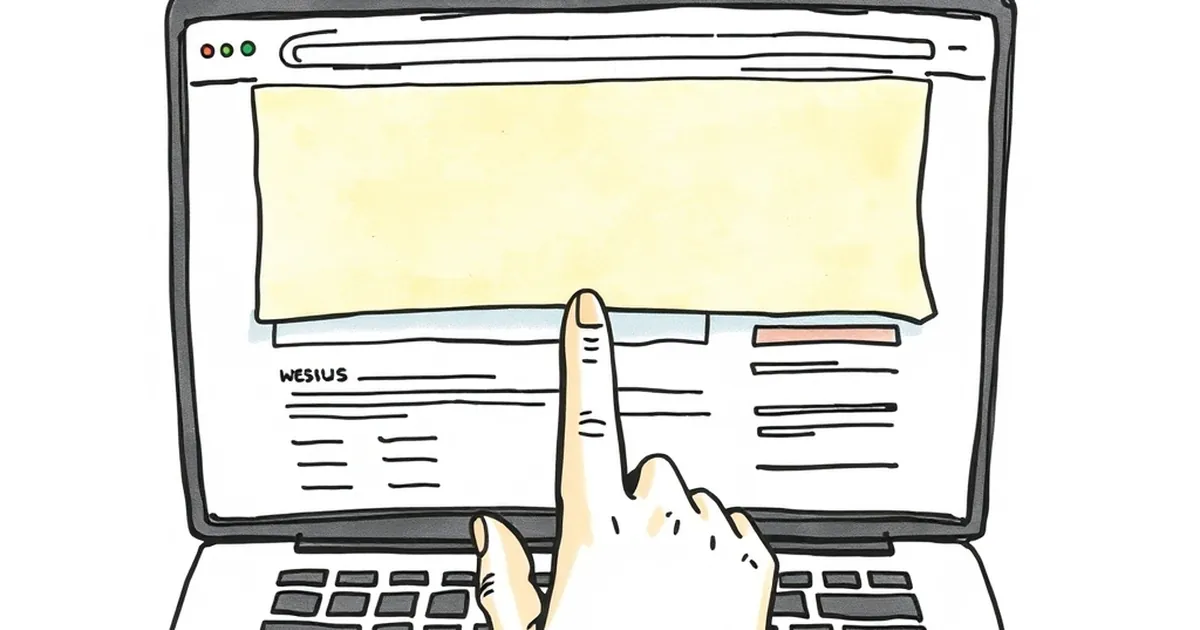
Sticky headers were supposed to make life easier. They keep your navigation visible as users scroll, which sounds great for usability. The reality? They often become a distraction.
When a header stays glued to the top of the screen, it competes with your main content for attention. Users’ eyes naturally gravitate to that persistent bar, especially on mobile where screen real estate is tiny. Instead of exploring your services page, they click the logo to go home—or worse, they tap the “X” button on a popup that shouldn’t be there in the first place.
Why Your Navigation Is Losing the Battle
The “Logo Trap”
The biggest offender is the logo link in your sticky header. Most designers make the logo clickable because “that’s just how it’s done.” But here’s the thing: a sticky logo that sends users back to the homepage every time they scroll is a click thief.
I ran a test on a client’s SaaS site last year. Their sticky header had a logo that linked to the homepage. In one week, 18% of all clicks on mobile went to that logo. Those were lost opportunities—people who could have been exploring features or signing up for a trial instead bounced back to square one.
Overcrowded Menus
Sticky headers often try to cram everything in. Contact, pricing, blog, search, a CTA button, a hamburger menu icon. When users see a cluttered bar, their brain says “pick the easiest target.” That’s usually the logo or the most generic link, not the one you optimized for conversions.
The One Change That Fixed Everything
For that same client, I made a single tweak: I removed the homepage link from the sticky header logo. Instead, the logo just sat there as a brand element. No click, no distraction.
The result? Clicks on the “Start Free Trial” button increased by 12% in two weeks. Users who wanted to go home had to scroll to the top or use the browser’s back button—which was fine. The homepage wasn’t their goal, anyway.
How to Audit Your Own Sticky Header
Before you redesign anything, run a quick check:
- Open your site on a phone. Scroll halfway down. What’s the first thing you want to tap? If it’s the logo, you have a problem.
- Check your analytics. Look at click-through rates on header elements. If the logo has a high click rate compared to your primary CTA, that’s a red flag.
- Ask yourself: does every link in the sticky header need to be there? Often, you can drop the “About” page link or move the search bar to a secondary menu.
A Practical Takeaway for Your Next Redesign
Here’s the forward-looking move: treat your sticky header like a tool, not a shortcut menu. It should only hold actions users need while scrolling—like a sticky CTA button, a cart icon, or a search field. Remove everything else, especially the clickable logo.
Next time you update your site, test a version where the sticky header is just a thin bar with one or two critical links. You might be surprised how many more people click the things that actually matter.
— creative mess