Why Your Sign-Up Form Is Chasing Away Potential Leads
Discover why your sign-up form may be driving leads away and how reducing friction can boost conversions
You’ve spent weeks perfecting your homepage, crafting the right value proposition, and driving traffic with laser-focused ads. People are clicking. They’re interested. Then they hit your sign-up form—and vanish. The culprit isn’t your offer. It’s the form itself.
Most sign-up forms are built for the business, not the user. They ask for too much, offer too little clarity, and create friction where there should be flow. If your conversion rates are stuck in the gutter, your form is likely the door you’re slamming in your own face.
The Information Overload Trap
Why Every Field Costs You Customers
Every extra input field on your form is a tiny wall between you and a new lead. Studies consistently show that removing just one or two fields can lift conversion rates by 20% to 50%. Yet I still see forms asking for phone numbers, company size, and job title before a user has even seen a demo.
I once worked with a small SaaS company that asked for a full address on their trial sign-up. We swapped it to just email and password. Their sign-ups tripled in a week. Nobody needed to know their street to let them try the software.
The "Just in Case" Fallacy
Many teams collect extra data "just in case" they need it later for segmentation or sales outreach. This is a mistake. You can always ask for more information after the user has experienced value. Start with the absolute minimum: email and password (or even just a magic link).
The Trust Gap You’re Ignoring
Privacy Anxiety Is Real
Your audience is global, and data privacy concerns are universal. If your form doesn’t show a clear privacy link, a lock icon, or a simple reassurance like "We’ll never spam you," visitors will hesitate. They’ve been burned before.
Make your privacy stance visible and human. Don’t hide your policy in a tiny gray link at the bottom. A one-liner like "Your email is safe with us. No spam, ever." placed next to the submit button can work wonders.
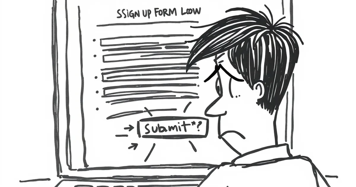
The "Submit" Button Problem
Speaking of the button: generic text like "Submit" or "Send" feels cold and transactional. It tells the user they’re performing a chore. Swap it for action-oriented language that reflects the benefit: "Get My Free Guide," "Start My Trial," or "Join the Community."
The Friction of Bad Design
Mobile Is Not an Afterthought
Over half your traffic is likely on mobile. If your form requires pinching and zooming to tap a tiny field, you’ve already lost them. Use large, tappable inputs, proper spacing, and auto-focus on the first field.
Test your form on a real phone, not just a browser resize. Watch yourself try to complete it with one thumb. If it feels awkward, redesign it.
The Missing Microcopy
Microcopy—the small bits of text around your form—is your secret weapon. A helpful placeholder like "Enter your best email" is better than just "Email." A note like "No credit card required" next to the trial button removes the biggest objection before it forms.
A Practical Takeaway for Tomorrow
Before you launch your next campaign or tweak your landing page, open your current sign-up form on your phone. Count the fields. Read every label and button out loud. Ask yourself: "Would I fill this out for a product I only kind of want?"
If the answer is no, cut fields, rewrite the button, and add a trust signal. Testing one small change this week could turn your form from a lead-killer into a conversion machine. Your future customers are waiting—don’t make them work so hard to find you.
— creative mess