Why Your Progress Bar’s Last 2% Feels Like a Final Exam
Why the final 2% of any progress bar feels agonizingly slow—and what that reveals about how our brains handle uncertainty
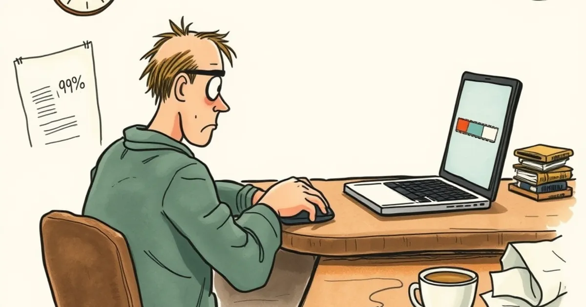
You know that feeling when you’re uploading a file, and it hits 98%, then just… sits there? You start refreshing, clicking, praying to the tech gods. Meanwhile, that little bar feels less like a utility and more like a stern proctor watching you sweat. Why does the final stretch of any digital process—loading, installing, syncing—feel like a high-stakes exam you didn’t study for?
The answer isn’t in your internet connection. It’s in your brain’s prediction engine, and it has everything to do with how we design for the finish line.
The Certainty Gap: When “Almost” Feels Like “Never”
Here’s the dirty secret of user experience: the last 2% is where the psychological stakes get highest. In the first half of a progress bar, your brain is in "cruise control." It hasn’t invested much, so it’s fine with ambiguity. But once you hit 90%, a switch flips. You’ve committed. You’ve decided this is worth waiting for.
This is loss aversion in action—Daniel Kahneman and Amos Tversky’s famous finding that losses hurt roughly twice as much as equivalent gains feel good. When you see 98%, your brain registers the potential loss of that progress (time, effort, the email you were about to send) as far more painful than the potential gain of completion. The bar isn’t just filling up; it’s holding your emotional investment hostage.
Why We Design for the Anticipation, Not the Wait
Most designers (myself included, historically) screw this up by making the bar too accurate. We map real-time server speed to the visual. That’s a mistake.
Think about slot machine psychology—specifically, the variable-ratio reinforcement schedule studied by B.F. Skinner. When rewards come at unpredictable intervals, dopamine spikes more than when they come at fixed times. A progress bar that moves smoothly and predictably is boring. A bar that stutters, pauses, and then jumps? That’s a tiny slot machine. The user’s brain is on edge because it can’t predict the exact moment of release. That uncertainty is what makes the final 2% feel like a coin flip.
The “Penalty Box” Effect
There’s a specific cognitive bias called the goal-gradient hypothesis (Hull, 1932). It states that as you get closer to a goal, you accelerate your effort. But when the goal doesn’t arrive at the expected moment, you don’t slow down—you get anxious. A progress bar that stalls at 98% triggers a "penalty box" response: the user starts double-checking, re-clicking, and mentally preparing for failure. The design has created a miniature panic attack where none needed to exist.
The Fix: Design for the “Exam” Mindset
Here’s the practical takeaway for anyone building anything—not just websites. You don’t fix the last 2% by making it faster. You fix it by changing the reward trigger.
1. Kill the Linear Truth
Don’t show real progress. Show perceived progress. Make the bar hit 80% quickly, then slow down. When you’re at 95%, give a micro-interaction (a subtle color shift, a checkmark, a haptic pulse). This breaks the linear anxiety and gives the brain a secondary reward for simply being patient.
2. Introduce a “Preview” of the Reward
Instead of a bar that just fills, show a sneak peek of the result. If you’re uploading a photo, show the photo becoming clearer as the bar fills. If it’s a form submission, show a ghost of the confirmation page. This shifts the feedback loop from waiting for completion to experiencing the outcome.
3. Embrace the “Almost Done” as a Feature
The last 2% is where users are most likely to abandon. So, make that section interactive. Give them a button that says “Show me when it’s ready” or a subtle sound cue. You’re not hiding the wait; you’re handing the user a sense of control over the uncertainty.
The Forward Close
Next time you’re staring at a stalled bar, don’t blame the server. Blame the designer who didn’t account for your brain’s loss-aversion circuitry. And if you’re the one building the interface, stop treating the progress bar as a status report. Treat it as a behavioral tool. The goal isn’t to reach 100%—it’s to make the user feel like they already won the moment they clicked start. The bar is just the applause.
— creative mess