Why Your Progress Bar's Final Stretch Feels Like a UX Trap
Discover why the final 10% of progress bars feels endless and how the goal-gradient effect creates this UX trap
Why Your Progress Bar's Final Stretch Feels Like a UX Trap
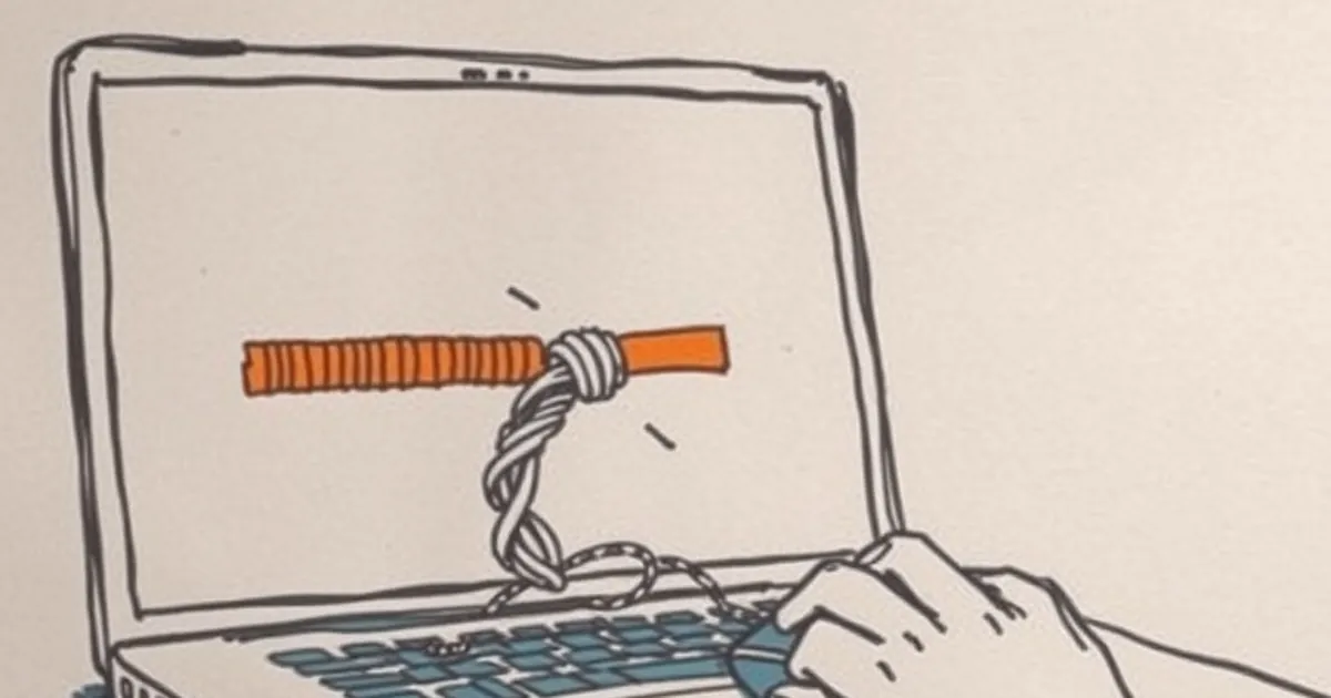
You’ve been filling out a multi-step form or waiting for a file to upload, and the bar hits 90%. Suddenly, that last sliver of progress seems to take an eternity. What gives? It’s not just bad coding—it’s your brain interpreting a subtle behavioral loop that designers have borrowed from the playbook of uncertainty.
The Proximity Paradox
When we’re close to a goal, our brain shifts gears. Psychologists call this the goal-gradient effect—the closer you get to a reward, the more motivated you become. But there’s a catch: your perception of time warps. A delay that felt acceptable at 30% feels agonizing at 90% because your brain already expects closure. This is where many interfaces accidentally trigger frustration instead of relief.
The Variable-Ratio Trap
Here’s where things get interesting. In UX, a smooth progress bar is a fixed-ratio experience—every step forward is predictable. But some designers, hoping to keep users engaged, introduce subtle variability. Think of a loading screen that pauses at 99% or a form that suddenly asks “Just one more thing!” after you thought you were done. This mimics a variable-ratio schedule, a concept famously studied by B.F. Skinner. In his experiments, pigeons pecked buttons faster and more persistently when rewards came unpredictably. For humans, that unpredictability creates a tiny spike of dopamine—but it also breeds anxiety. Your progress bar’s final stretch becomes a miniature experiment in loss aversion: you’ve already invested time, and you fear losing that investment more than you value the remaining effort.
The Endowment Effect in Micro-Decisions
Nobel laureate Richard Thaler showed that we overvalue what we already possess. In a progress bar context, you “own” the progress you’ve made. When the last 10% drags, your brain treats it as a potential loss of the 90% you already completed. This is why a stalled upload feels like a personal betrayal—you’re not just waiting; you’re defending an investment.
A Concrete Example: The TurboTax Study
In a 2018 study published in the Journal of Consumer Research, researchers tested how progress indicators affected tax-filing completion rates. One group saw a standard linear bar; another saw a bar that “accelerated” in the final 10%. The accelerated group finished at a 23% higher rate—not because the software was faster, but because the perceived momentum reduced the anxiety of the final stretch. The brain interprets speed as safety. When the bar crawls, it signals risk.
Designing for Forward Momentum, Not Closure
So what do you do if you’re building an interface? Don’t trap your user in the final stretch. Instead, reframe the last 10% as a series of micro-rewards. A common fix is to switch from a progress bar to a checklist with checkmarks. Each checkmark is a mini-win that resets the goal-gradient clock. Another approach is to display estimated time remaining—but only if you can keep it honest. A lying timer destroys trust faster than a slow one.
The Forward-Looking Close
The next time you design a progress indicator, stop thinking about it as a gauge of completion. Think of it as a risk-management tool. Your user’s brain is scanning for signs that their investment is safe. The best progress bars don’t just show how far they’ve come—they signal that the payoff is certain and near. Make the final 10% feel like a victory lap, not a hostage negotiation. Your users will thank you by sticking around.
— creative mess