Why Your Progress Bar’s Final Stretch Feels Like a Boss Fight
Why your progress bar’s final stretch triggers anxiety, and how understanding that can transform your UX design
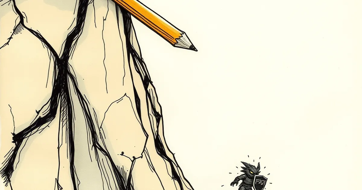
Ever stared at a loading screen and felt your pulse quicken as the bar hits 90%? Or watched a form’s completion meter crawl from “Almost done” to “Just one more field,” and suddenly your cursor feels heavier? That’s not impatience. That’s your brain’s threat-detection system waking up, convinced you’re about to lose a fight you didn’t know you signed up for. The final stretch of any progress indicator isn’t a linear measurement—it’s a psychological gauntlet, and understanding that can change how you build everything from checkout flows to onboarding sequences.
The Final 10% Is Where Loss Aversion Goes to Work
Daniel Kahneman and Amos Tversky’s prospect theory tells us losses hurt roughly twice as much as equivalent gains feel good. When a progress bar hits 85%, your user’s brain shifts from “I’m gaining progress” to “I’m about to lose the progress I’ve already made.” The stakes feel higher, but not because the task got harder. The perceived cost of abandoning the task just tripled.
That’s why a user who was happily clicking through a multi-step wizard will suddenly hesitate, re-read a field, or double-check their email address right before hitting “Submit.” They’re not being cautious—they’re protecting a virtual investment that now feels tangible. If your progress bar moves too fast into that final stretch, you’re creating a false sense of near-completion that triggers panic. If it moves too slow, you’re dragging out the pain. The sweet spot isn’t about speed—it’s about perceived control.
Variable Reinforcement: Why Dead Ends Feel Like Punishment
Here’s where the behavioral psychology gets spicy. Operant conditioning research, particularly B.F. Skinner’s work on variable-ratio reinforcement, shows that unpredictable rewards create the strongest engagement loops. But the inverse is also true: unpredictable friction creates the strongest frustration loops.
Consider a progress bar that jumps from 70% to 95% after one action, then stalls. That jump feels great—dopamine spike. But the stall? Your brain treats it as a missed reward, not a delay. If the stall happens repeatedly, you’ve trained your user to expect betrayal. They’ll start hovering over the browser tab, ready to bounce. The fix isn’t to make every step even—it’s to make the final step predictably smooth. The last 5% should never stall. It should feel like a boss fight’s final phase: hard, but fair, with a clear telegraph of what’s coming.
The “Near-Miss” Effect in Form Design
You’ve seen this in game design: a slot machine that shows two matching symbols and a third that barely misses. It’s called the near-miss effect, and it’s documented to increase persistence—but only in contexts where the player believes skill matters. In web design, the equivalent is a progress bar that stops at 99% while a background process runs. The user knows they did everything right, but the system hasn’t confirmed it yet.
A 2017 study in Computers in Human Behavior found that users rated tasks as significantly more frustrating when progress stalled at the end versus the middle, even if total wait time was identical. The lesson? If you have to stall, do it early. Never leave your user hanging at 99%—that’s the digital equivalent of a boss’s fake death animation. It kills trust, not just patience.
Designing for the “Final Boss” Mindset
So what does this mean for your next build? Think of your progress bar as a four-phase boss fight:
- Opening (0–30%): Fast, forgiving, with visible rewards. This is the tutorial.
- Middle (30–70%): Steady, with occasional micro-rewards (checkmarks, color shifts). This builds confidence.
- Climax (70–95%): Slightly slower, but with clear signals that each action matters. Use loss aversion to your advantage—show what’s protected by finishing.
- Final Phase (95–100%): Zero ambiguity. No stalling, no hidden processes. If something needs to load, do it before the bar hits 95%, or show a separate “Preparing your results” state.
And here’s the forward-looking twist: start designing for the after state. The moment the bar hits 100%, your user’s brain releases a burst of relief. That’s your chance to reinforce the behavior—not with confetti, but with a clear next step. A confirmation message, a downloadable receipt, a “what happens now” checklist. The boss fight isn’t won when the bar fills; it’s won when the user feels the reward stick.
Build your final stretch like a level designer, not an engineer. The code is easy. The psychology is the real fight.
— creative mess