Why Your Progress Bar’s Final 10% Rewards Time Over Skill
Why your brain treats a progress bar’s final 10% as a reward zone, not a productivity zone—and what that means for your patience
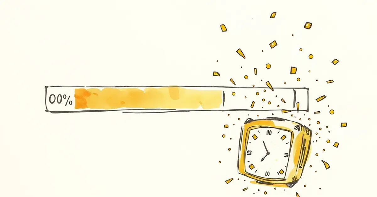
You’ve spent an hour filling out a form, tweaking a design, or onboarding into a new tool. The progress bar says 90%. Then it stops. And you sit there, refreshing, waiting, wondering if the universe is testing your patience. Why does that final stretch feel so much longer than everything before it? And why does our brain treat that last 10% as a reward zone, not a productivity zone?
The Psychology of the Endgame
The answer isn’t about software performance. It’s about how our brains handle completion. Behavioral economist Daniel Kahneman’s work on the peak-end rule shows we judge an experience largely by its most intense moment and its ending. A slow, frustrating final 10% can ruin the memory of a smooth 90% start. But here’s the twist: designers have learned to exploit this. By making the last segment visually slower or emotionally heavier, they turn it into a reward trigger rather than a task trigger.
Variable-Ratio Reinforcement, But Backwards
You might know variable-ratio reinforcement from slot machines (unpredictable rewards keep you pulling). Progress bars flip the script. Instead of rewarding you for taking a risk, they reward you for staying put. The final 10% is often a fixed, predictable wait. But your brain, trained by years of unpredictable loading screens, treats it like a mini victory lap. You’ve already done the hard work. Now you’re just waiting for the dopamine hit of completion. The bar isn’t measuring progress anymore—it’s measuring your patience, and paying you in anticipation.
Loss Aversion at the Finish Line
Here’s where it gets interesting for designers. Loss aversion (we hate losing twice as much as we enjoy winning) kicks in hard at 90%. If you quit now, you lose all the time you’ve already invested. That’s sunk cost fallacy in action. Smart interfaces use this. They slow the final 10% deliberately (or at least perceptibly) to make you feel the weight of what you’d lose if you walked away. It’s not a technical limitation—it’s a behavioral nudge.
The “Almost There” Feedback Loop
A 2013 study by researchers at the University of Michigan found that people persisted longer on a task when the progress indicator seemed to slow down near the end, compared to when it moved at a steady pace. Why? The slowdown signals that the finish line is real and imminent. Your brain shifts from “how much more work?” to “how much more waiting?”. And waiting feels easier than working. You stop optimizing your effort and start riding the reward loop.
Practical Takeaway for Designers and Creators
Don’t fight the final 10%—design for it. Instead of a linear bar, try a two-stage indicator: a fast “setup” phase (0-80%) that builds momentum, followed by a deliberate, visual “almost there” phase that signals completion is earned, not given. This works for onboarding flows, checkout processes, and even content creation tools.
For example, a website builder could show the first 80% of a page load as a smooth sweep, then pause at 90% with a subtle animation (a pulsing dot, a “finalizing your design” message). The user isn’t waiting for a technical process—they’re waiting for a reward. And the reward is the feeling of having finished something hard.
The future of interface design isn’t about making everything faster. It’s about making the ending feel meaningful. So next time you build a progress bar, ask yourself: is this measuring time, or is it measuring the emotional payoff of staying the course? The best designs do both.
— creative mess