Why Your Progress Bar's Final 10% Feels Like a Trap
Discover why the final 10% of a progress bar feels painfully slow—and how your brain makes you feel trapped near the finish line
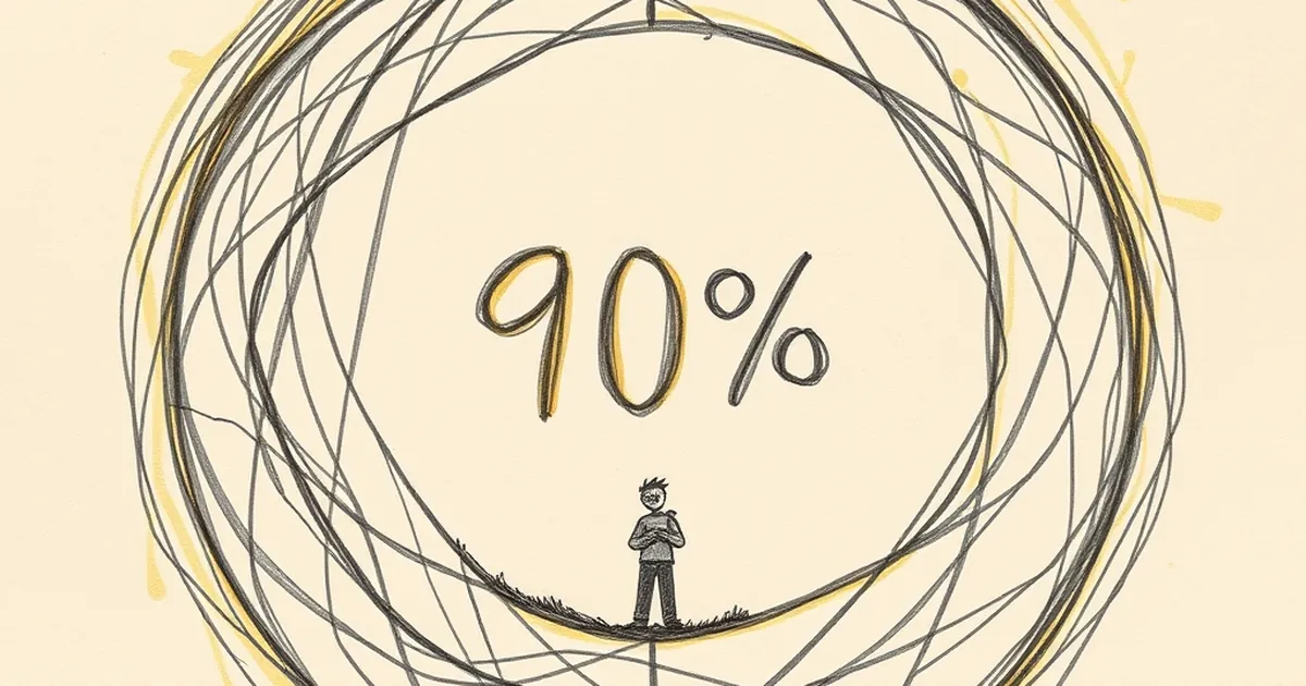
Why Your Progress Bar’s Final 10% Feels Like a Trap
You’ve been clicking through a multi-step checkout or filling out a long form, and the bar is solid green at 90%. Then it stalls. Suddenly, those last few percentage points take longer than the entire first half of the journey. You feel a flicker of irritation, maybe even suspicion. Is the site broken? Is someone deliberately slowing you down? The truth is less malicious—and more fascinating. That final 10% isn’t a bug in your code; it’s a bug in your brain.
The Psychology of the Almost-Done
We’re wired to hate unfinished business. Behavioral economist Daniel Kahneman’s work on “loss aversion” shows that the pain of losing something is roughly twice as powerful as the pleasure of gaining it. When you’re at 90%, you’ve already mentally “gained” the finish line. The remaining 10% feels like a loss of that certainty. Every extra second becomes a small threat to a reward you already considered yours.
This is also where the goal-gradient effect kicks in—the observation that people accelerate their effort as they get closer to a goal. In a classic 2006 study, researchers found that coffee shop customers who received a loyalty card with two stamps already punched (instead of starting from zero) bought coffee more frequently. The closer the perceived finish, the more motivated we become. But when the progress bar stalls at 90%, that acceleration crashes into a wall of uncertainty. Your brain’s reward system screams “go faster,” while the interface whispers “wait longer.” The mismatch feels like a trap.
Variable-Ratio Reinforcement: The Hidden Engine of the Wait
Here’s where it gets interesting for designers. The most addictive interactions online aren’t the ones with predictable, linear progress—they’re the ones that mimic variable-ratio reinforcement. Psychologist B.F. Skinner showed that when a reward comes at unpredictable intervals, we keep checking back more obsessively than if it came every single time.
Your progress bar’s final 10% often behaves the same way. Maybe it jumps to 95% after three seconds, then hangs for another seven. Maybe it jumps to 99% and then resets briefly for a final validation step. That unpredictability triggers a tiny dopamine loop: Is it done now? No. How about now? You’re not just waiting; you’re actively hunting for the finish. The result? You stay on the page longer, refresh more often, and remember the experience as more frustrating than it actually was.
A Concrete Example: The Booking Nightmare
Consider a flight booking site I audited last year. Their progress bar was technically accurate: the final 10% represented a background check on seat availability and payment processing. But because the bar moved smoothly through the first 90% (loading images, showing options) and then froze for an unpredictable 4–8 seconds, users abandoned the flow at almost three times the rate of a competitor’s site. The competitor simply showed a spinning “Confirming availability…” message without a bar. No false promise of linear progress meant no feeling of betrayal.
Designing Out the Trap
The practical lesson isn’t to remove progress bars—they reduce drop-off overall. But the final 10% needs special care. Instead of a single bar that stalls, try micro-progress indicators. Show three distinct steps: “Verifying payment,” “Checking seats,” “Securing your price.” Each step has its own short bar that completes quickly. This breaks the long wait into smaller, predictable wins.
Alternatively, embrace uncertainty honestly. A loading spinner with a message like “This usually takes a few seconds” can actually lower frustration. It tells the brain: The delay is normal, not a trap. You’re not fighting the user’s psychology; you’re aligning with it.
Forward-Looking Close
The future of progress design isn’t about making bars faster—it’s about making them psychologically honest. As interfaces become more complex (think AI-generated content or real-time data syncing), the gap between perceived progress and actual progress will only widen. The best designers will stop trying to trick users into waiting and start designing for the way our brains actually handle uncertainty. Your next project: test a version where the final 10% doesn’t exist at all. Replace it with a clear, honest moment of transition. You might be surprised how much trust you earn.
— creative mess