Why Your Page Load Progress Bar Is a UX Mirage
Progress bars often create anxiety instead of reassurance—discover why this common UX element makes waiting feel longer
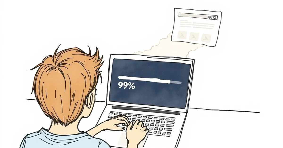
Ever clicked a link, watched a progress bar race to 99%, and then… nothing? You sat there, staring at that almost-complete bar, waiting for a page that had clearly already given up. That’s the dirty secret of the loading bar: it’s often a UX mirage—a shimmering promise of speed that actually makes the wait feel longer.
We slap progress bars on websites to reassure users, but more often than not, they just create anxiety. Let’s pull back the curtain on why this beloved UI element might be hurting more than it helps.
The Illusion of Control (That You Don’t Have)
A progress bar is supposed to tell you how long something will take. The problem? Your website's front-end has no real idea what the server is doing.
The Fake "60% Complete" Problem
Most loading bars are just animations that run on a timer. They zip to 60% in a second, then crawl to 99% while the real work happens in the background. Your user sees a fast start, then a painful stall. This creates a cognitive dissonance: “Is it broken? Did I break it?”
I once worked on a travel booking site. We added a progress bar for the search results. The bar hit 80% before the API even responded. Users started refreshing the page at 95%, killing the request entirely. The bar was lying, and they knew it.
Why "Almost Done" Feels Like an Eternity
When a bar hangs at 99%, our brains do something weird. We stop thinking about the content we’re about to see and start focusing entirely on the bar itself. This is called the goal-gradient effect gone wrong.
- The normal wait: You’re distracted, scrolling, or thinking.
- The 99% wait: You are locked in. Every millisecond feels like ten seconds.
A static loading spinner actually performs better here. It doesn't promise a finish line, so your brain relaxes. A progress bar that lies about the finish line is a stress test for your user’s patience.
When a Progress Bar Actually Works
I’m not saying all progress bars are evil. They shine when the progress is deterministic. Think of a file upload or a video render—something where the computer genuinely knows the file size and the speed.
The 3 Rules for a Honest Bar
If you must use one, follow these rules:
- Use real data. Hook it into the actual load event (like browser
onprogress), not a timer. - Don't show a percentage. Just a thin, indeterminate bar at the top of the screen (like YouTube or Medium) signals “something is happening” without promising a specific time.
- Kill it if it stalls. If the page hasn’t loaded after 8 seconds, show an error state or a retry button. Don’t leave the user staring at a frozen 99%.
The Practical Takeaway: Prioritize Perceived Performance
Here’s the honest truth: your users don’t care about your backend load time. They care about the feeling of speed.
Instead of a progress bar, invest in skeleton screens (grey boxes that mimic your layout) or instant loading (prefetching the next page when a user hovers over a link). Amazon famously found that every 100ms of delay cost them 1% in sales. They didn’t fix that with a better progress bar; they fixed it by making the page feel instant.
So next time you reach for a loading bar, ask yourself: “Am I solving a real timing problem, or am I just painting a target on my page’s slow load time?” Ditch the mirage. Give your users a fast page, or give them an honest spinner. They’ll thank you for it.
— creative mess