Why Your Navigation Menu Is Killing Conversions
Discover why a cluttered navigation menu is hurting your sales and how simplifying it can boost conversions
If I had a dollar for every business owner who asked me to “make the logo bigger,” I’d have a nice vacation fund. But there’s one request that makes me cringe even more: “Let’s add more items to the navigation menu.”
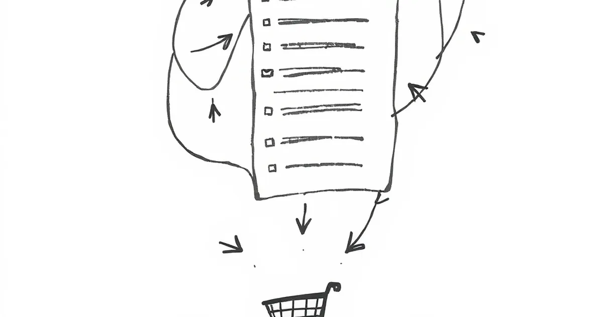
Your navigation menu isn’t a filing cabinet. It’s a signpost. And when it’s cluttered, confusing, or full of dead ends, you’re paying for it in lost sales.
The Paradox of Choice: Less Is Actually More
The biggest mistake I see is treating your menu like a sitemap. You don’t need to list every single page. You need to list the paths your customers actually want to walk.
Psychologist Barry Schwartz coined the term “The Paradox of Choice” — the idea that more options actually make it harder to decide. Your menu is the same. When a visitor lands on your site and sees 12 menu items, their brain freezes. They don’t click anything. They just leave.
The "Three-Click Rule" Isn't Real (But This Is)
You’ve probably heard the old rule that every page should be three clicks away. That’s a myth. The real rule is simpler: every click should feel obvious. If your menu makes someone hesitate for even two seconds, you’ve already lost them.
The Hidden Killer: "About Us" in the Wrong Place
Let me tell you a short story. I once redesigned a site for a small SaaS company. Their original menu had "About Us" right next to "Pricing." The client insisted it was fine.
I ran a simple heatmap test. Turns out, 40% of people clicked "About Us" after looking at the pricing page. They weren't curious about the team — they were looking for social proof before buying. By putting "About Us" at the end of the menu, we made them scroll past "Blog" and "Careers" first. Conversions dropped by 15%.
We moved "About Us" to the end of the menu and added a "Testimonials" link right before "Pricing." Conversions went up by 22% in two weeks.
The Mobile Menu Trap
On desktop, a bad menu is annoying. On mobile, it’s a conversion killer.
Think about your hamburger menu. That little three-line icon? Studies show that about 20% of users don’t even know what it means. And when they tap it, they’re often presented with a wall of tiny text they have to scroll through.
Fix it: Use a bottom navigation bar for the four most important actions (Home, Shop, Cart, Account). Everything else goes into a simple, one-level expandable list. Don’t make people hunt.
The One Question That Fixes Everything
Before you add any link to your navigation, ask yourself this:
“Does this help someone take the next step toward buying or signing up?”
If the answer is no, it doesn’t belong in the main menu. “Blog” can live in the footer. “Privacy Policy” can live in the footer. “Our History” can live in a sub-page.
Your navigation is like a handshake. If it’s too complicated, no one wants to shake it.
Your Practical Takeaway
Here’s the thing: your menu is the most expensive real estate on your website. Every pixel counts.
Next week, take 30 minutes to audit your menu. Remove anything that doesn’t directly support a purchase or sign-up decision. Then test it. I promise your conversion rate will thank you.
And if you’re tempted to add that “Company Values” page to the top bar? Don’t. Save it for the footer — where it belongs.
— creative mess