Why Your Loading Spinner Is Damaging User Retention
Discover how loading spinners silently drive users away and learn actionable fixes to boost retention and conversions
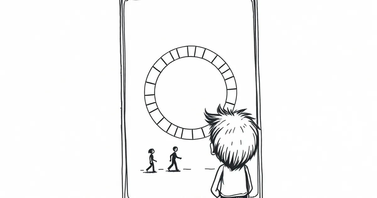
You finally got a visitor to click through from Google. They’re interested, curious, maybe even ready to buy. Then you hit them with a spinning circle for three seconds. By the time your page loads, that visitor is already scrolling Instagram, and you’ve lost them for good.
That little spinner isn’t a neutral waiting icon — it’s a tiny, spinning “goodbye” sign. Let’s talk about why it’s costing you real customers and how to fix it.
The Psychology of the Spin
The Attention Tax
Every second your spinner is visible, you’re asking your user to pay an attention tax. They came to your site with a goal — read an article, check a price, sign up. The spinner says, “Hold on, you can’t do that yet.”
In a world where people make snap judgments in under three seconds, a spinner feels like a broken promise. It signals that your site is slow, and by extension, your business might be unreliable.
The Confusion Factor
A spinner tells the user nothing. Is it loading? Is it stuck? Should they refresh? This ambiguity creates anxiety. Users don’t think, “Oh, the backend is processing a request.” They think, “This site is broken.”
I once waited 12 seconds for a checkout spinner on a fashion site. I assumed my card was charged but the order didn’t go through. I abandoned the cart and never came back. That spinner cost that company my business and probably my future recommendations.
When Spinners Actually Hurt You Most
On Mobile Connections
Your desktop might be fast, but your user is standing on a train platform with spotty 4G. A spinner here isn’t just annoying — it’s a data drain. Mobile users are impatient and data-conscious. If your spinner eats their data while doing nothing useful, they’ll bounce.
During Checkout
This is the worst place for a spinner. When someone is about to pay, every second of uncertainty feels like a minute. A spinner during checkout screams, “We might have lost your payment info.” It erodes trust instantly.
Better Alternatives That Keep Users Around
Show Progress, Not a Circle
Instead of a generic spinner, show what’s happening. A loading bar with a percentage or a skeleton screen (a gray outline of your page layout) feels faster because users see progress. Even if the actual load time is the same, the experience feels quicker.
Use Optimistic Loading
This is my favorite trick. Instead of waiting for all data to arrive, render the page immediately with placeholders. Let users see the content structure and start reading while images or dynamic elements load in the background.
For example, a news site can show headlines and text first, then lazy-load images. The user reads immediately, and the spinner never appears.
The Practical Takeaway
Next time you build or redesign a page, hunt down every spinner like it’s a bug. Ask yourself: Can I show something useful here? Can I render the critical content first? If you must use a waiting state, make it meaningful — a skeleton screen, a progress bar, or even a simple message like “Loading your order details.”
Your users don’t owe you their patience. They owe you their attention. Don’t waste it on a circle that goes nowhere.
— creative mess