Why Your Hamburger Menu Is Costing Mobile Users More Than Space
Discover why hamburger menus may be costing your site clicks and trust, and how mobile design choices impact user engagement
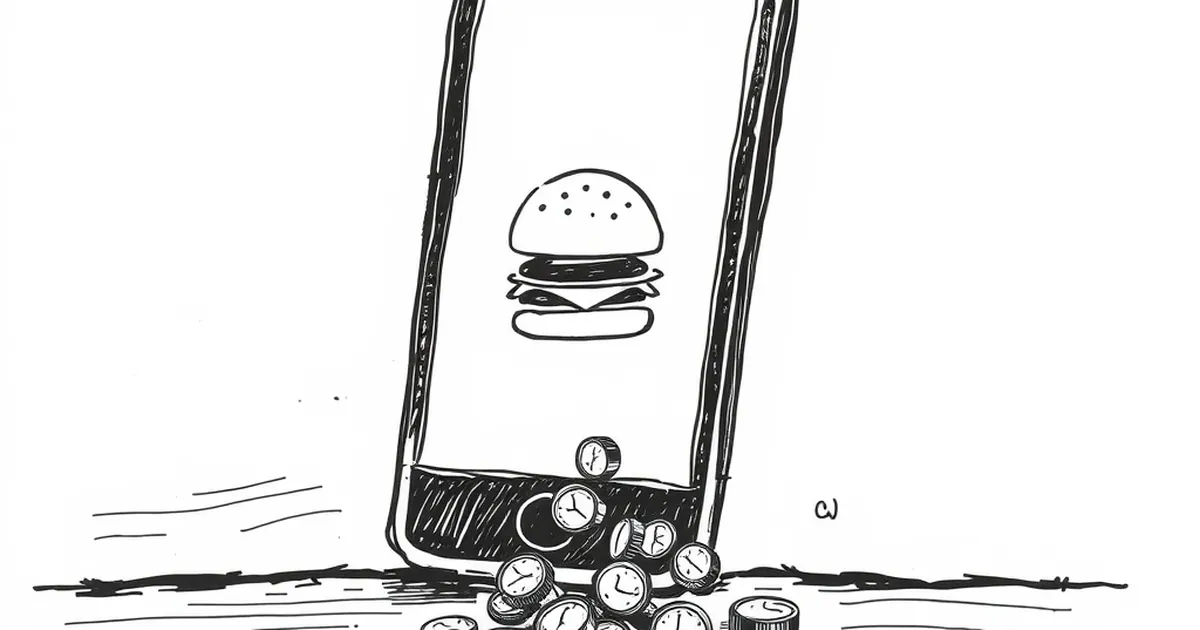
When you hide your main navigation behind a hamburger menu, you’re not just saving screen space—you’re likely losing clicks, conversions, and trust. That tiny three-line icon has become the default for mobile design, but research and real user behavior keep pointing to a tough truth: hamburger menus often hurt engagement. So, is the convenience for the designer actually costing your business?
The Hidden Cost of the Icon
The hamburger menu forces users to take an extra step before they can explore your site. That extra tap might not sound like much, but it creates friction. On mobile, where attention spans are already short, asking someone to guess what’s inside that icon can feel like a barrier.
I once worked with a small e-commerce brand that saw a 40% drop in product page views after redesigning their mobile site with a hamburger menu. Users simply weren’t clicking it. They assumed it was either a settings button or not worth the effort. The redesign looked cleaner, but the numbers told a different story.
Lower Discovery and Engagement
When navigation is hidden, users see fewer of your pages. They tend to stick to the homepage or whatever they landed on. If you run a blog or a service site, this means your most valuable content—pricing, portfolio, about page—gets ignored.
- Visitors rarely tap the hamburger menu. Studies show that only about 20% of mobile users interact with it.
- People scan, not search. If they can’t quickly see what you offer, they leave.
When It Actually Works
I’m not saying you should never use a hamburger menu. It makes sense for apps or sites where users already have a strong mental model—like a social media feed or a tool dashboard. In those cases, the icon is familiar and expected.
But for a business website, especially one that relies on conversions, it’s often a gamble. The key question is: Does your user arrive with a clear goal? If they’re browsing, exploring, or comparing, hidden navigation hurts. If they’re logging in or checking notifications, it’s fine.
Better Alternatives for Mobile Navigation
You don’t have to cram everything into a top bar. Instead, consider these proven patterns:
Priority+ Navigation
Show the most important links (like “Shop” or “Contact”) in the visible bar, and tuck the rest behind a “More” button or a plus icon. This keeps key actions one tap away without overwhelming the screen.
Bottom Tab Bar
For sites with 3–5 core sections, a bottom tab bar works beautifully. Your thumb naturally rests there, and each tap feels immediate. It’s the pattern used by Instagram, Spotify, and most banking apps for a reason.
Sticky Top Bar with Visible Links
If you only have 4–6 main pages, just show them. On modern phones, you have enough space for a few short labels. Use a sticky bar so navigation stays accessible as users scroll.
A Practical Takeaway
Test your current mobile navigation with real users—not just your team. Watch where they hesitate. If they consistently ignore the hamburger menu, swap it for a visible link or a bottom bar. Even a small change, like moving one key page out of the menu, can boost engagement. The next time you design for mobile, ask yourself: Is this helping my user get where they need to go, or just making my layout look cleaner?
— creative mess