Why Your Font Choice Is Sabotaging Readability and Trust
Is your font choice driving visitors away? Discover how readability impacts trust and keeps users engaged
You click onto a website, excited to read about a topic you care about, and then you see it. A wall of text in a wispy, thin font that screams "I designed this for myself, not for you." Within seconds, you’re gone, bouncing to a competitor who actually respects your eyes.
This happens every single day. Your font choice isn't just a stylistic preference—it’s the first handshake with your visitor. If it’s a weak, sweaty handshake, they won't stick around to learn how trustworthy your business actually is.
The Readability Trap You Keep Falling Into
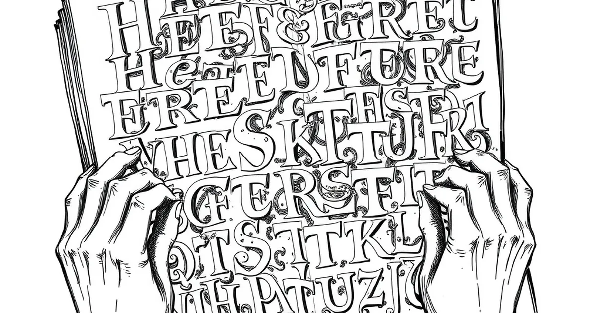
Fancy Fonts Are the Enemy of Speed
We read online differently than we read a book. Our brains scan for key information, and we do it fast. A decorative script font or an ultra-light sans-serif might look beautiful on a mockup in Figma, but in the wild, it forces the reader to slow down and decode each letter.
That mental friction feels like work. And nobody visits your business website looking for extra work. If your body text is anything other than a clean, standard font like system UI, Georgia, or Open Sans, you are actively draining your reader's patience.
The Size Deception
Here’s a mistake I see constantly: designers set 12px as the standard body text size. On a high-resolution screen, that is practically a whisper. You might be able to read it because you stare at it all day. Your visitor, reading on a phone in a sunny coffee shop, cannot.
If your font is smaller than 16px for body text, you are asking for a high bounce rate. It’s that simple. Your content might be gold, but if it’s microscopic, nobody will mine it.
Trust Lives in the Details
I once redesigned a local bakery’s site. The owner loved a playful, handwritten font for everything—headlines, descriptions, even the phone number. The result? Customers kept calling the wrong number because the "8" looked like a "3." They lost orders for weeks.
Your font choice signals competence. A clean, well-spaced font tells the visitor, "This business has its act together." A messy or hard-to-read font quietly whispers, "This business cuts corners." Which message do you want to send?
The Legibility Checklist
Check these three things right now on your own site:
- Letter spacing: Is the text cramped? Add a little breathing room.
- Line height: That’s the space between lines. If it’s too tight, the eye gets lost. Aim for 1.5x the font size.
- Contrast: Grey text on a light grey background is a modern trend that kills readability. Stick to dark grey or black text on white.
Your Practical Takeaway
Stop treating your font choice as a branding exercise and start treating it as an accessibility tool. Pick one reliable workhorse font for your body text. Keep it between 16px and 18px. Use a distinct, bold font for headlines, but don't get cute with the paragraphs.
The best design decision you can make today is to make your content invisible to the reader. They shouldn't notice the font at all. They should only notice how easy it is to understand what you offer. That ease is trust, and trust is what turns a visitor into a customer.
— creative mess