Why Your Floating Social Buttons Hurt Mobile Conversions More Than They Help
Floating social buttons can sabotage mobile conversions by crowding precious screen space and frustrating users
You finally got that piece of content perfect. The headline is strong, the images load fast, and the call-to-action button is impossible to miss. But then you check your mobile analytics and see a brutal bounce rate. The culprit is almost always that sticky social share bar clinging to the side of the screen.
We put those floating buttons on our sites because we want free traffic. But on mobile, that tiny real estate is precious. You might be trading a few potential shares for a whole lot of frustrated users who just leave.
The Thumb Zone Trap
Think about how you actually hold your phone. Your thumb naturally rests on the lower half of the screen. Floating share bars usually sit right where you need to tap or swipe to scroll.
When a user tries to scroll through your article, their finger hits that social bar first. They either accidentally tap a share button and get annoyed, or they have to zoom in to avoid it. Either way, the reading flow is broken. Once you interrupt the user, getting them back into the article is an uphill battle.
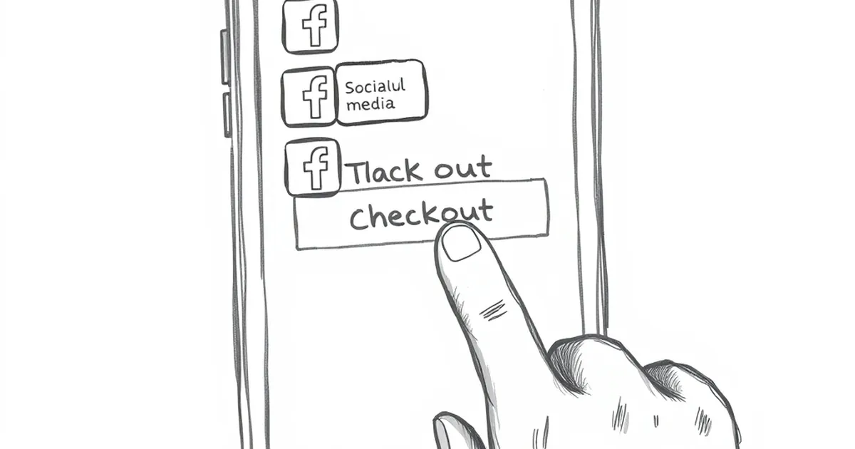
The "Fat Finger" Problem
I once tested a client's blog that had a vertical floating bar on the left side. Their mobile conversion rate was 1.2%, which felt low. We checked the heatmaps. Every single user had to scroll around the bar to read the first sentence of each paragraph. We removed the bar, and the conversion rate jumped to 3.4% in two weeks. No other changes.
They Steal Your Page Speed
Floating social bars are typically heavy. They load scripts from Facebook, Twitter, LinkedIn, and Pinterest simultaneously. Each script is a separate HTTP request that fights with your main content for bandwidth.
On a 4G connection, this might add one or two seconds to your load time. On a slower 3G connection in emerging markets, that floating bar can delay your entire page by five seconds or more. Google's data shows that a one-second delay in mobile load time can reduce conversions by up to 20%. You are literally paying for those buttons with lost sales.
The "Share" Illusion
Here is the uncomfortable truth: most people don't share content from floating bars. They share content from their browser's native share menu, or they copy the link and paste it into WhatsApp or Messenger.
Floating bars often only show four or five networks. They miss the biggest sharing channels in markets like Southeast Asia, Latin America, and Africa, where platforms like Telegram, WeChat, and Viber dominate. By forcing a generic set of buttons on everyone, you are actually blocking your own content from being shared in the places your audience lives.
A Better Mobile Approach
The fix is not to kill social sharing entirely. It is to place the buttons where they actually help.
Put a simple, static row of share buttons at the very end of your article. That way, the user has already consumed your content and decided it was worth sharing. If they want to share while reading, they can use their phone's native share feature, which is faster and less intrusive.
The Sticky Bottom Bar Exception
If you absolutely must have floating buttons, place them at the bottom of the screen, not the side. Keep the design minimal: just an icon and a count. No text labels. This keeps the thumb zone free for scrolling while still giving users a quick tap option after they finish a section.
What to Do This Week
Go into your analytics and look at your mobile bounce rate for your five most popular articles. If it is above 65%, open one of those articles on your phone. Take a screenshot. Look at how much space your floating bar is taking up. Then remove it for a week and watch what happens to your time on page.
Your goal is not to maximize shares. Your goal is to keep people reading long enough to care. The share buttons will still be there when they are ready.
— creative mess