Why Your Floating Contact Button Pushes Users Away Before They Reach Out
Learn why that persistent floating contact button creates subtle friction that drives visitors away instead of inviting them to connect
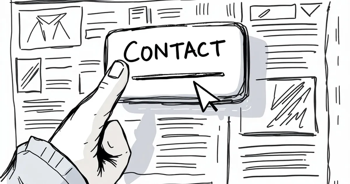
You’ve spent hours perfecting your site’s user experience, but there it sits. A floating contact button, glowing or pulsing, following visitors down every scroll. It feels helpful, but here’s the uncomfortable truth: that persistent little button is often the first thing a potential client wants to escape.
The friction it creates isn’t dramatic. It’s subtle, like an overeager salesperson hovering by the door. Instead of feeling supported, visitors feel watched. And when people feel watched, they don’t reach out. They leave.
The Psychological Weight of a Sticky Button
A floating button that never moves taps into a basic human reaction: the need for autonomy. When a button follows you around the page, it signals urgency. It whispers, “Contact us now, or you’ll forget.” This creates low-grade anxiety.
The “Commitment Before Context” Problem
The real issue is timing. A visitor who just landed on your homepage doesn’t know if they trust you yet. Asking them to click a contact button before they’ve seen your work, read your about page, or understood your pricing feels like a demand for commitment.
It’s like asking someone to marry you on the first date. Even if they’re interested, the pressure makes them back away.
How It Hurts Mobile Users the Most
On mobile, space is precious. A floating button can cover a key piece of content, a menu item, or the “Add to Cart” button. I once watched a user on my own site try to tap a product image three times, only to accidentally trigger the contact form each time.
That’s not just annoying. It’s a conversion killer. On small screens, a floating button often sits right where your thumb naturally rests. Every accidental tap trains the user to distrust the interface. After a few misfires, they’ll leave, associating your brand with frustration.
When the Button Actually Works
This doesn’t mean all floating buttons are evil. I’ve seen them succeed beautifully on support-heavy sites. A SaaS company I worked with placed a simple, non-animated chat button that only appeared after a user scrolled past the pricing table. It didn’t pulse. It didn’t glow. It just sat there, quiet and available.
That’s the secret: timing and restraint. The button appeared exactly when a user had enough context to know they might need help. Conversion rates went up by 18% in two weeks.
What to Do Instead of a Floating Button
You don’t need to remove the contact option. You just need to place it where it feels natural, not forced. Here are three practical swaps that keep the door open without the pressure.
Place a Static Button in the Header
A simple “Contact” link in your main navigation works wonders. It’s visible, accessible, and doesn’t follow the user around. It says, “We’re here when you’re ready.”
Use Contextual Inline CTAs
Instead of a global floating button, add a contact CTA at the bottom of your most important pages. After someone reads your case studies or service descriptions, they’re primed to act. Place the button there, not before they’ve seen your value.
Try a Scroll-Triggered Widget
If you really want a floating element, make it appear only after the user has scrolled 60-70% of the page. By then, they’ve engaged with your content. The timing feels respectful, not pushy.
A Forward-Looking Note on Trust
The best websites don’t chase their visitors. They guide them. As attention spans shrink and trust becomes harder to earn, subtlety is your secret weapon. Remove the pressure, and you’ll find that people reach out more willingly, on their own terms. That’s the kind of contact that actually leads to business.
— creative mess