Why Your Cookie Consent Banner Is Hurting More Than Privacy Compliance
Your cookie banner may be legal, but a poor design could be costing you conversions, SEO, and visitor trust
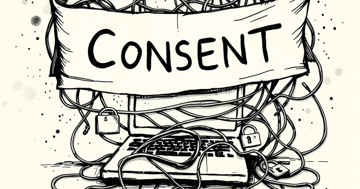
You’ve spent weeks perfecting your website’s user experience. The layout is clean, the copy is sharp, the load time is fast. Then a giant, gray box slams down from the top of the screen asking for “cookie preferences.” Suddenly, your entire brand feels like a bureaucratic office. This is the moment your cookie banner stops being a legal formality and starts actively damaging your business.
It’s not about ignoring privacy laws. It’s about realizing that a badly designed banner can kill conversions, tank your SEO, and frustrate visitors before they even read your headline. Let’s look at where things go wrong.
The Real Cost of a Bad Banner
Most cookie banners are built by legal teams, not designers. The result is a clunky, fear-inducing block of text that screams “this site is a risk.” Visitors don't care about your legal compliance—they care about getting value from your page.
A poor banner creates friction. Every extra second a user spends deciphering buttons or hunting for a “reject all” link is a second they could spend scrolling your content. On mobile, these overlays often cover half the screen, making your site feel broken. That’s not compliance—that’s a barrier to entry.
The Conversion Killer You Didn’t Notice
Here’s a concrete example from a e-commerce client I worked with. They had a standard “Accept All” banner with a tiny, gray “Preferences” link. Their checkout abandonment rate was sitting at 78%. After switching to a minimalist, bottom-fixed banner with a clear “Reject All” button, the abandonment rate dropped to 64% in two weeks.
Why? Because people who felt trapped by the banner were leaving the site entirely. They weren’t just rejecting cookies—they were rejecting the brand.
Why Global Audiences React Differently
Privacy expectations aren’t the same in Tokyo, London, or São Paulo. In the EU, users are trained to immediately look for a “Reject All” option. In the US, many users are still confused about what cookies even do. A single banner design rarely works for both.
If your banner treats every visitor like a GDPR expert, you’ll alienate casual browsers. If it treats everyone like a novice, you’ll frustrate privacy-savvy users. The solution isn’t a one-size-fits-all text block—it’s a layout that adapts to the user’s region without overwhelming them.
The Language Trap
Many global sites default to English in their cookie banners, even when the main content is translated. This instantly signals that the site isn’t local. A banner in the wrong language feels like a pop-up ad, not a privacy tool.
The SEO Damage Nobody Talks About
Google’s Core Web Vitals penalize sites with intrusive interstitials. A full-screen cookie banner that blocks content until a button is clicked counts as a poor user experience. If your site relies on organic traffic, that banner is actively hurting your search rankings.
Worse, some banners load scripts before the user consents, slowing down page speed. Google measures that loading time. A heavy, poorly coded banner can drop your Lighthouse score by 15 points.
A Better Path Forward
Stop thinking of the cookie banner as a necessary evil. Treat it like a design element that belongs in your site’s visual system. Use the same font, colors, and spacing as your navigation. Keep it small and sticky at the bottom of the screen. Give users a clear, one-click “Reject All” that doesn’t hide behind a menu.
Your next step is simple: test your current banner with real users. Watch their face when it appears. If they frown or scroll away, you have your answer. Privacy compliance is non-negotiable, but a bad banner is a choice you can fix today.
— creative mess