Why Your Breadcrumb Trail Makes Users Forget Where They Are
Breadcrumb trails often confuse users when navigation hierarchy clashes with mental models, eroding their sense of place on your site
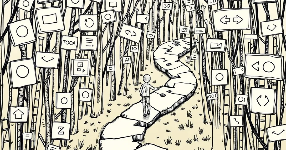
You’d think a trail of breadcrumbs would be the most helpful thing on your website. You click, you land, you see exactly where you are, and you can hop back a step. So why does it feel like half the time, those little links just make you more lost?
The problem isn’t the concept. It’s the execution. Most breadcrumbs are designed by engineers for logic, not by designers for humans. When your navigation hierarchy doesn’t match how users actually think about your content, those little links become a psychological trap that erases your sense of place.
The Hierarchy Mismatch
Your backend structure is a filing cabinet. It makes sense to your CMS, your database, and your SEO plugin. But your user doesn’t care about your database. They care about their task.
Consider a typical e-commerce flow. Your backend says: Home > Electronics > Audio > Headphones > Wireless. That’s clean, right? But what if the user searched for "noise-canceling headphones for flights"? In their mind, they’re in a "Travel Gear" section. They never saw "Electronics." They clicked a result from Google.
When they look at your breadcrumb, they see a path they never walked. It feels like a stranger’s map. Instead of confirming their location, it questions their entire journey. The user thinks, "Wait, am I in the wrong place?" That doubt is the first step toward the back button.
The "Last Click" Illusion
We often assume the breadcrumb is a record of where the user has been. It’s not. It’s a reflection of where the site thinks they should be.
The Search Trap
If a user lands directly on a product page via a Pinterest link or a deep search, the breadcrumb shows a hierarchical path they never traversed. You’re telling them they "came from" a category they’ve never seen. This is disorienting, not helpful.
The Faceted Filter Fog
This is where it gets ugly. If you have filters (e.g., "Size: Large," "Color: Red"), your breadcrumb might start stacking these as "levels." Home > Clothing > Shirts > Large > Red. Now the trail is longer than the actual content on the page. It looks like a rabbit hole, and users feel buried. They forget they are one click from checkout; they feel three levels deep in a dungeon.
A Concrete Example: The Recipe Blog
Let me share a quick anecdote. I recently visited a cooking site for a "One-Pan Lemon Chicken" recipe. The breadcrumb read: Home > Recipes > Dinner > Poultry > Chicken > Skillet.
That’s six levels. The recipe itself was on the screen, but my eye was drawn to the trail. I scrolled up to see where I was, realized I was "4 levels deep" into a category I didn't care about, and felt an inexplicable urge to "go back" to the homepage to reset. I almost left. The breadcrumb created anxiety, not clarity.
The Fix: Context Over Hierarchy
You don’t need to remove breadcrumbs; you need to re-engineer them. Stop showing the site's structure and start showing the user's context.
H3: Use the Page Title as the Anchor
The last item in the breadcrumb should always be the current page title (non-clickable). This is standard, but many sites skip it. If you don’t show them where they are now, the trail is pointless.
H3: Flatten the Trail
If you have more than three levels, you’ve failed. Your breadcrumb should rarely exceed: Home > Category > Subcategory > Page. If you have filters, don’t put them in the breadcrumb. Put them in the filter bar with a clear "Clear All" button. The breadcrumb is for location, not for query state.
H3: Match the User’s Mental Model
If your visitors search for "budget options," make sure your breadcrumb reflects a "Budget" or "Deals" path if that’s how they found you. If you can’t do that dynamically, just use the product's primary category and keep it short.
The Future is "You Are Here"
We are moving away from linear hierarchies. Modern sites use "pill" navigation and tag-based systems. The best breadcrumb might just be a simple "Back to Results" button that remembers the search query, paired with a static "You are viewing [Product Name]" indicator.
Don’t let your navigation become a history lesson. Make it a compass. If the trail doesn’t instantly tell the user, "Yes, I chose to be here, and I know how to leave," then it’s just noise. Trim it down. Your bounce rate will thank you.
— creative mess