Why Your Auto-Save Icon Keeps Users Second-Guessing Their Progress
Discover why your auto-save icon creates user doubt and how to eliminate that moment of hesitation for trust-building progress feedback
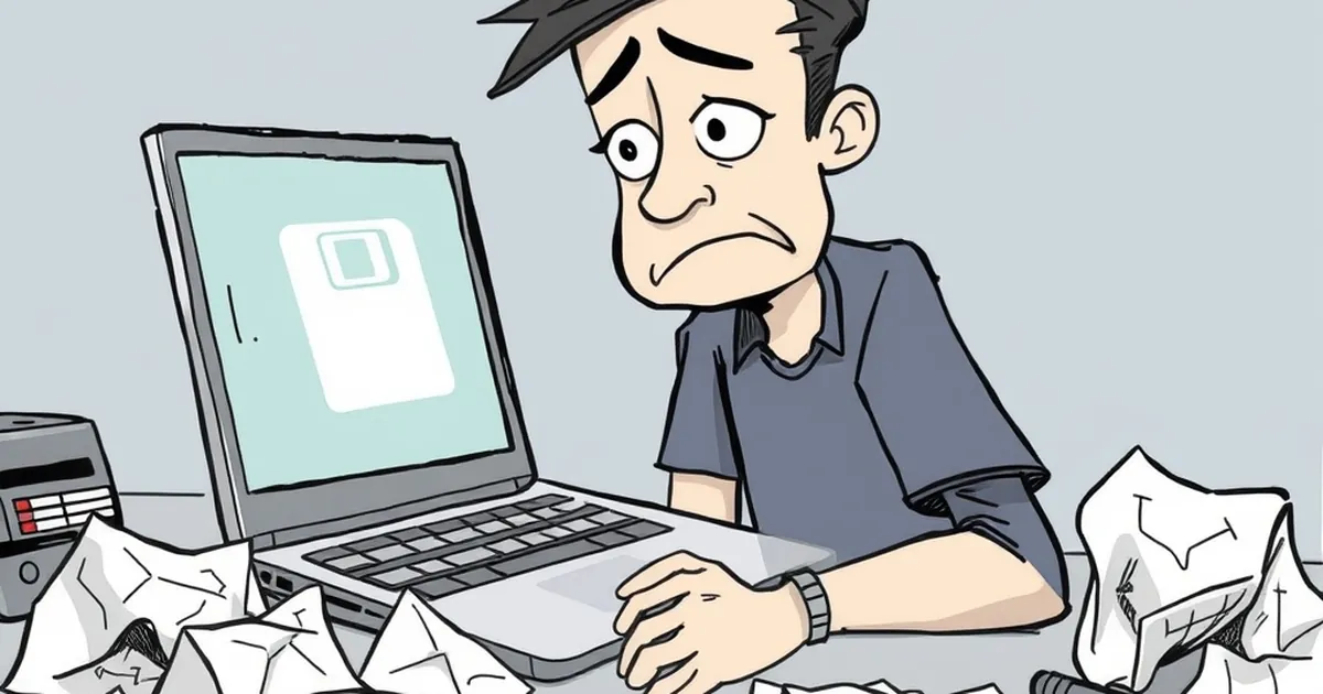
You hit save. The little icon spins. Then it stops. But did it actually save? That moment of hesitation, that tiny pause where you wonder if your work is safe, is a subtle trust-breaker between your users and your product. If your auto-save icon is doing its job silently, users shouldn't have to question it—ever.
The Problem with "Saved" vs. "Saving"
Most auto-save icons fall into a confusing gray zone. A spinning wheel usually means "working," but a checkmark often means "done." The issue is that users don't know if "done" means saved to the cloud, saved locally, or just queued for later.
The Familiar Friction
Think about the last time you wrote a long email in a web app. You saw the little "Draft saved" message pop up, but you still manually clicked "Save" before closing the tab. That extra click is a symptom of a broken feedback loop. Your icon told the user one thing, but their gut told them something else.
Why Micro-Interactions Matter More Than You Think
Designers often focus on the big flows—sign-ups, checkouts, dashboards—but the tiny moments define trust. A poorly designed save indicator creates cognitive load. Every time a user has to stop and check if their work is safe, you've asked them to do a small, unnecessary calculation.
The "Lost Work" Anecdote
A friend of mine runs a small consulting firm. They used a popular project management tool for client proposals. One day, a team member spent two hours editing a document. The auto-save icon showed a spinning circle for a second, then disappeared. They closed the tab. The next morning, the edits were gone. The icon had stopped spinning because the session timed out, not because the data was saved. That single incident cost them a client and a weekend of rework.
Clarity Over Cuteness
Your save icon shouldn't be a mystery. A simple text label like "Saving..." followed by "Saved just now" is far more effective than a spinning gear or a vague checkmark. Users need a status, not a symbol.
The Verdict on Visuals
- Spinners are ambiguous: They tell you something is happening, but not what.
- Checkmarks are final: They imply completion, but users may not trust them if the save was silent.
- Timestamps build trust: "Saved 2 seconds ago" is concrete proof of progress.
Practical Takeaway: Test Your Feedback Loop
Here's the thing—your auto-save icon isn't just a UI element. It's a promise to your user that their effort is secure. Don't assume it works. Open your app, type a sentence, and watch the icon. Does it hesitate? Does it disappear too fast? Does it appear at all? If you have to squint or guess, your users are doing the same.
The next time you design a save indicator, ask yourself one question: "Would I close this browser tab without double-checking?" If the answer is no, your icon needs rethinking. The goal isn't just to save data—it's to let your users move on with confidence.
— creative mess