Why Your Accordion Menu Hides Critical User Choices
Hidden accordion menus bury critical user choices, costing sales by making customers feel tricked instead of informed
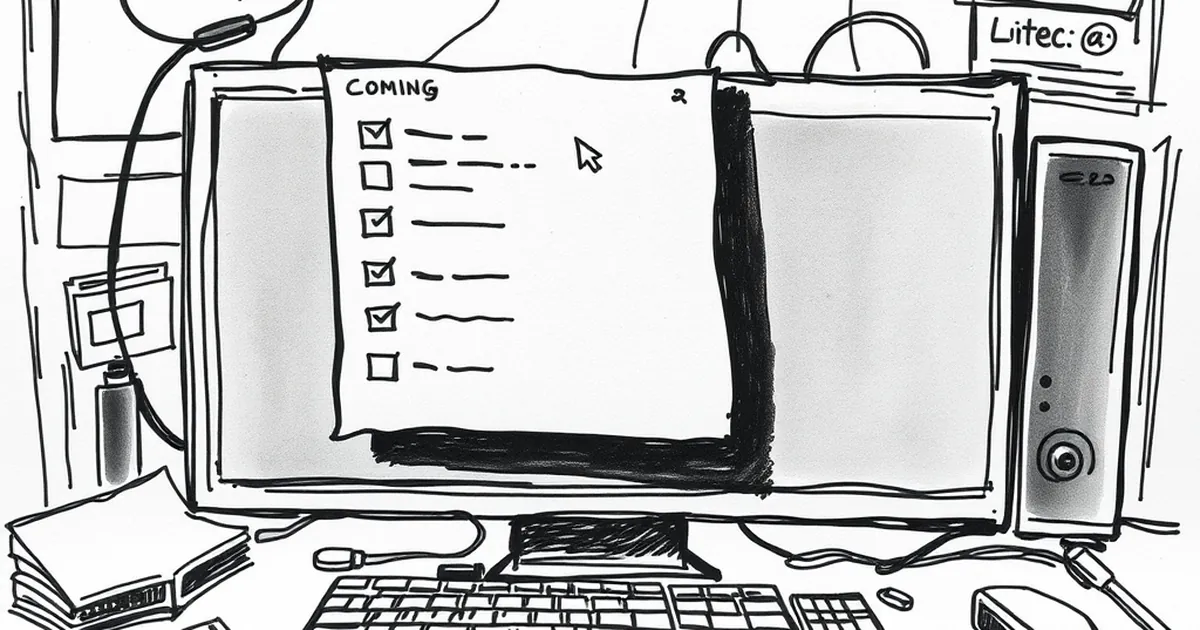
You finally got someone to click through to your pricing page. They’re ready to buy. Then they see it: a neat little hamburger icon labeled “More Plans.” One click expands it. Inside are three better options they never would have found. Now they feel tricked, and you’ve lost a sale.
Accordion menus feel clean, but they often hide the very decisions your users came to make. When you bury critical choices behind a click, you aren’t simplifying—you’re gatekeeping.
The “Out of Sight, Out of Mind” Problem
People scan websites, not read them. When a menu option is collapsed, your brain treats it as less important. It’s basic cognitive load theory: we prioritize what’s visible.
- Users miss alternatives: If your “Enterprise” plan lives inside an accordion, most small business owners will never see it.
- Trust takes a hit: When someone finally clicks and discovers a cheaper or better option, they wonder what else you’re hiding.
I once redesigned a SaaS dashboard where the “Export CSV” button was inside a three-level accordion. Users complained for months that export didn’t exist. It did—they just never found it.
When Accordions Actually Work (And When They Don’t)
Not all accordions are evil. The trick is knowing what to collapse and what to leave visible.
Good Use Cases
- Optional filters: “Show advanced search options” is fine. The user isn’t looking for advanced stuff unless they click.
- Long legal text: Privacy policies and terms of service belong behind a click. Nobody needs those visible by default.
Bad Use Cases
- Pricing tiers: Never hide how much something costs. Ever.
- Primary navigation: If a menu item leads to your core offering, keep it open.
- Call-to-action buttons: A “Get Started” link should never require a click to reveal.
The Mobile Trap
Mobile screens are small, so accordions feel like a natural fix. But mobile users are even more impatient. They’re tapping with thumbs, often one-handed.
If your mobile menu uses accordions for product categories, you’re asking users to:
- Tap to open the menu
- Tap to expand “Services”
- Tap to expand “Web Design”
- Tap to select “E-commerce”
That’s four taps for one choice. On desktop, it would be one hover. The friction is real, and it kills conversions.
A Better Pattern: Progressive Disclosure Done Right
The goal isn’t to show everything at once. It’s to show the right things by default.
- Use tabs instead: Horizontal tabs keep options visible without taking up vertical space.
- Prioritize by frequency: Put the most common choices front and center. Bury the niche stuff.
- Add a “Show all” link: Let users expand everything at once, not one section at a time.
For example, on a checkout page, show the three most popular payment methods (credit card, PayPal, Apple Pay) as buttons. Put the rest—wire transfer, crypto, gift cards—behind a single “More payment options” link.
Your Forward-Looking Move
Next time you design a menu, ask yourself: “If I hide this, will someone miss it?” If the answer is even a maybe, keep it visible.
Good design doesn’t mean less information—it means the right information at the right time. Accordions have their place, but your users’ critical choices deserve to be seen, not stashed behind a click.
— creative mess