Why Your 404 Page Might Be Your Best Sales Tool
Turn a dead-end 404 page into an unexpected sales opportunity with creative design that captures frustrated visitors
You’ve spent weeks perfecting your homepage, optimising your checkout flow, and polishing every product description. Then a visitor types in a wrong URL and lands on a grey page with “404 Not Found” and a dead link. That’s it. They leave.
But here’s the thing: that 404 page is the only page on your site that gets 100% undivided attention from someone who is already frustrated. If you treat it like an afterthought, you’re basically throwing money away. With a tiny bit of creativity, that dead end can become a surprisingly effective sales tool.
Why a Broken Link Isn’t the End of the World
Every visitor who hits a 404 is already engaged enough to be on your site. They typed a URL, clicked a bookmark, or followed a link from somewhere. That’s a person who wanted to interact with your brand.
The mistake most businesses make is thinking the job is done once you show an apology message. But a frustrated visitor is still a warm lead. They’re just lost. Your job is to gently guide them somewhere useful before they hit the back button.
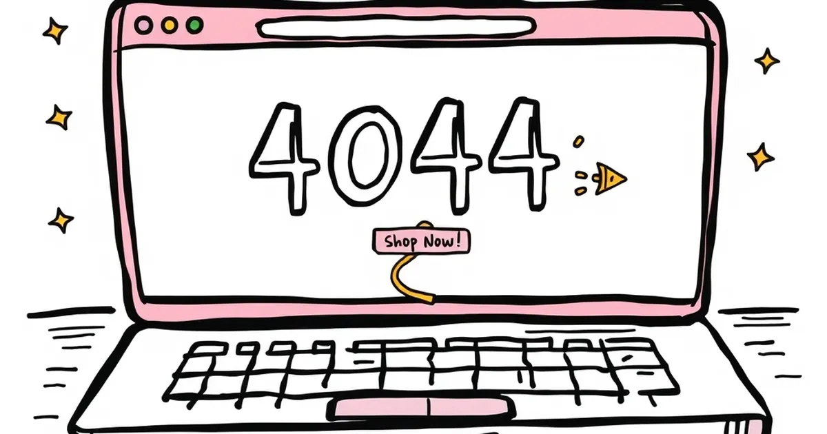
Turn Confusion Into Curiosity
Give Them a Clear Next Step
The worst 404 pages just say “Page not found” and leave you stranded. Instead, give your visitor one obvious thing to do. A search bar is helpful, but it’s not exciting. A button that says “See our best-selling products” or “Check out today’s deals” is a direct path to a sale.
Add a Dash of Personality
A 404 page is one of the few places where you can be weird without hurting your brand. A funny illustration, a self-deprecating joke, or a quirky line like “Looks like this page went on vacation without telling us” can turn a moment of annoyance into a smile. That emotional shift makes people more receptive to whatever you show them next.
A Real-World Example That Worked
I once helped a small online tea shop redesign their 404 page. They sold loose-leaf blends and had a loyal following on social media. Instead of a dead end, we put a photo of the founder holding a cup of tea with the caption: “Even our best pages get lost sometimes. Here, have a look at our most popular blend instead.”
Below that was a single button: “Try the Earl Grey that sells out every month.” That page started converting at over 8% — better than some of their product pages. People who landed on a 404 weren’t angry; they were curious. And curiosity, when guided well, leads to purchases.
What to Actually Put on Your 404 Page
- A clear, friendly heading that acknowledges the error without apologising too much
- One primary call-to-action — not a menu of choices, just one button that leads to your best offer
- A search bar for the rare visitor who knows exactly what they want
- A link to your most popular category or blog post — something that keeps them browsing
Skip the homepage link as the only option. That’s like dropping someone off at the airport entrance and expecting them to find their gate. Give them a direct route.
Make It a Tiny Experiment
Your 404 page is easy to change and costs nothing to test. Run a simple A/B test: one version with a standard apology and one with a playful headline and a product button. Track how many people click through and how many actually buy.
You might be surprised to find that your best-converting page is the one you never planned to build. That lost visitor? They might just become your next loyal customer — if you give them a reason to stay.
— creative mess