What Your Website's White Space Says About Your Pricing
Discover how your website's white space silently signals your pricing—and why it may be undermining your premium brand perception
You’ve spent hours perfecting your service page, but something feels off. Every time a prospect clicks away, you wonder if it’s the price or the presentation. Here’s the uncomfortable truth: your website’s white space might be whispering “budget” when you meant to shout “premium.”
The way you use empty space on a page is a silent signal about your pricing. It’s not just about aesthetics—it’s a psychological cue that tells visitors whether you’re a bargain or an investment. Let’s decode what your layout is actually saying.
The Psychology of Scarcity vs. Abundance
White space is visual breathing room. When you cram text, buttons, and images together, you create a sense of density. That density often reads as scarcity—like you’re squeezing every last drop of value out of a limited resource. Visitors subconsciously think, “This must be affordable, because they’re cutting corners on design.”
The opposite is also true. Generous white space signals abundance. It says, “We have enough margin to let our content breathe.” That sense of abundance is the same feeling we get from luxury hotels or high-end retail stores. It primes your audience to expect a higher price tag.
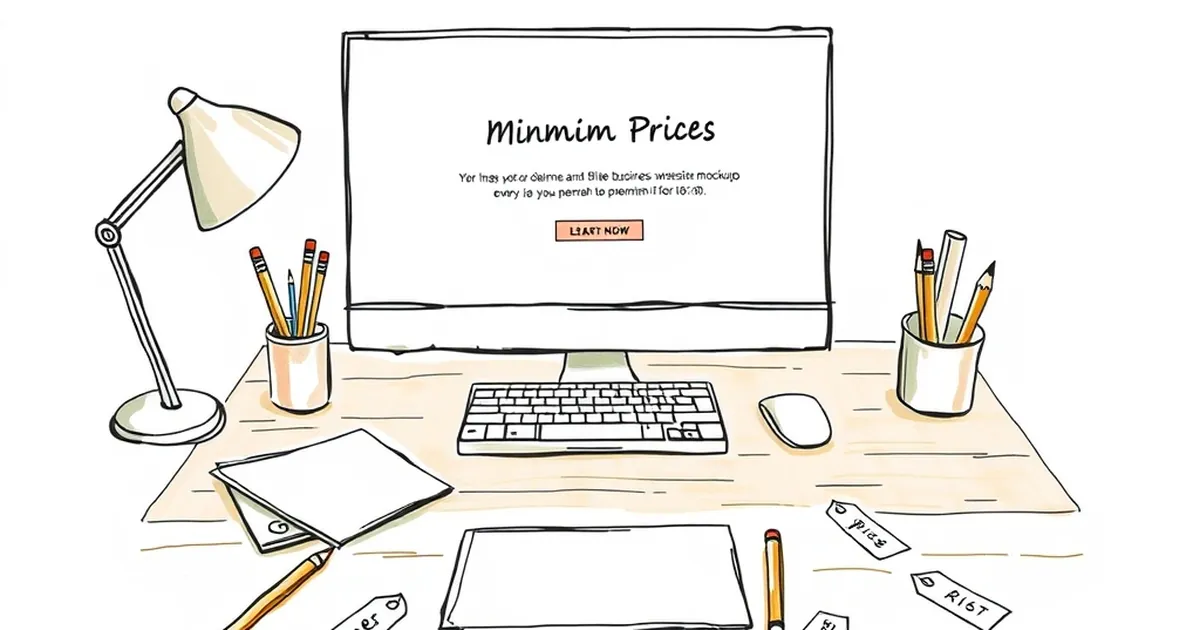
The “Clutter = Discount” Trap
I once worked with a freelance photographer who charged $500 per session. Her homepage was a wall of tiny thumbnails, dense paragraphs of bio, and a price list buried in a sidebar. She couldn’t understand why leads always asked for a discount. We stripped the page down to one large hero image, a single sentence of copy, and a prominent “Book Now” button.
Her close rate for full-price bookings doubled in two months. The white space made her look like a specialist—not a hustler.
How Much Space Is “Premium”?
There’s no magic number, but a good rule of thumb is to aim for at least 50% empty space on your key landing pages. That includes margins between sections, padding around call-to-action buttons, and the gap between your headline and supporting text.
If your page feels like a crowded subway car, it’s time to edit. Remove one sidebar, cut a paragraph from your hero section, or increase the line height of your body text. The goal is to make the page feel effortless to scan.
The Button Test
Look at your main “Buy Now” or “Get Started” button. Is it surrounded by other elements? If there’s a testimonial, a trust badge, or a navigation link within two inches of it, you’re diluting its importance. A premium button needs isolation. Give it at least 80–100 pixels of padding on all sides. That emptiness makes the action feel deliberate and confident.
The Real Cost of Cramming
Cramped layouts don’t just hurt pricing perception—they hurt conversion rates. A 2021 eye-tracking study found that users spend 80% of their time looking at whitespace-negative areas on a page. Translation: if you fill every pixel, you force visitors to work harder to find what matters.
When people have to work, they assume the solution (your product) will also require extra effort. That mental friction makes them question the value. High prices feel justified only when the experience feels effortless.
A Practical Takeaway for Your Next Redesign
Instead of asking “How much white space should I add?” ask “What can I remove this week?” Pick one page—your pricing page or services page. Cut the word count by 30%. Remove any image that doesn’t directly support your primary offer. Double the space around your headline and primary CTA.
Then watch your analytics. If time on page increases and bounce rate drops, you’ve just raised your perceived value without changing a single price. White space isn’t wasted space. It’s the most expensive real estate you own—use it to signal that you’re worth every penny.
— creative mess