What Your CTA Button Placement Reveals About User Trust
Discover how your CTA button placement reveals user trust levels and why strategic positioning can boost conversions
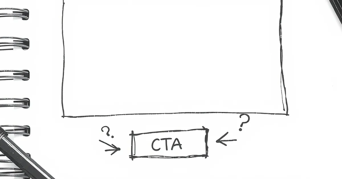
You’ve spent hours perfecting your website copy, nailing the color palette, and polishing your value proposition. But visitors still aren’t clicking that big, beautiful button. The problem might not be the button itself—it’s where you placed it.
The location of your Call to Action (CTA) isn’t just a layout decision. It’s a signal of how much you trust your visitor to make a smart decision. And more importantly, it reveals how much they trust you.
The "Too Soon" CTA: Asking Before You’ve Earned Anything
We’ve all landed on a blog post, read one sentence, and then got hit with a full-screen popup screaming "Sign up now!". That placement screams desperation. It tells your user: I don’t care if you found what you need, I just want your email.
This is the fastest way to erode trust. You haven't delivered any value yet, so why should they give you their contact info? When you place a CTA before you’ve established authority, you’re asking for a commitment on a first date. It rarely works.
The one exception: the "Bribe" CTA
There’s one case where an early CTA works: when you offer immediate, undeniable value. A lead magnet (like a free checklist or template) can sit at the top of a post. The trust is placed in the resource, not in your brand yet. Just be honest about what they get.
The "Below the Fold" CTA: The Old Default
For years, the standard advice was to put your primary CTA "below the fold"—meaning the user had to scroll. This assumes your visitor is lazy or impatient. It assumes you need to force them to read your entire pitch before trusting them to click.
In reality, this placement can feel safe, but it often misses the mark. If your headline and first paragraph are strong, you’ve already built a tiny bridge of trust. Asking them to scroll past everything else before acting can feel like you’re hiding the real ask.
The "Just in Time" CTA: The Sweet Spot of Trust
The most effective CTA placement isn't about a specific pixel location. It’s about timing. You place the button right after you’ve answered the user’s most pressing question. That moment—when they feel understood—is when trust is highest.
For example, a small software company I worked with moved their "Start Free Trial" button from the bottom of a long feature list to directly underneath a short testimonial video. The video lasted 90 seconds and answered the biggest objection. Conversions jumped by 40%. The button didn't change. The trust context did.
How to find your "Just in Time" spot
- Look at your analytics. Where do users spend the most time?
- Read your comments or support tickets. What question do they ask most often?
- Place the CTA right after you answer that question, not before.
The "Bottomless" CTA: The Lack of Commitment
Some sites bury their primary CTA at the very end of a page, after every single piece of content. This can signal that you’re afraid to ask for the sale. It suggests you don’t believe in your own offer enough to interrupt the reading experience.
Ironically, this can lower trust. If you don't seem confident in your offer, why should they be? A clear, well-placed CTA shows that you respect their time and believe in the value you provide.
Your Takeaway: Stop Overthinking the Fold
Stop worrying about whether the button is "above" or "below" the fold. Start worrying about the moment of clarity. That’s the only real metric.
Next time you build a landing page or a blog post, read it out loud. Imagine you’re the user. The moment you feel a "yes" in your head, that’s where your button needs to be. Trust your content first, and the button will find its place.
— creative mess