What Nobody Tells You About Accessibility Before You Redesign
Redesigning your site? Accessibility isn’t just contrast and alt text—it’s how your whole site works for everyone
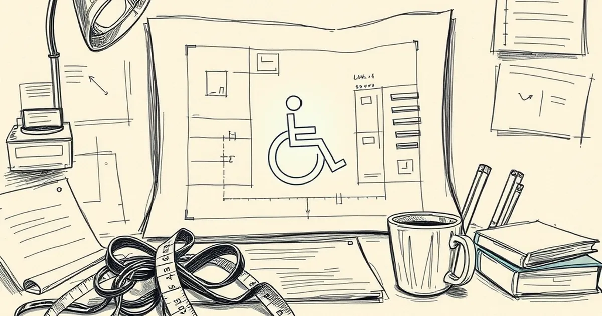
You decide to redesign your website. You’ve got a fresh brand palette, better copy, and a layout that actually looks good on mobile. But if you’re not thinking about accessibility from day one, you’re building a beautiful door that a huge chunk of your audience can’t open.
Here’s the thing nobody tells you: an accessible redesign isn’t just about checking contrast ratios or adding alt text at the end. It’s about rethinking how your entire site works for people who don’t use a mouse, can’t see the screen, or rely on keyboard navigation. And if you don’t plan for it early, the fix will cost you triple.
The "Sneaky" Costs Nobody Budgets For
Most teams budget for design and development hours. They forget the "audit and rework" phase. When you redesign without accessibility in mind, you will inevitably find that your fancy new custom dropdown menu is completely unusable with a screen reader. That stunning parallax hero section? It makes some users physically nauseous.
The Keyboard Trap Nightmare
A concrete example: I once worked with a SaaS company that rebuilt their navigation as a set of custom JavaScript widgets. It looked beautiful. But if you tried to tab through the menu using only a keyboard, you got stuck. You could tab in, but you couldn't tab out. A user who relies on keyboard navigation would have to close their browser entirely. That’s a hard "no" for business.
Fixing that after launch meant rewriting hundreds of lines of JavaScript. Had they planned for focus management during the wireframing stage, it would have been ten lines of code.
Why "Just Add Alt Text" Is a Lie
You’ve heard the basics: add descriptive alt text to images, use proper heading hierarchy. That’s table stakes. What nobody tells you is that accessibility is a system, not a checklist.
It Changes Your Design Language
When you prioritize accessibility, you might discover that your brand's favorite low-contrast gray text on a white background simply doesn't work. You can't just "add a darker shade" to the existing palette—you have to redesign the entire color system. This affects button states, link underlines, and even the background patterns you chose. The earlier you test this with real users, the less painful the pivot.
The Hidden Win: Better for Everyone
Here’s the part that surprises most business owners. When you design for accessibility, you almost always improve the experience for all users.
Captions Help Everyone, Not Just the Deaf
Think about captions on videos. They were built for people who are hard of hearing. But today, millions of people watch videos with the sound off while commuting or sitting in a quiet office. The same goes for clear link text (instead of "click here") and large, tappable buttons. These decisions make your site faster to use for everyone.
The Takeaway: Start With One Hard Constraint
Instead of waiting for the audit at the end, give your designer one hard constraint before the first mockup is made: "Every interaction must work with a keyboard alone." That single rule will force you to simplify menus, improve focus states, and avoid the worst accessibility sins.
Don't treat accessibility as a polish layer you add after the "real" design is done. Treat it as a core requirement, like "the logo goes in the top left." Your users won’t thank you—they’ll just have a seamless experience. And that silence is the loudest compliment you can get.
— creative mess