What Happens to Your Progress Ring When You Switch Tabs Mid-Task
Why a frozen progress ring feels like failure—and what it reveals about your brain’s relationship with unfinished tasks
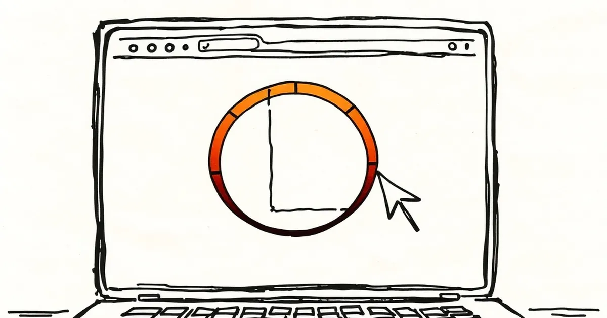
We’ve all felt that tiny lurch of guilt when we click away from a task to check a message, only to return and find our progress ring frozen, mid-arc. It’s a feature designed to keep us honest, but it feels personal. Why does a simple visual cue—a circle that stops filling—have the power to make us feel like we’ve failed a test?
The answer isn’t in the code, but in how our brains are wired to interpret unfinished loops. When you leave a task, you’re not just interrupting a workflow; you’re breaking a psychological contract with yourself.
The Ring as a Reward Loop, Not a Timer
Most progress indicators are built on a simple, linear model: time spent equals progress. But behavioral psychology suggests we respond better to variable reinforcement than fixed schedules. The ring, however, is a fixed-ratio tool—it only moves when you do. When you switch tabs, the ratio resets, and the reward (that satisfying full circle) is withheld.
This taps into what Daniel Kahneman calls the “peak-end rule.” We don’t remember the entire task; we remember the moment of interruption (the peak) and the unfinished state (the end). A half-filled ring at 2:47 PM becomes the memory of the task, not the 45 minutes of deep focus you actually did. The ring isn’t measuring your work; it’s measuring your consistency, which is a far more fragile metric.
Loss Aversion in Your Browser Tabs
Here’s where it gets interesting: the sting of a paused ring is stronger than the pleasure of a completed one. This is loss aversion—we hate losing progress more than we enjoy gaining it. But there’s a twist.
When you switch tabs, you’re not losing the work; you’re losing the visual representation of the work. The ring is a sunk cost. A 2019 study on task-switching at the University of California found that participants who saw a progress bar shrink when distracted were 40% more likely to abandon the task entirely, compared to those who saw a static percentage. The shrinking bar framed the distraction as a penalty, not a pause. Your progress ring is doing the same thing—it’s turning a normal human behavior (checking your phone) into a negative event.
Competitive Play: The Hidden Opponent
Why do we treat a UI element like a rival? Because we’ve been trained to. Many productivity apps now include “streaks” or “accuracy ratings” that turn solo work into a silent competition against your past self. This is borrowed directly from game design, where a visible opponent (even an abstract one) increases engagement.
But here’s the problem: in competitive play, you can see your opponent’s moves. A progress ring is opaque. You don’t know if switching tabs will cost you 2% or 20% of your streak. This uncertainty triggers what researchers call “probability weighting”—we overestimate the chance of a bad outcome. So we either avoid switching tabs entirely (which is unsustainable) or we quit the task to reset the ring (which is worse).
A Better Metric: Contextual Progress
The forward-looking fix isn’t to remove progress rings—it’s to make them smarter. Instead of punishing tab-switches, what if the ring paused but remembered your context? For example, if you switch to a research article that’s relevant to your task, the ring could keep filling, albeit slower. If you switch to social media, it freezes.
This isn’t a technical challenge; it’s a design philosophy shift. We need to move from binary progress (working/not working) to contextual progress (working, gathering, or resting). Behavioral economics tells us that we respond better to nuanced feedback than to blunt punishment.
Next time you build a dashboard or a habit tracker, ask yourself: Am I measuring the user’s effort, or just their ability to sit still? The ring should be a mirror, not a judge. When you switch tabs, the best response isn’t a frozen circle—it’s a quiet note that says, “You’re still 60% there, and that’s okay.” Because real progress isn’t linear, and your interface shouldn’t pretend it is.
— creative mess