Tooltips That Appear 300ms Late Make Users Trust the Form Less
Why a 300ms tooltip delay damages form trust, and how human perception of timing shapes whether users believe an interface is on their side
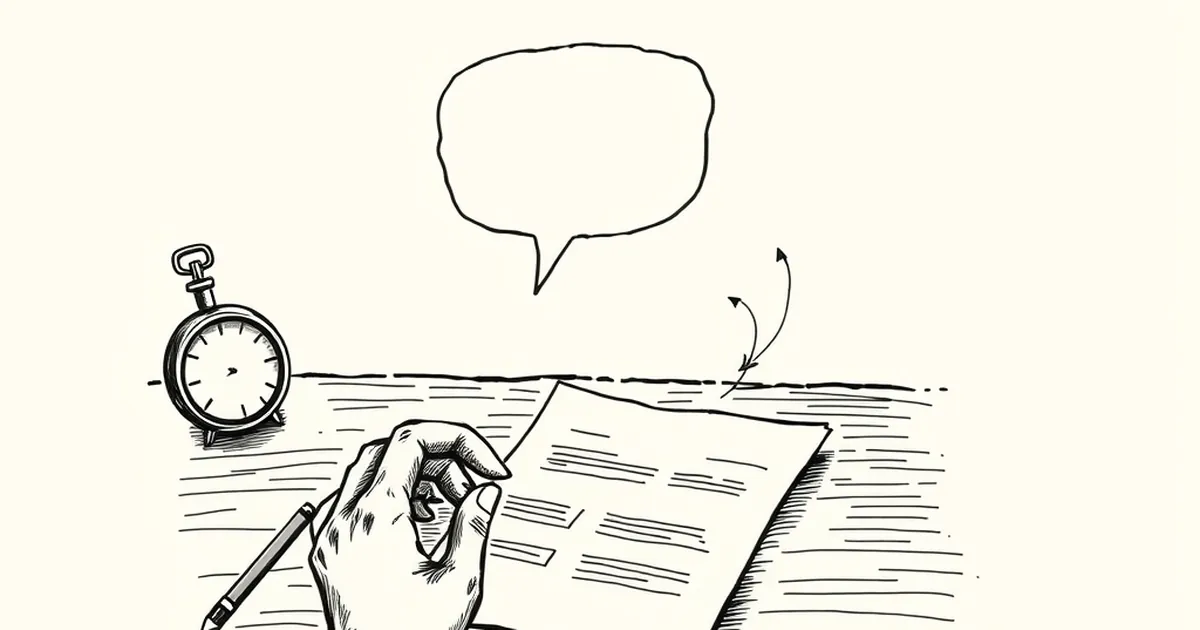
There's a moment in every form-filling session where your brain quietly decides whether this thing is on your side or working against you. It happens before you hit submit, before you even finish typing. And weirdly, a lot of that judgment gets made in the first fraction of a second after you hover over a little question mark icon.
So here's the question I keep coming back to: why does a tooltip that shows up 300 milliseconds late feel worse than one that never shows up at all?
Your Brain Notices the Gap, Not the Tooltip
Human perception is brutally tuned to timing. We're not great at judging absolute durations, but we're excellent at spotting interruption and delay. If you hover over a help icon and nothing happens for a beat, your brain doesn't file that as "neutral." It files it as "something went wrong."
This is loss aversion doing quiet work in the background. Daniel Kahneman and Amos Tversky showed that we weigh negative experiences more heavily than equivalent positive ones. A tooltip that arrives late isn't just a missing feature — it registers as a small failure. And failures stack.
The threshold matters. Around 100ms, an interface feels instantaneous. By 300ms, you've crossed into "did that work?" territory. Past a second, most people have already moved their cursor or clicked something else.
Variable Rewards Cut Both Ways
Here's where it gets interesting. Behavioral psychology has a well-documented concept called variable-ratio reinforcement — the idea that unpredictable rewards create the strongest habit loops. It's why notification badges feel addictive. Sometimes you check your phone and there's something good. Sometimes there isn't.
Tooltips are supposed to be the opposite of that. They're a promise of reliable help. When they fire inconsistently — sometimes fast, sometimes slow, sometimes not at all — you've accidentally built a variable-ratio system into your form. Except the "reward" is just... information you needed. The unpredictability doesn't create engagement. It creates low-grade anxiety.
Users start hovering twice. They start clicking the icon instead. They start abandoning fields they don't understand. None of that shows up in your analytics as "tooltip was slow." It shows up as a drop-off.
A Concrete Case: The 400ms Tax
Google's Material Design guidelines recommend keeping UI feedback under 100ms for perceived instantaneity, with 200ms as an outer bound for anything interactive. A team I worked with once had tooltips firing at 400ms because of a debounce function nobody remembered adding. Support tickets mentioned "the site feels janky" three times more often than a control version. No one could point to the tooltip. Everyone felt it.
We cut the delay to 80ms. Completion rates on the affected form rose by roughly 4%. Nothing else changed.
What This Means for How You Build
The instinct is to treat tooltips as decoration — a nice-to-have layer on top of the "real" form. That's backwards. Tooltips are micro-contracts. You hover, you get help. Break the contract by 200ms and you've taught the user that this interface is unreliable in small ways, which primes them to expect unreliability in big ones.
So the forward-looking move isn't better tooltip copy. It's treating latency as a design material, the same way you'd treat color or spacing. Audit your hover states. Measure them. If your help text takes longer to appear than a human blink, you're not helping anyone — you're just teaching them to stop asking.
— creative mess