The Undo Stack Clears 5 Seconds Before You Commit
Why we hesitate at the moment a decision becomes irreversible—and what that reveals about interface design and human psychology
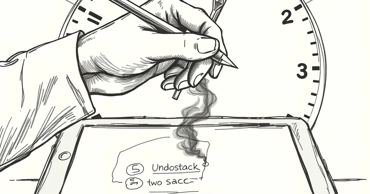
The undo stack is a quiet miracle of modern design—a digital safety net that lets you click, type, and drag with the confidence that a mistake is never permanent. But here’s the thing: that safety net evaporates the moment you hit “publish,” “send,” or “checkout.” Suddenly, the stakes feel real, your cursor hovers, and your brain does something strange. It hesitates. Why do we freeze at the exact moment a decision becomes irreversible, even when we’ve triple-checked everything?
This isn’t just about bad UX or jittery nerves. It’s a collision between how we build interfaces and how our brains are wired to handle loss, risk, and reward. Let’s pull back the curtain on that five-second gap between intention and commitment.
The Illusion of Control (and Why We Crave It)
When you’re designing a website, you’re not just arranging pixels—you’re architecting a psychological environment. The most underrated tool in your kit is the perception of control. A user who feels they can tweak, revert, or adjust is a user who explores more freely. That’s why drag-and-drop builders and live previews are so addictive: they simulate a sandbox where nothing counts.
But here’s the rub: real business decisions—signing a client, launching a product, publishing a pricing page—don’t have a “preview” button. The moment you commit, you’re exposed. Behavioral economist Daniel Kahneman would call this a classic loss aversion trigger: the pain of losing (or failing) is psychologically twice as powerful as the pleasure of gaining. Your website’s final “Submit” button isn’t just a call-to-action; it’s a psychological threshold.
Variable-Ratio Reinforcement and the “Just One More Tweak” Loop
Ever notice how you can spend an hour adjusting a font size, only to revert it? That’s not perfectionism—it’s a variable-ratio reinforcement schedule, the same mechanism that keeps people glued to slot machines (minus the gambling, of course). In design, the uncertainty of whether your next tweak will be “the one” that makes it perfect is precisely what keeps you in the loop. The reward isn’t the final product; it’s the occasional, unpredictable dopamine hit when a change feels right.
The problem? This loop thrives on the undo stack. The moment you commit, the loop breaks. That’s why launching a website feels like withdrawal. You’re not just shipping a product—you’re severing a behavioral addiction.
The “Commit” Button as a Bounded Risk
Here’s where design meets decision science. When you build for business, you’re constantly asking users to take bounded risks: “Buy now,” “Sign up,” “Start your free trial.” The best interfaces don’t eliminate risk—they frame it. Think of the last time you saw a checkout page with a countdown timer or a “Only 3 left in stock” note. That’s scarcity framing, a nudge that exploits our fear of missing out. But there’s a more ethical, effective approach: pre-commitment transparency.
A study on decision fatigue found that people are more likely to follow through on a choice if they’ve been shown the exact consequences before the final click. So instead of hiding the “what happens next” behind a button, show it. Let the user see the email they’ll receive, the invoice they’ll get, the timeline they’re agreeing to. You’re not removing the risk—you’re shrinking the unknown.
Designing for the Post-Click Mind
The real design challenge isn’t the moment of clicking; it’s the five seconds after. That’s when the brain runs a post-purchase rationalization check. If you’ve designed properly, the user should feel a reward immediately after committing—not just a “Thank you” page, but a tangible confirmation of progress. A progress bar, a clear next step, even a playful animation. This taps into reward prediction error: if the outcome matches what they expected, the brain releases a small dose of satisfaction, reinforcing the decision.
For business owners building their own sites, this is a golden rule: design for the moment after the click as carefully as you design for the moment before it. Your customer’s loyalty isn’t built on the ease of the click—it’s built on how they feel after the irreversible step.
The Forward-Looking Close
So here’s your practical takeaway: stop treating your website’s “Submit” button as a gateway and start treating it as a bridge. Before you add that button, map out the user’s emotional state five seconds after they click. What do they see? What do they feel? What’s their next logical move? If you can’t answer that, you’re not ready to publish—not because the design isn’t perfect, but because you haven’t designed for the moment your undo stack goes blank.
Build for the commitment, not the click. That’s where the real trust—and the real business—lives.
— creative mess