The Skill Bar’s Last 10% Waits for Your Cursor to Hesitate
The final 10% of design work is a battle with your own hesitation—here’s why finishing feels harder than starting, and how to push through
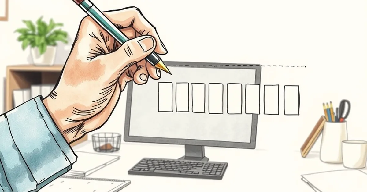
Any designer who has stared at a blank artboard knows the feeling: ninety percent of the skill is knowing what to build, but the last ten percent is a battle against your own cursor. It hovers over the publish button, the color picker, or the “send to client” email, and suddenly the gap between a good layout and a great one feels like a chasm. Why does the finishing move—the one that actually converts a visitor—feel so much harder than the structural work? The answer isn’t in your CSS; it’s in your reward system.
The Variable Ratio Trap in A/B Testing
We like to think we’re rational, but our design decisions are heavily influenced by intermittent feedback. When you run an A/B test, you’re essentially playing a slot machine for your ego. Sometimes a tiny button color change yields a 12% lift; other times, the same change does nothing. This is classic variable-ratio reinforcement—the same mechanism that makes social media feeds addictive. The unpredictability doesn’t just affect users; it affects you.
Why You Keep Tweaking the Hero Section
Here’s the trap: because the reward (a conversion spike) is random, you keep tweaking elements that don’t matter. Psychologist B.F. Skinner showed that pigeons peck harder when food comes unpredictably. Your cursor does the same. You’ll re-aline the footer for the fourth time because the last tweak might be the one that cracks the code. The fix isn’t more testing—it’s acknowledging that the uncertainty is the hook, not the data.
Loss Aversion: The Real Reason You Don’t Ship
Kahneman and Tversky’s prospect theory tells us losses hurt twice as much as equivalent gains feel good. For a business site, that means the fear of a broken checkout button outweighs the joy of a new testimonial. So you hesitate. You run one more cross-browser check. You delay the launch for a “safer” Tuesday. That hesitation is your brain overvaluing the potential loss of a single sale against the certain gain of shipping on time.
The 10% That Feels Like a Gamble
Here’s the concrete example: a recent study on negotiation behavior found that people who made a final, irreversible offer (no take-backs) felt more regret than those who kept a window open—even when the outcome was identical. In web design, that “irreversible” moment is hitting deploy. The solution isn’t to remove risk; it’s to frame it as a learning cost, not a loss. Budget for one failed variant per month. That’s your tuition.
Risk-Taking as a Design Currency
Competitive play teaches us something useful here. In games, players don’t avoid risk; they manage it in cycles. They go all-in on a strategy, observe the result, and adapt. Your website should work the same way. Instead of hedging with neutral grays and safe copy, pick one high-risk element—an aggressive headline, a single-page checkout, a bold color for the CTA—and commit to it for two weeks. No mid-stream changes.
The Hesitation is the Signal
When your cursor pauses, that’s not a bug. That’s your brain doing a cost-benefit analysis that’s stuck on the cost side. The most practical habit I’ve found is to set a “regret timer.” If you’re hesitating on a design choice for more than 15 minutes, write down the worst-case outcome in one sentence. Usually, it’s “a visitor bounces.” That’s not a loss; that’s data.
The Forward-Looking Close
The last 10% isn’t about skill—it’s about recalibrating your fear of uncertainty. Next time your cursor hovers, don’t force it to move. Instead, ask: “If this fails, what exactly do I lose?” If the answer is “a few sessions,” click. If it’s “my client’s trust,” then you’re not actually ready to ship—you’re missing a requirement, not courage. Design is a game of imperfect information, and the only way to level up is to play more hands. So ship the imperfect button. Measure the mess. Let the next hesitation be shorter than the last.
— creative mess