The Loading Bar’s Last 2% Moves Slower Than the First 60
Why progress bars stall at 97%—and how the same psychology shapes your site’s perceived speed and trustworthiness
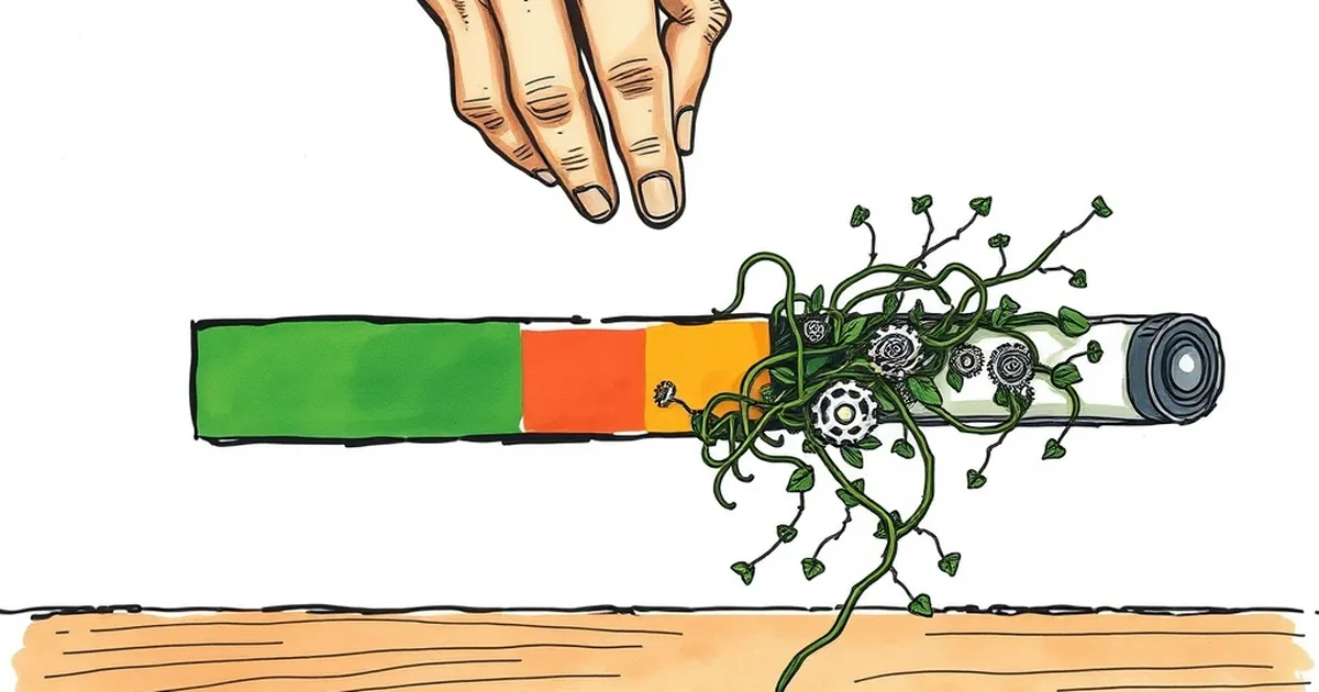
Ask anyone who’s ever watched a progress bar stall at 97%: time doesn’t just slow down—it inverts. You’ll blaze through the first half of a file upload, then sit through what feels like a small ice age for the final sliver. Is this a conspiracy of bad UX, or is your brain playing a trick that also explains why we overcommit to doomed projects and underprice our own work?
The answer is a cocktail of psychology and interface design, and it’s worth unpacking because the same mechanics that make a loading bar feel dishonest are the ones shaping how visitors perceive your website’s speed, trustworthiness, and even your pricing.
The Perception Gap: Why 97% Feels Like 7%
Your brain doesn’t process time linearly. It uses relative change. When a progress bar jumps from 0% to 60%, that’s a massive visual event—a flood of dopamine from visible momentum. But from 90% to 95%? The bar moves a few pixels. The perceived gain is tiny, so your attention shifts from “we’re moving” to “why aren’t we done?”
This is classic loss aversion (Kahneman & Tversky, 1979) in reverse. You’re not losing anything, but you’re anticipating a completion reward that’s being delayed. The closer you get to the finish line, the more the delay costs you psychologically. Designers know this; that’s why many fake the last 10% on purpose.
The Design Fix: Architecture of Anticipation
Good web design doesn’t just speed things up—it manages the wait. Two tricks work well:
- Non-linear progress bars: Show 80% of the bar filling in the first 30% of actual time, then creep slowly. Users feel the heavy lifting is done, so the tail end feels like polish, not failure.
- Micro-commitments: Break the final load into labeled steps (“Compressing images…”, “Connecting to server…”). Each label is a mini-reward, resetting the relative-change clock.
These aren’t gimmicks; they’re applications of variable-ratio reinforcement. When you don’t know exactly when the reward hits, you stay engaged. That’s why a bar that stutters feels more “alive” than a perfectly smooth one—it mimics the unpredictability of a game, not a boring factory line.
The Business Parallel: Risk, Reward, and the Dip
Here’s where it gets interesting for your business website. The same cognitive bias that makes you refresh a stuck download also drives your customers’ buying decisions. Consider the sunk cost fallacy: once a user has invested 5 minutes filling out a form, they’re more likely to finish—even if it’s broken. That’s your opportunity.
But it’s also a trap. If your checkout process feels like that last 2%, users will abandon it. The fix is to front-load the effort. Show the total number of steps (e.g., “Step 1 of 3”) and make the first step trivially easy. That initial win creates a commitment effect—they’ve already “loaded” 33% in their head, so the remaining 67% feels shorter.
A Concrete Example: The “Loading” Study You Can Steal
In a 2016 study by the Nielsen Norman Group, users were shown two identical checkout flows. One had a progress bar that moved in small, frequent increments; the other moved in large, rare jumps (0% → 50% → 100%). Surprisingly, the jumpy bar was rated as faster, even though both took the same real time. Participants reported feeling a sense of “risk” with the jumpy bar—like a game of chance. That uncertainty, paradoxically, made them more engaged.
Practical takeaway: Don’t hide your process. Show a progress bar that pauses at 90% for a moment, then snaps to 100%. The brief pause triggers a “will it or won’t it?” loop, and the snap delivers a bigger dopamine hit than a smooth glide.
Forward-Looking: Design for the Last 2%
Stop trying to make your website feel instant. Instead, design for the experience of completion. Next time you build a form, a checkout, or even a portfolio page, ask: where does the user’s attention stall? That stall is not a bug—it’s a signal. It’s where you can add a micro-interaction, a reassuring message, or a small visual reward.
The last 2% will never move faster in real time. But you can make it feel like the most exciting part of the journey. That’s not deception; that’s good rhythm. And rhythm is what keeps people coming back for the next load.
— creative mess