The 400ms Between Keypress and Paint Is a Full Thought Loop
The 400ms between keypress and paint is a full thought loop—where design decisions, risk, and uncertainty actually happen
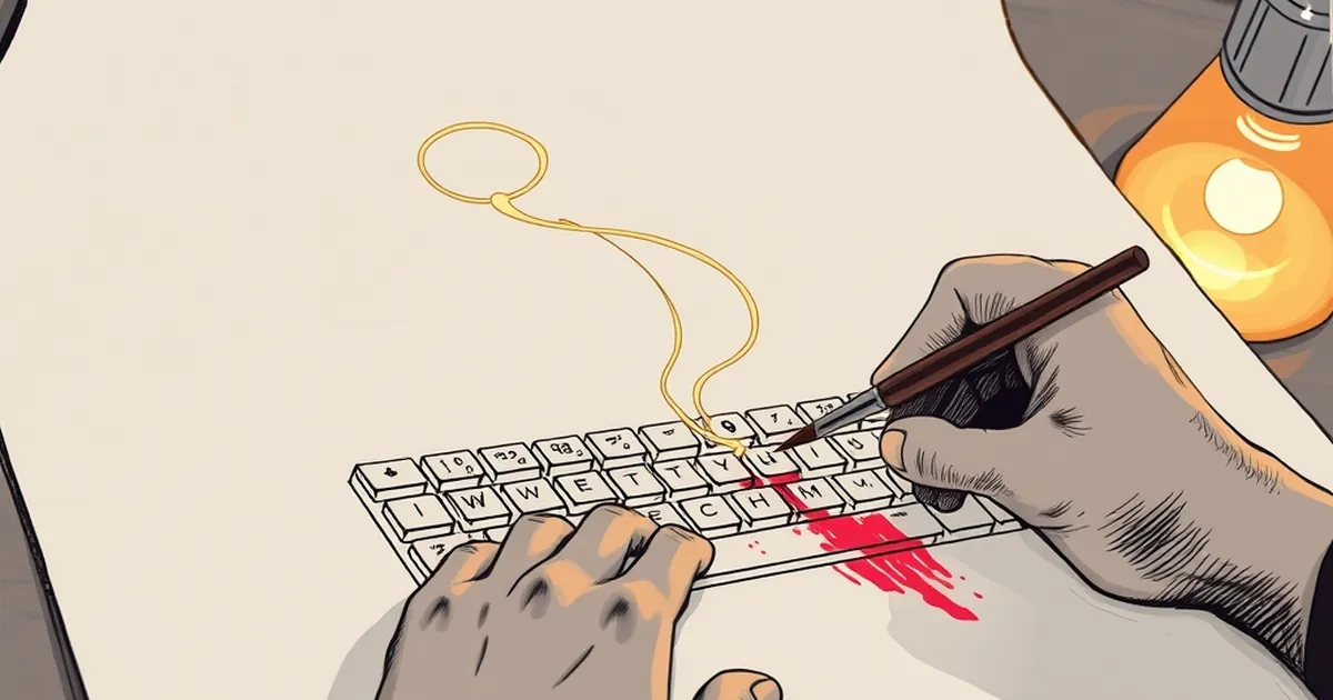
Every time you hit "publish," there’s a tiny window—about 400 milliseconds—where your brain runs a full audit. Did I use the right verb? Is the headline too clickbaity? What if the client hates the orange? That gap between the keypress and the browser painting the final layout isn’t just latency. It’s a compressed version of every decision you’ve ever made about risk, reward, and uncertainty. And for anyone building websites for a living, that microsecond is where the real design work happens.
The Brain’s Built-In A/B Test
You’d think designing a business website is a logical process: define goals, map user flows, pick a grid. But your brain doesn’t work that way. It’s running a continuous, low-stakes gamble on every element. Kahneman and Tversky’s prospect theory tells us losses hurt twice as much as equivalent gains feel good. That’s why a client will ignore ten glowing testimonials but fixate on one lukewarm review in the footer. Your job isn’t to remove risk—it’s to redesign the perception of it.
Loss Aversion in the Hero Section
When you place a "Start Free Trial" button next to a "See Pricing" link, you’re managing loss aversion. The free trial feels like a gain (no cost), but the pricing link triggers the fear of losing money. The 400ms loop is your brain checking: Did I just make the risky choice too prominent? The best designers don’t fight this—they use it. A subtle "No credit card required" caption isn’t a feature; it’s a loss-aversion vaccine.
Variable-Ratio Reinforcement, But for Clicks
Ever wonder why infinite scroll feels so addictive? It’s the same mechanism behind slot machines—but let’s call it what it is in web design: variable-ratio reinforcement. You scroll, and sometimes you get a great piece of content, sometimes a mediocre one. The unpredictability keeps the thumb moving. For a business site, this is dangerous. You don’t want your clients’ customers to feel like they’re pulling a lever.
The Fix: Predictable Reward Schedules
Instead of random surprises, design for intermittent but meaningful payoffs. A well-placed case study after every third product feature. A client testimonial that appears exactly when the visitor hesitates on the pricing page. This isn’t manipulation—it’s matching the brain’s natural expectation of effort-reward loops. The 400ms loop is asking: Is the next scroll worth it? Give them a clear yes, and they’ll stay.
Decision Fatigue Is Your Worst Enemy
Here’s a concrete example: a recent study from the University of Minnesota showed that judges are more likely to grant parole right after a food break. The mental energy spent on small decisions (what to eat, how to phrase a ruling) depletes the capacity for big ones. Your website does the same thing. Every extra form field, every ambiguous button label, every carousel that requires a choice—that’s a cognitive tax.
The 400ms Audit in Practice
When you’re staring at a checkout page with 12 input fields, your brain’s loop is screaming: Too many decisions. Abort. The fix isn’t to remove all choices—it’s to sequence them. Break the process into three clear steps with visible progress. This is called "chunking," and it’s borrowed directly from behavioral psychology. You’re not simplifying the task; you’re making the effort feel lighter.
Competitive Play: The Hidden User Test
Think of your website as a game against the user’s impatience. Not a zero-sum game, but a cooperative one where the rules are set by their attention span. The best designers I know treat every session like a speedrun. They ask: What’s the fastest path to a "yes"? That’s not manipulation—it’s respect. It’s understanding that the 400ms loop is a full thought cycle, and you want that cycle to end with a nod, not a sigh.
The Forward-Looking Close
Next time you’re about to ship a page, don’t just check the mobile breakpoints. Run a mental walkthrough of that 400ms gap. Ask yourself: What is the user’s brain deciding right now? Then design for that decision—not the page’s aesthetics. Build a website that feels like a well-played hand of cards: predictable enough to trust, surprising enough to engage. You’re not just arranging pixels; you’re scripting a tiny behavioral loop that ends with a client’s customer thinking, This just makes sense. And that’s the only win that matters.
— creative mess