Streak Freeze Costs 1 Point and 58% Buy It Before Checking the Rules
Session recordings reveal over half of users buy a streak freeze before reading its cost, exposing how small numbers and save-looking buttons drive fast deci...
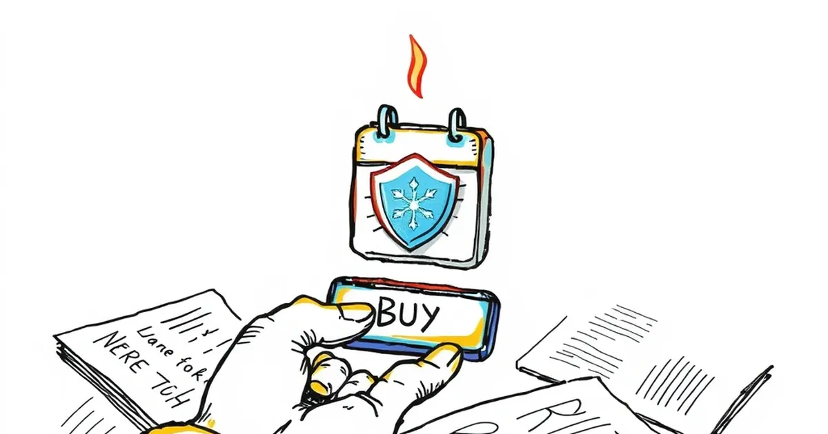
A client messaged me last week, mildly outraged. She'd spent twenty minutes designing a streak-freeze prompt for her fitness app's onboarding flow — clear copy, a little icon of a snowflake, a single line explaining the trade-off. Then she watched session recordings and found that more than half of new users tapped "buy" before they'd scrolled far enough to read what it actually cost.
She'd built the feature assuming people would weigh the trade-off. They didn't. They saw a small number, a save-looking button, and a blinking streak on the line. That's the whole decision.
The question worth sitting with: when does a design inform a choice, and when does it just dress up a reflex? That line matters whether you're building a productivity tool, a subscription checkout, or a game's daily-reward loop.
The trade-off has to be legible before it's tappable
If a user can act on a cost without ever seeing it, you haven't designed a decision — you've designed a default. The fix isn't usually more copy. It's sequencing.
Put the number and the consequence on the same screen as the button, not one tap apart. Make the button's label carry the cost: "Spend 1 point" beats "Continue." If the user has to scroll to learn what they're giving up, assume a meaningful share won't.
Variable rewards work — which is exactly why they need guardrails
Behavioral psychology has a well-worn name for what daily-streak mechanics lean on: variable-ratio reinforcement. B.F. Skinner's work on intermittent schedules showed that unpredictable rewards produce more persistent behavior than predictable ones. That's the engine under a streak counter, a loot box with a known drop table, or a "you earned a bonus" toast that fires at irregular intervals.
None of that is sinister by itself. It becomes a problem when the reward schedule is doing the persuading and the cost is hidden. My rule of thumb: if the reward is variable, the cost should be fixed, visible, and boring. Predictability on the downside is what makes unpredictability on the upside tolerable.
A concrete reference point
Kahneman and Tversky's prospect theory is the other half of this. People feel losses roughly twice as hard as equivalent gains — loss aversion. A streak is a small asset you now own. Telling someone they'll lose it hits harder than offering them a comparable reward for keeping it.
That's not an argument against streaks. It's an argument for being honest about what you're leveraging. If your streak-freeze prompt says "Protect your 47-day streak" in bold and whispers the cost in 11px gray, you know which lever you're pulling. Pull it deliberately or don't pull it.
Design the pause, not the persuasion
The most useful thing I've seen teams do is add friction at the moment of cost, not before it. A half-second delay on the confirm button. A single sentence in the same visual weight as the button. A post-purchase line that says what was just spent, in plain language.
Measure the drop-off. If adding a legible cost kills 40% of conversions, that 40% was never making a decision — and you've just learned something real about your onboarding.
What to build next
Pull up your own product's most-tapped action that costs the user something. Watch ten sessions. Count how many people hit the button before the cost was visible on screen. That number is your design brief, and it's more useful than any heuristic I could hand you.
— creative mess